Pamela's Posh Picks: Red, White and Blue…Chandeliers!
Aug 03 2012 · 0 comments · Posh Picks ·0
Like so many Americans, this week I’ve been riveted to the television and social media poring over events and updates from the Summer Olympic Games in London. Team USA has been doing a wonderful job competing and showing outstanding sportsmanship. In honor of our athletes I thought today’s Posh Picks should revolve around the patriotic color palette of RED, WHITE and BLUE!
During Blogfest back in May, I had the opportunity to visit the then in-progress brand new Baccarat showroom in New York City. Baccarat is a 200 year old company known for it’s unrivaled imagination, meticulous craftsmanship and notable creativity as the world’s leading creator of luxury crystal. This week I’m sharing my favorite RED, WHITE, and BLUE Baccarat chandeliers (yes, chandeliers are an obsession of mine! Shhh, it’s a secret!).
First up, RED:
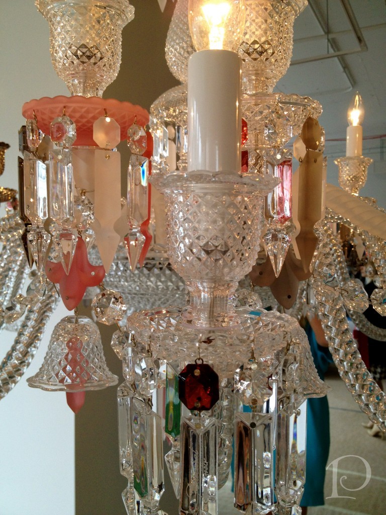
If you look closely you’ll see Baccarat’s signature RED crystal. Every Baccarat chandelier has one.
This pale pink and RED Flou Je Te Vois Flou Zenith chandelier is an evolved design with a whimsical twist.
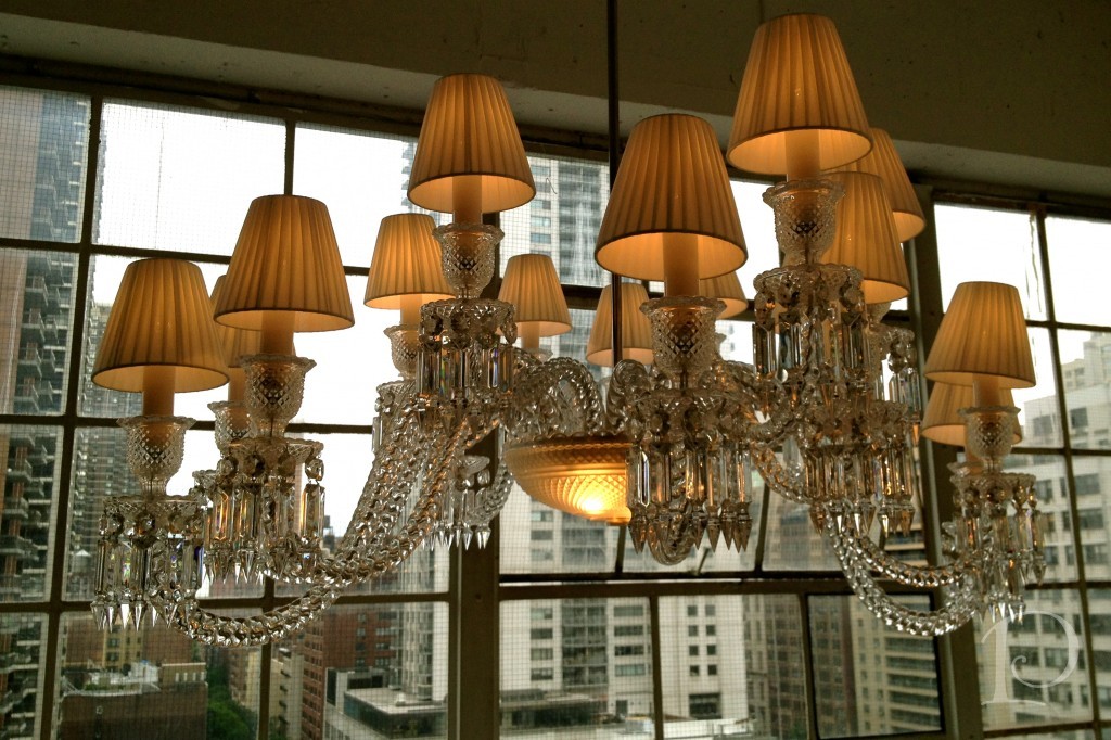
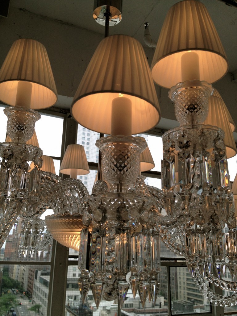
How about this stunning WHITE shaded chandelier, the Ellipse?
It’s traditional yet perfectly brilliant in every light. I love how the NYC skyline backdrop enhances the overall look.
Here’s a closer look at some of the details:
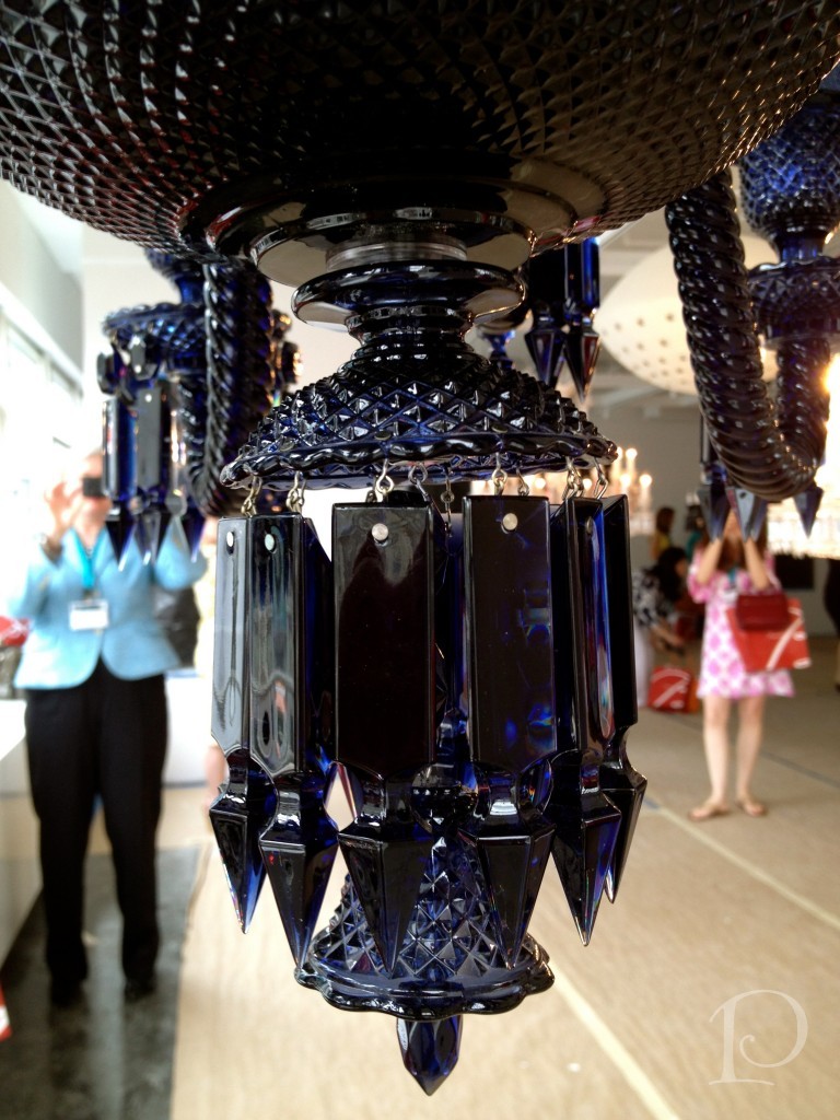
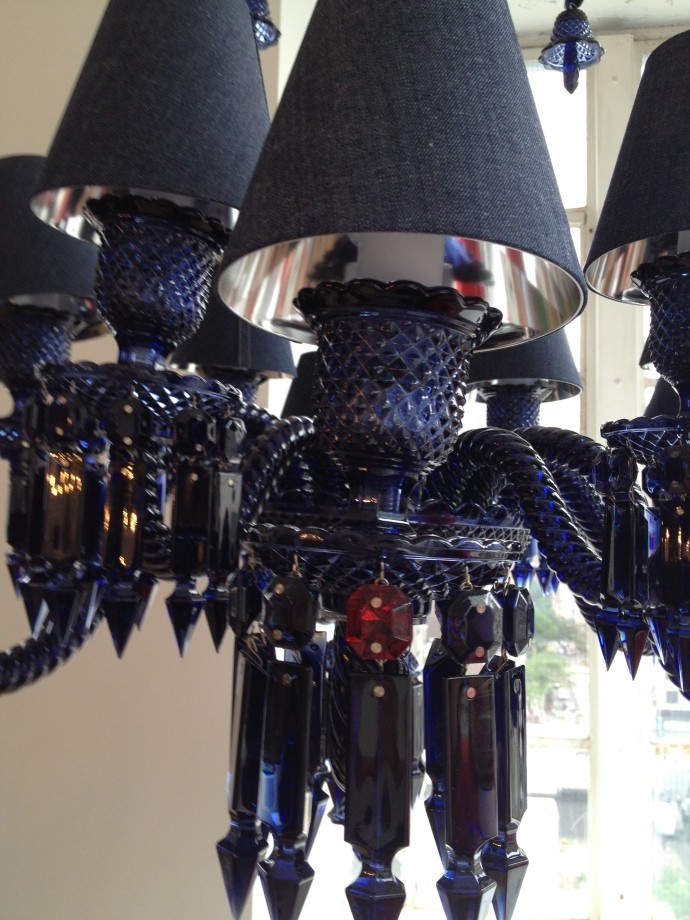
And yes, Baccarat does create a deep, rich royal cobalt BLUE crystal.
Called the Zenith Midnight chandelier, isn’t it grand?
I love the lampshades in denim, tres modern!
The day we visited the showroom, I just happened to be wearing a USA-blue dress.
I’m sorry to say, I think my lanyard and ID badge may be the closest I’ll get to having an Olympic medal! In the meantime, you can’t deny the brilliance of these amazing crystal Baccarat chandeliers ~ or our Olympians!
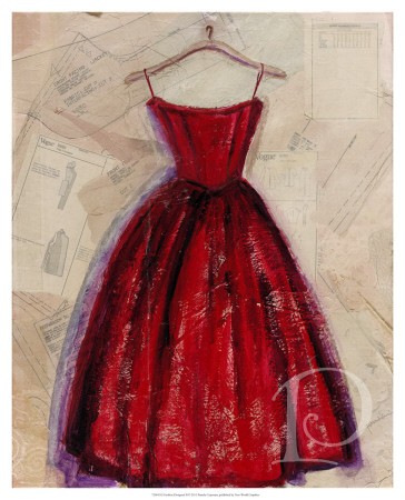
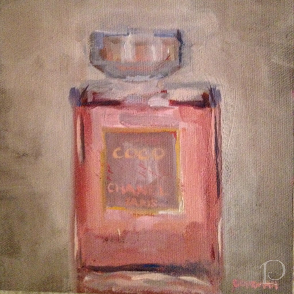
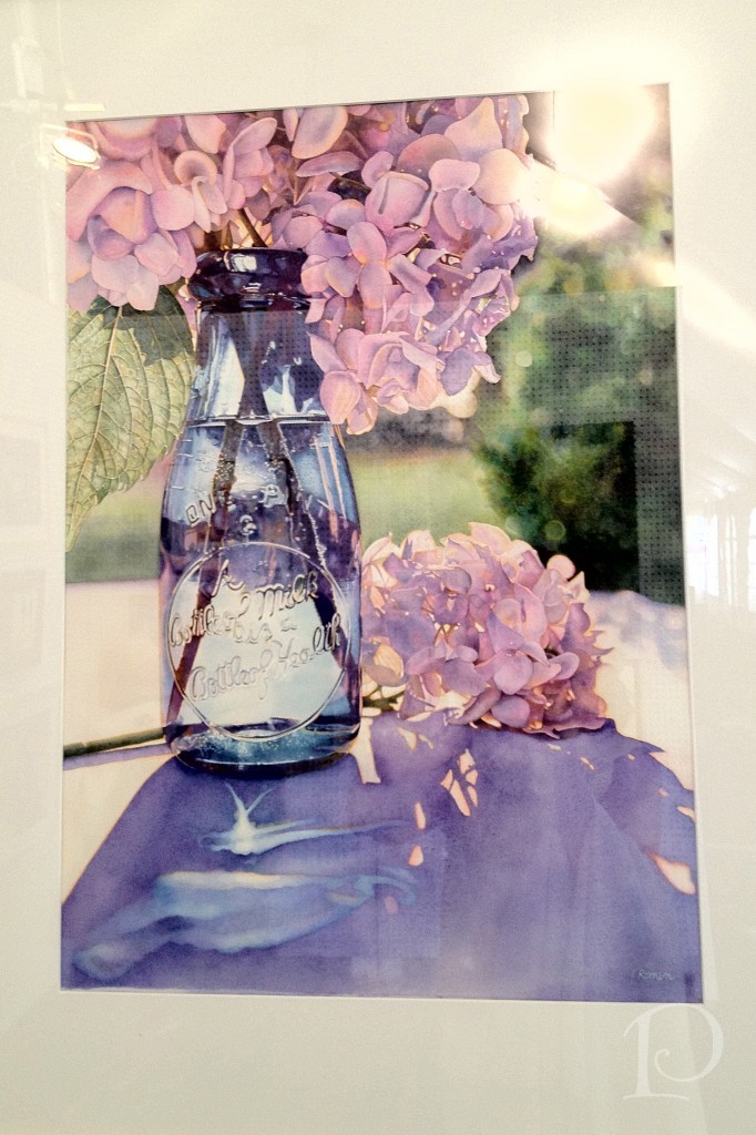
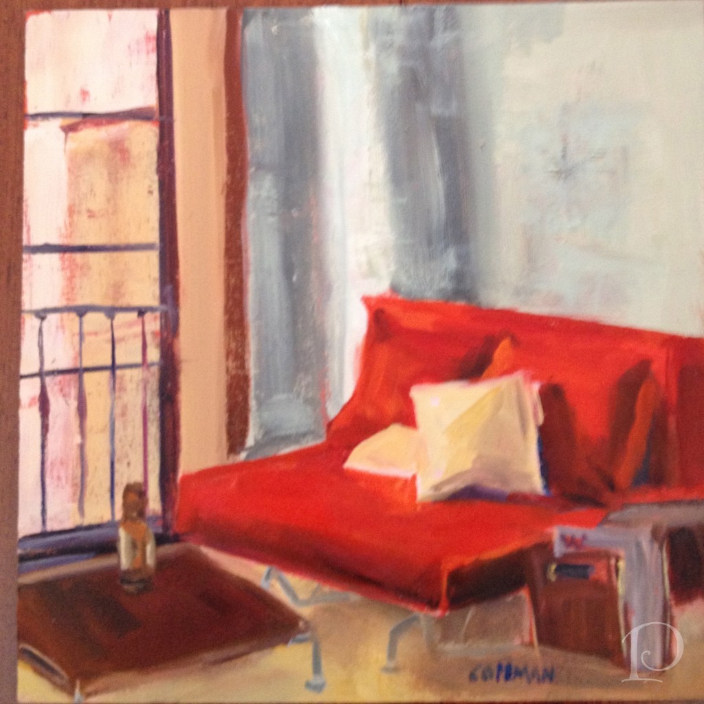
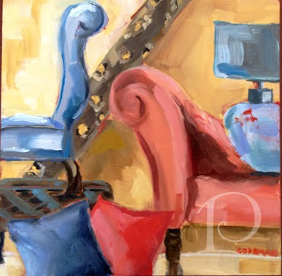
Finally, this week’s petite oil painting is actually a larger mixed-media work of mine. I couldn’t resist showing it though as it fits the Red, White and Blue theme:
Better still, this print is available for sale at AllPosters.com!
Hurray for RED, WHITE, and BLUE…and go Team USA!
xo,
Pamela
To receive new blog posts in your inbox, be sure to subscribe via email! Just click on the link in the right sidebar.
Contact me about Pamela Copeman Design Group services.
To follow me on Pinterest, click here.
To follow Pamela Copeman Design Group on Facebook, click here.
To follow me on Twitter, click here
Carpets, Paint, and a Closet…oh my!
Jul 31 2012 · 0 comments · Meet the Team, My Designs ·0
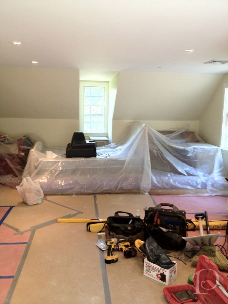
The design for my teenage client is really taking shape. The room is still covered in drop cloths and tape but we are definitely making progress…
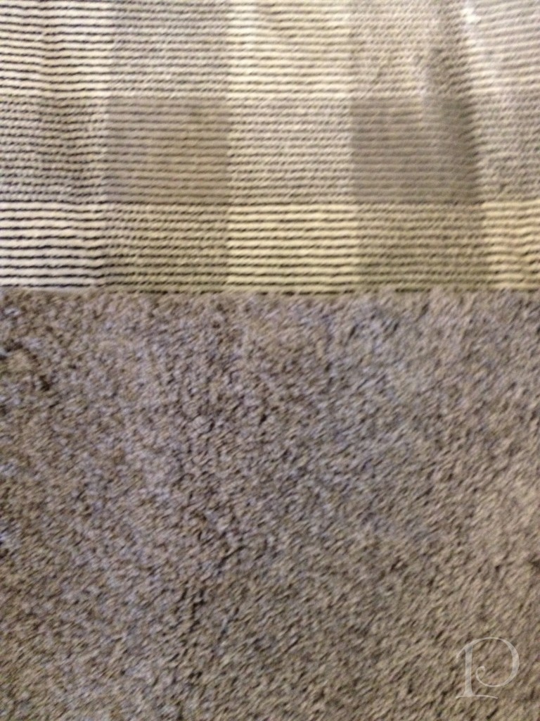
We have finalized the carpet. The area carpet is from Colony Rug. It’s a gray tone-on-tone pattern on top of which we will place a modern interpretation of a “shag” rug. The “shag” rug will be sized much smaller, 4’x6′, and bound in a red to match the sofa fabric ~ very sharp looking indeed.
I couldn’t resist showing you Lilly, from Colony, showing off our carpet choices. Isn’t she adorable?
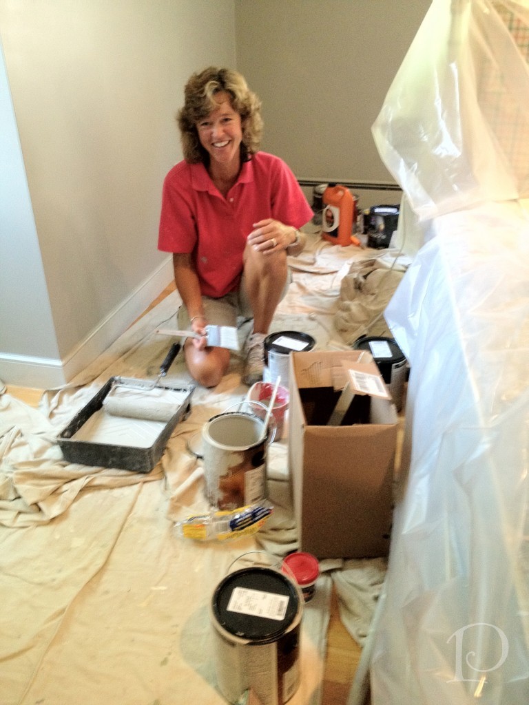
The walls are finished! Karen, painter extraordinaire, did a great job! We used a Sherwin Williams gray called Pussy Willow. It’s purrr-fect.
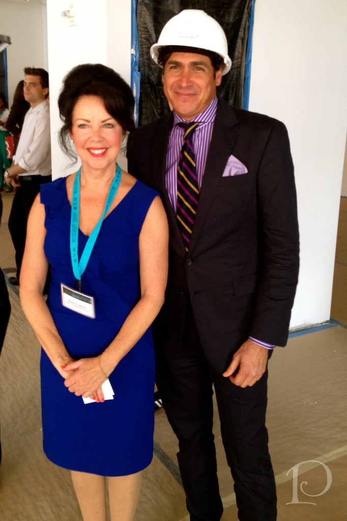
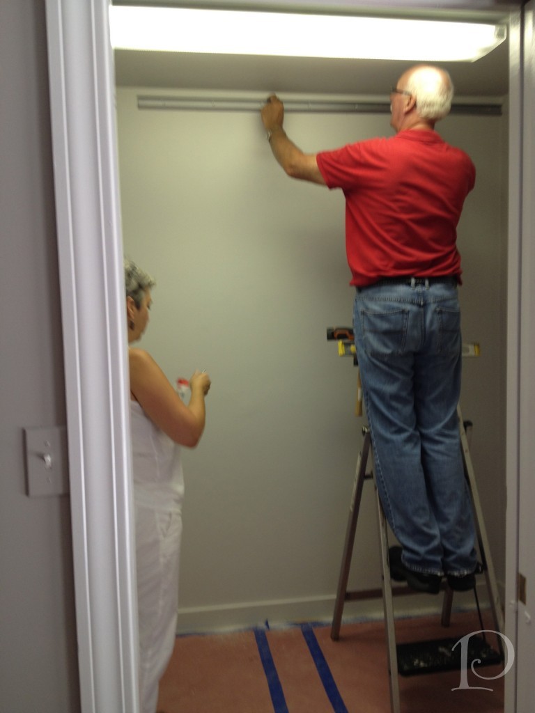
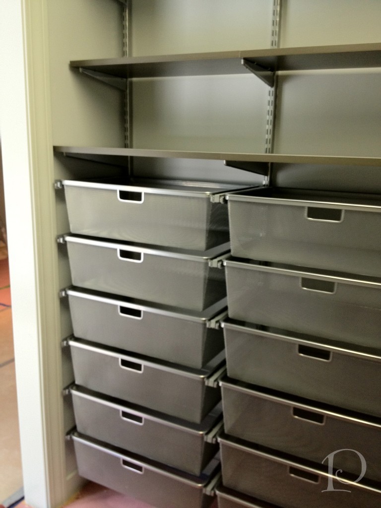
Tina Ghiz of Aphrotidy designed the custom closet system using components from The Container Store. Here, Paul and Tina hard at work on the installation.They started with the track which is the base of the hanging and drawer pieces.
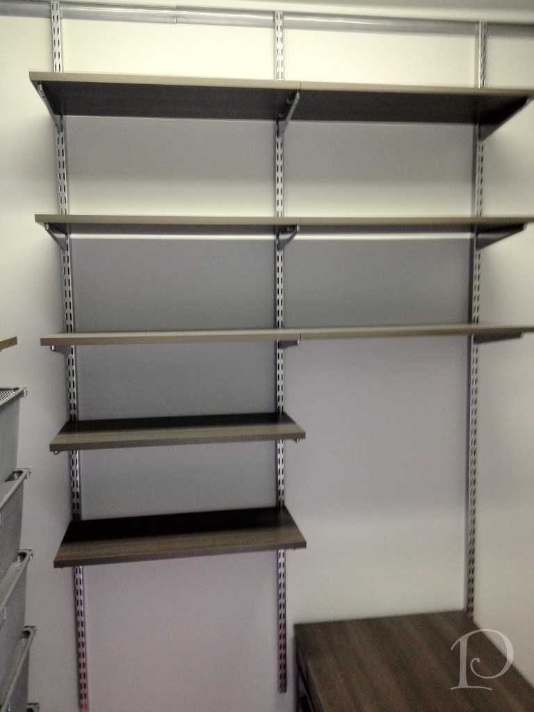
This is the center wall of the closet. Every inch of the space is customized for my client, including an open area for a mini-fridge and the even the hanging rods were placed to accommodate the length of his shirts.
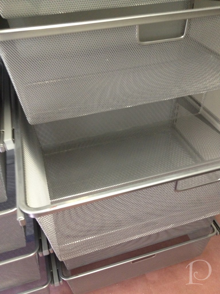
The left wall is filled with drawers that will be filled with t-shirts, underwear, socks and such.
This is a close-up view of the drawers, the open design is great for air circulation.
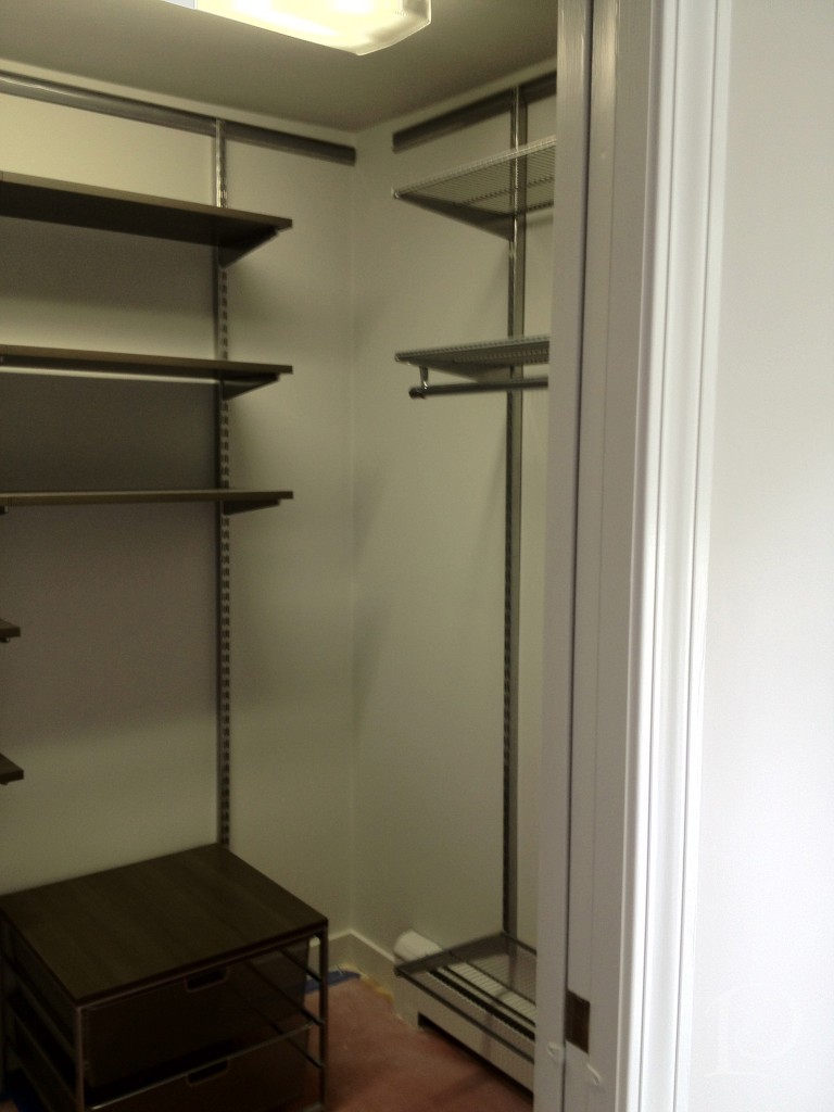
The right wall is for long hanging pieces such as pants.
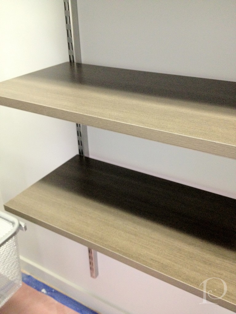
The shelves are a wood finish that coordinate with entire palette of the room…they’re beautiful. Thank you Team for all your hard work!
“You can design and create and build the most wonderful place I’m the world but it takes people to make a dream a reality.”
~Walt Disney
xo,
Pamela
To receive new blog posts in your inbox, be sure to subscribe via email! Just click on the link in the right sidebar.
Contact me about Pamela Copeman Design Group services.
To follow me on Pinterest, click here.
To follow Pamela Copeman Design Group on Facebook, click here.
To follow me on Twitter, click here
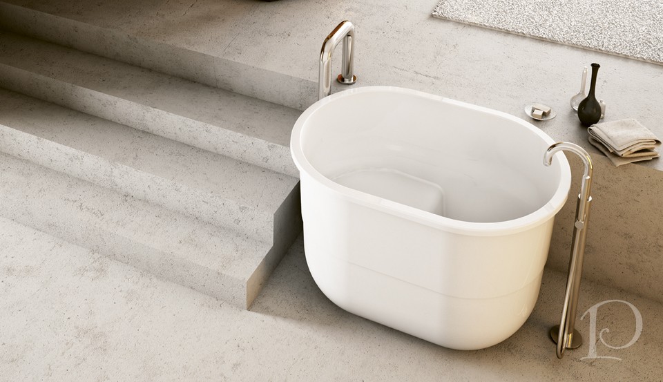
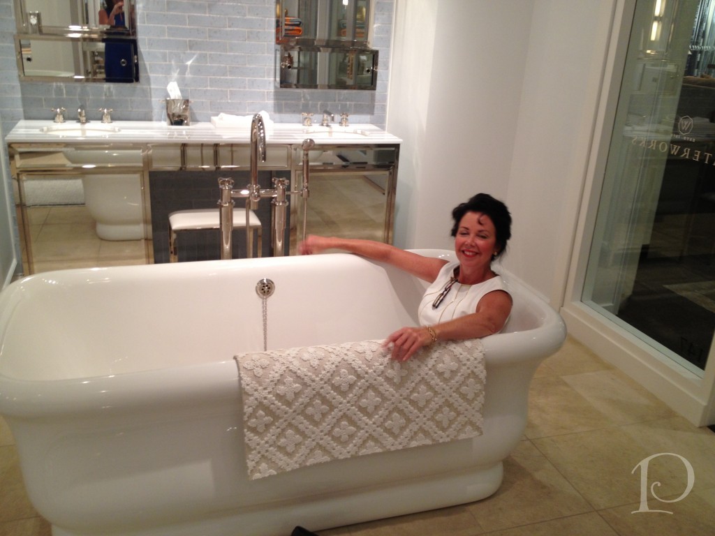
Pamela's Posh Picks: Victoria & Albert Tubs
Jul 27 2012 · 0 comments · My Designs, Posh Picks ·0
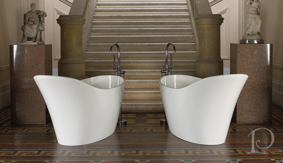
Things have been moving right along in my latest project. In fact, this past week I was out shopping for tubs for the next phase which will include renovating the master bathroom.
I just love tubs. To me they represent romance, relaxation and luxury. Some of my favorite tubs are from Victoria + Albert. Victoria + Albert tubs (or baths) are made with volcanic limestone mixed with resin to form a patented material called ENGLISHCAST. Replete with unique properties, ENGLISHCAST is the foundation of all of the beautiful Victoria + Albert baths.
Here are my Posh Picks from Victoria + Albert tubs…
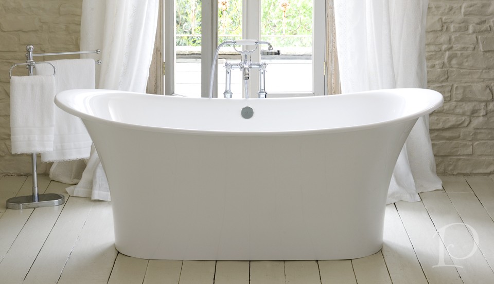
A slipper tub for the 21st century, the Amalfi transforms the period look into sexy sleekness
I think I would feel like a Roman goddess bathing in this tub!
Bateau style freestanding design
I imagine a bath in this tub would transport you to the gently rolling seas…
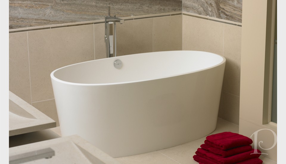
Big bath luxury in an amazingly compact design
Modern, sleek and contemporary. I love the clean lines and surprising capacity of this tub.
I love the detail of the cutaway base on this tub. So chic.
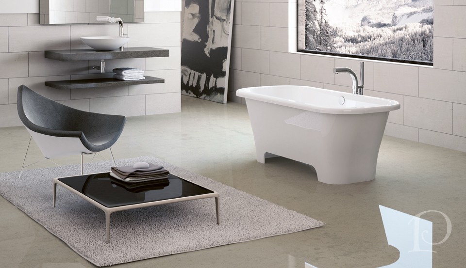
A modern sit tub, the bold Sorrento is designed for full immersion
The best part ~ it’s big enough for two!
When selecting a tub for your luxurious bathroom, you certainly can’t go wrong with any of these stunners from Victoria + Albert. Of course, you shouldn’t choose a bath based on looks alone. You must consider how it feels and “fits”…
Oh, what I won’t do for my clients!
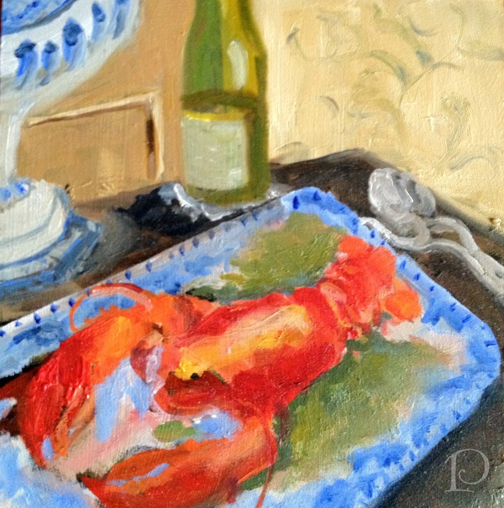
Finally, this week’s petite oil painting is a bit of pure summer:
I had my first lobster this week at Jake’s Seafood Restaurant in Hull with my BFF Tina. It was so delicious, I can’t wait to have my next one. After all, it’s only summer here in New England once a year ~ it’s up to us to make the most of it!
xo,
Pamela
To receive new blog posts in your inbox, be sure to subscribe via email! Just click on the link in the right sidebar.
Contact me about Pamela Copeman Design Group services.
To follow me on Pinterest, click here.
To follow Pamela Copeman Design Group on Facebook, click here.
To follow me on Twitter, click here
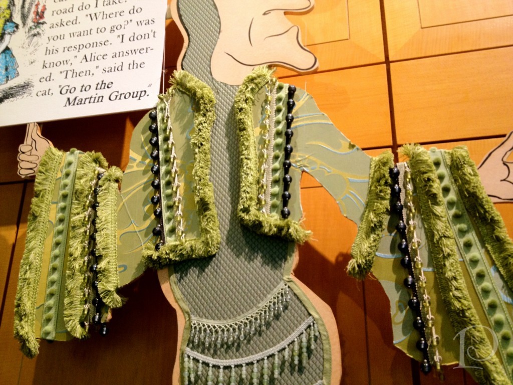
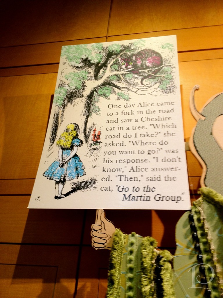
Alice in…the Boston Design Center?!
Jul 25 2012 · 0 comments · Art Exhibits & Events, Design Events ·0
“Why, sometimes I’ve believed as many as six impossible things before breakfast.”
~Lewis Carroll, Alice in Wonderland
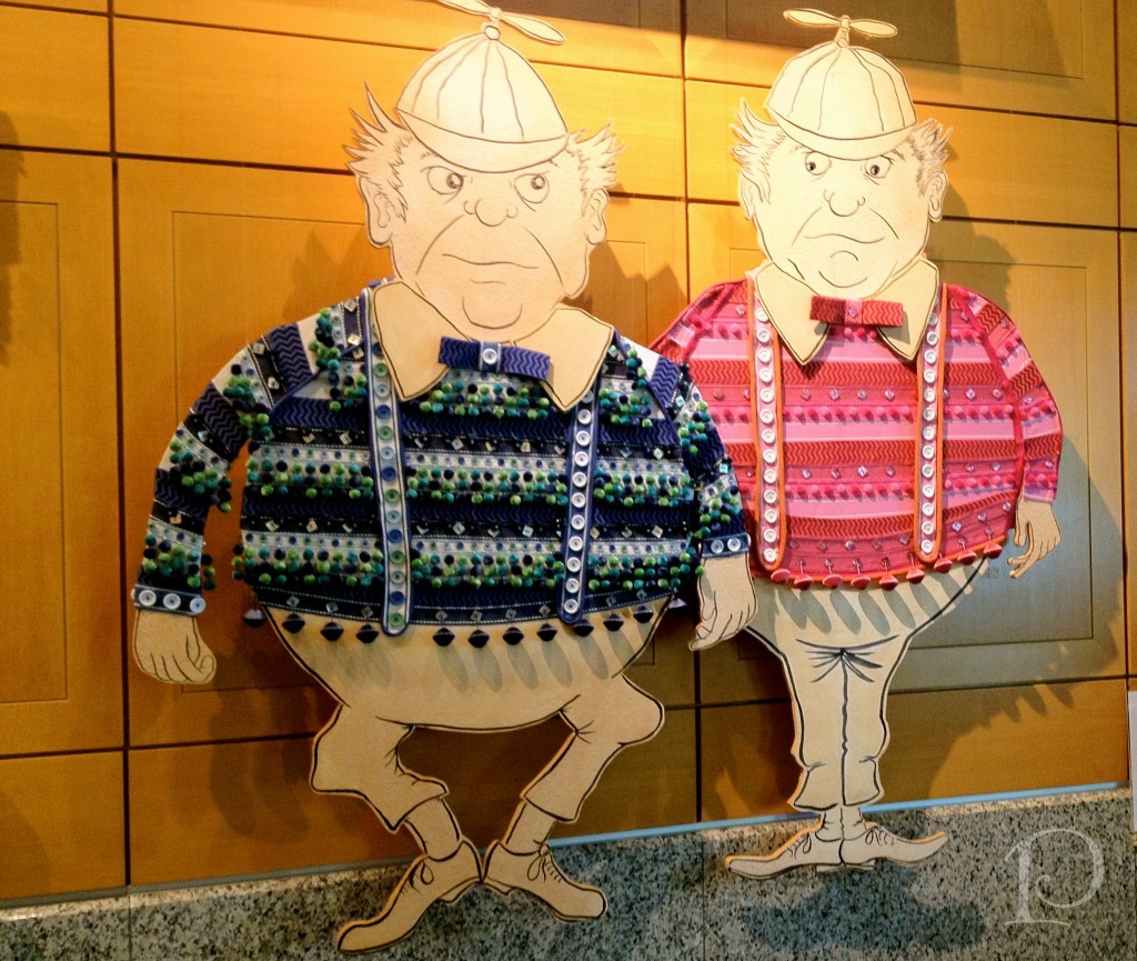
I believe I fell down a rabbit hole when I entered the Boston Design Center last week! Right there before my very eyes in the windows of the Martin Group showroom were all the Alice in Wonderland characters dressed to the nines in Samuel and Sons trimmings!
Here is where the story begins…
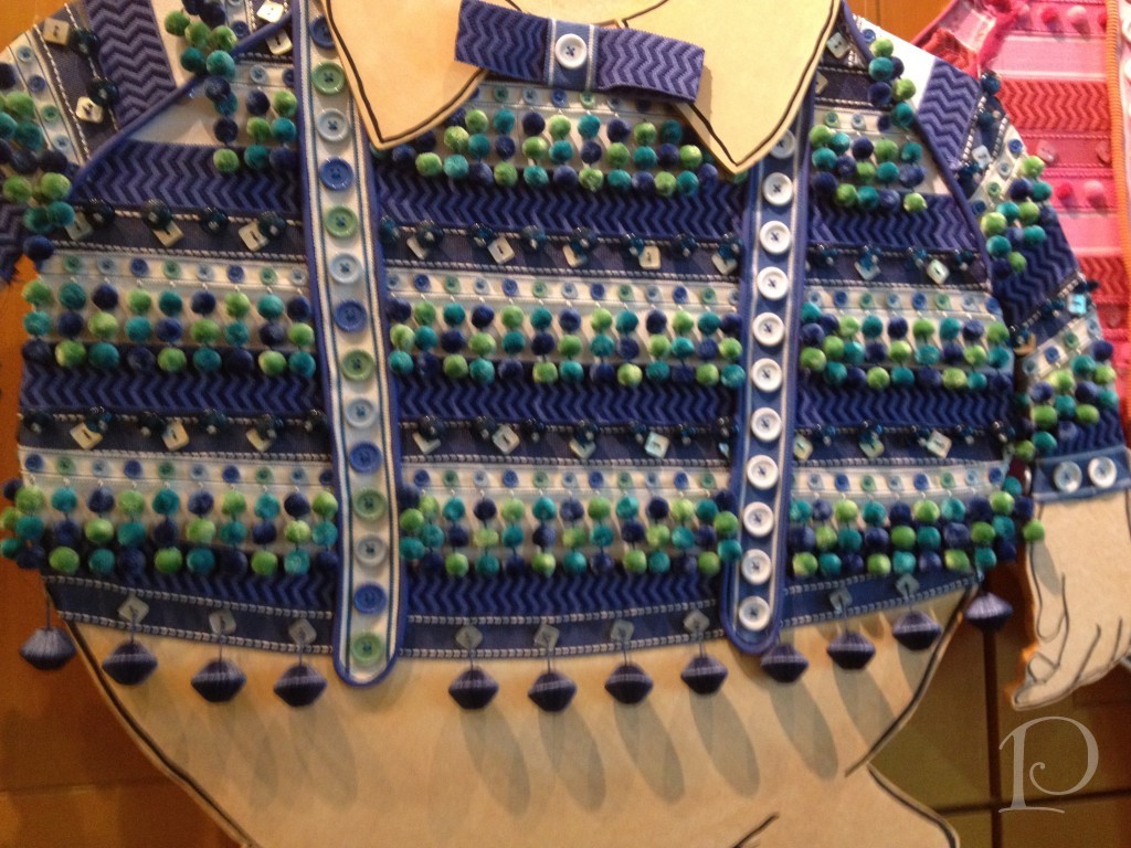
Tweedledee and Tweedledum never looked so dapper!
I just love the detail of the ball fringe, so clever!
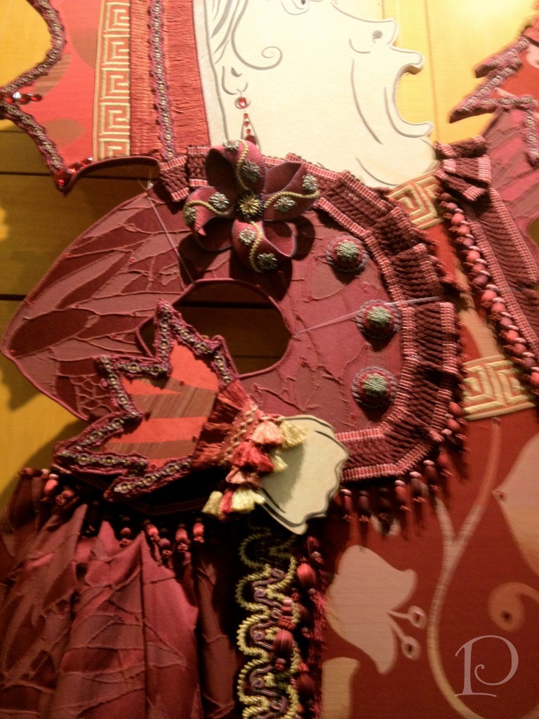
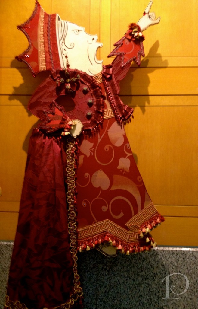
The Queen of Hearts is looking exceptionally posh in her opulent regalia:
And really, aren’t there days when your inner diva just wants to say, “Off with Her Head”??
Oh, to be able to wear such finery and be a tyrant…bliss!
Meanwhile, Alice seems to be feeling a bit odd:
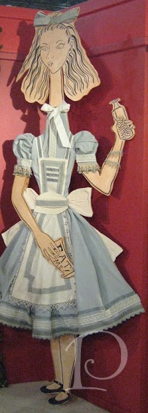
The details on her dress however are nothing but stunning!
Here is the ever unshakably mellow caterpillar who gives Alice sage advice, all while bedecked in his lovely green garb…
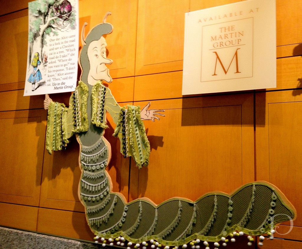
And for a close up:
Just think of all the possibilities with these amazing pieces of passementerie! Wonderful pillows, shams, duvets, leading edges on draperies and upholstery, and table skirts just to name a few~ oh my! These exquisite tassels, trims, beads, tapes, ropes are just waiting to bejewel your home decor and with the right designer, that is not impossible at all!
xo,
Pamela
P.S. To receive new blog posts in your inbox, be sure to subscribe via email! Just click on the link in the right sidebar.
Contact me about Pamela Copeman Design Group services.
To follow me on Pinterest, click here.
To follow Pamela Copeman Design Group on Facebook, click here.
To follow me on Twitter, click here
Pamela's Posh Picks: Party Bites
Jul 20 2012 · 1 comment · Posh Picks ·0
With the summer entertaining season in full swing, I’d thought this would be a perfect week to share some of my favorite festive appetizers, along with a few tips and tricks for serving.
Here we go…
Ricotta Cheesecake and Fruit Lollipops
These adorable sweet snacks are so easy to put together. To make them even faster, you could substitute store-bought pound cake for the ricotta cheesecake.
I love the idea behind these crudité baskets! You could use any small container, perhaps a berry basket or even an espresso cup. Served with a larger bowl of yogurt-based veggie dip, you have a healthy and refreshing appetizer for your guests.
This Caprese salad on a stick is simple to prepare and so delicious. I can almost taste the mouthful of bursting fresh flavor!
Tostito’s scoop chip are so versatile, they make a great “nest” for a variety of fillings. I love how this taco bite is dressed up with the piped star shaped sour cream ~ what a great detail!
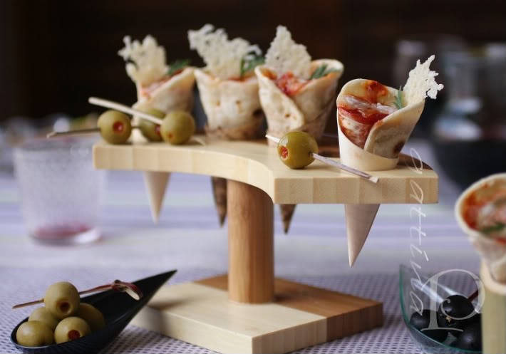
How fun are these pizza cones? The tortilla shaped cones offer a variety of possibilities for fillings. How about Boursin cheese, yellow pepper, watercress and a hint of red onion? Just use your imagination!
It’s a great time of year to entertain with the warm weather and bounty of fresh produce. Check your garden or local farmer’s market and get creative. Any appetizer can be party-ready with a few simple touches, whether a hand-tied ribbons on the serving skewers or a bouquet of fresh herbs or flowers on a serving tray, presentation can make all the difference!
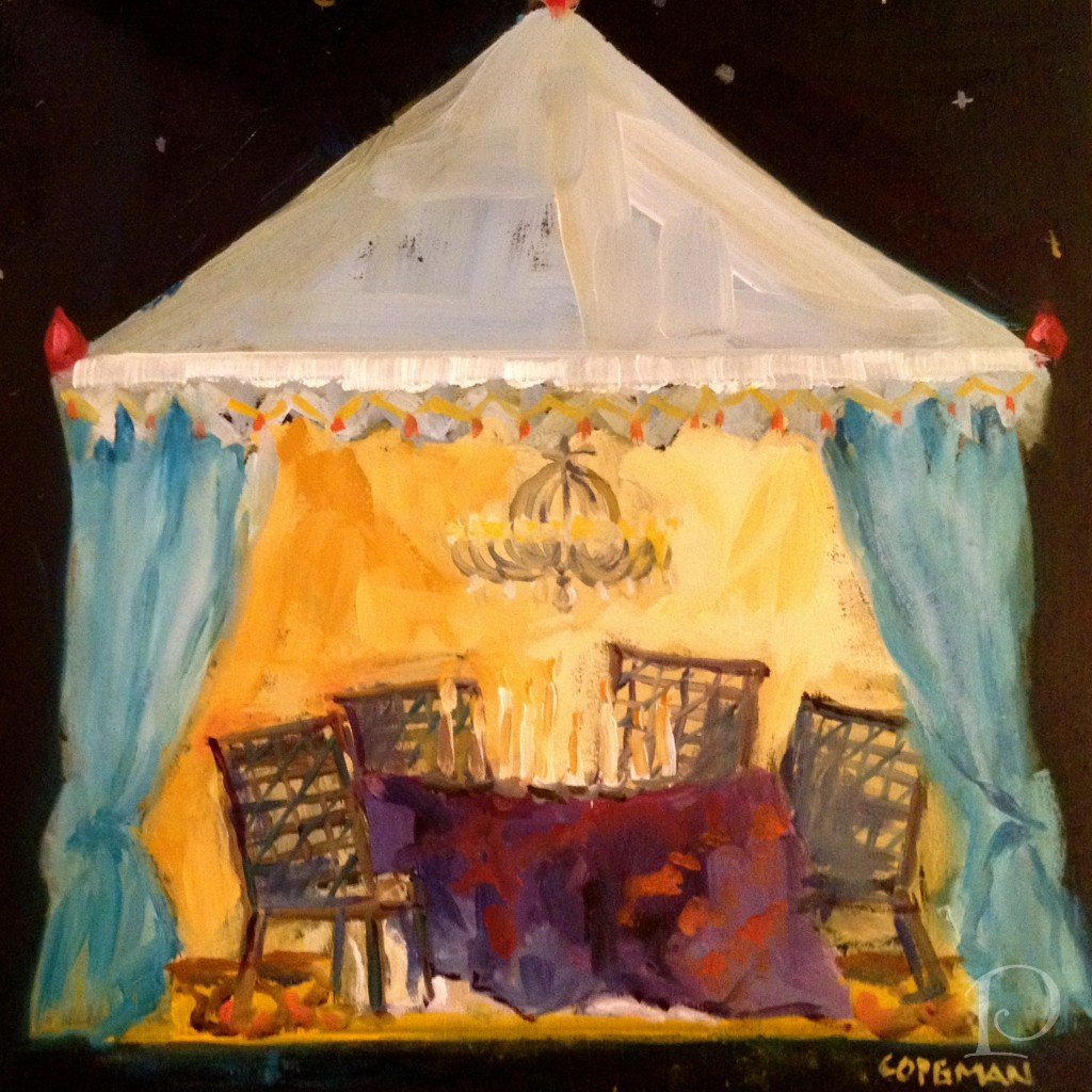
I imagine a twilight Summer party would be just delightful under this Starry Night tent in this week’s petite oil painting:
xo,
Pamela
Contact me about Pamela Copeman Design Group services.
To follow me on Pinterest, click here.
To follow Pamela Copeman Design Group on Facebook, click here.
To follow me on Twitter, click here
Demolition Day
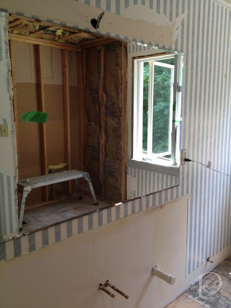
Jul 16 2012 · 2 comments · Behind the Design, My Designs ·0
I LOVE Demolition Day! Demolition Day is truly a sign of progress, it means designs are moving forward and a big rush of adrenaline at the excitement of it all!
Last week it was time for Demolition Day on the bathroom portion of the Teenage Boy’s Domain project I’ve been chronicling on the blog. We are working with the award-winning S+H Construction firm of Cambridge. The entire team is professional, outstanding in their field and, so importantly, on time. All of this translates to a smooth Demolition Day.
They say a picture is worth a thousand words so here goes…
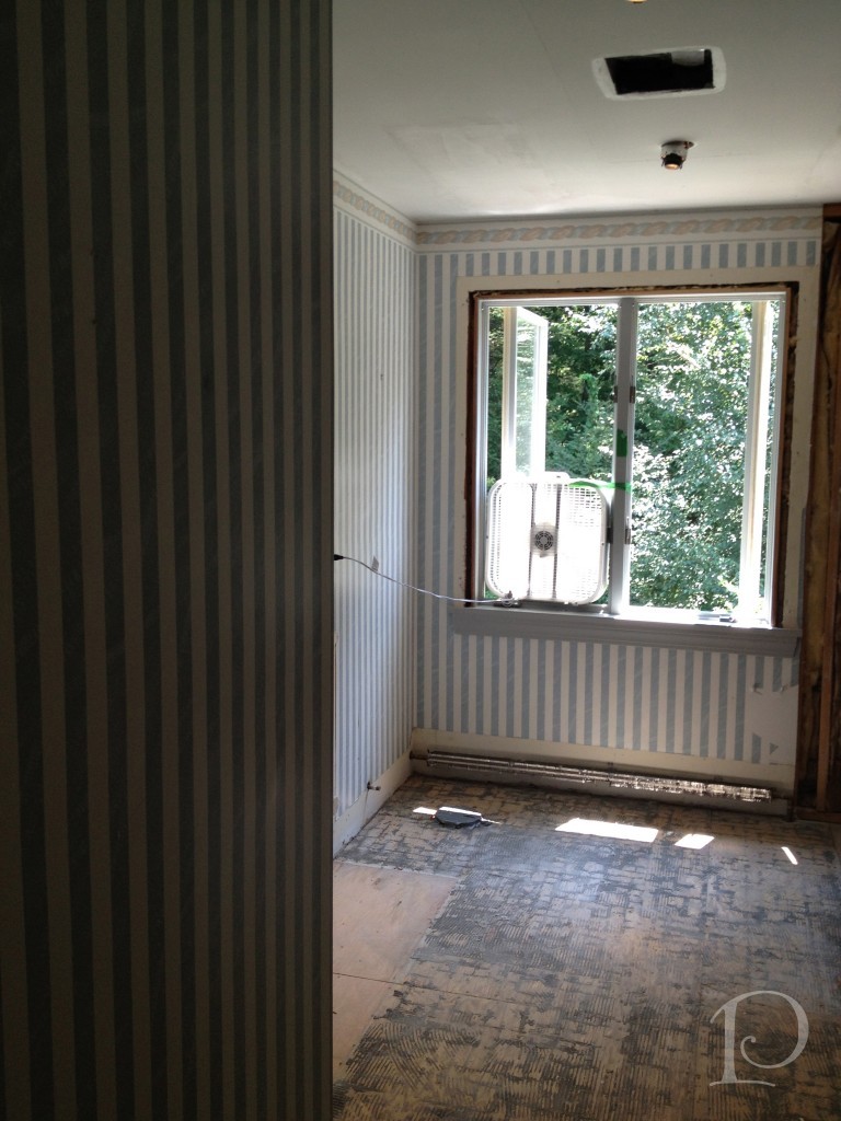
This is the perfectly prepped bedroom that is not being demo-ed. The space is totally protected, I love how they’ve covered the hard wood floors to the bathroom.
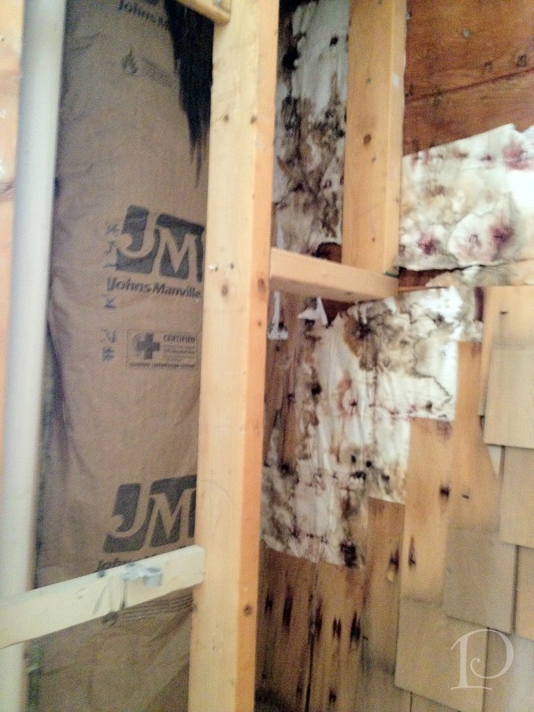
Here is the shower minus the inserted fiberglass unit ~ voila, an extra 3 feet of space! Ahhh, the secret discoveries of demolition!
Here we found some hidden exterior shingles. Why are they there? Who knows, but no worries.
This space will house the new tiled shower with glass door, stay tuned…
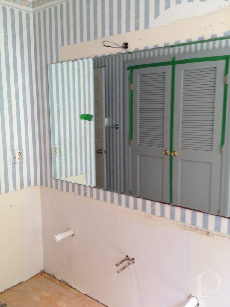
The demolition of the guest bathroom came with a LOT of noise. Getting those funky tiles up from the sub floor was not a quiet job! Look for this window to be replaced as well.
This view shows the bath/shower area as reflected in the soon to be replaced mirror.
I can’t wait to share the custom vanity that is being designed for this bathroom. The space will be absolutely transformed, just you wait and see!
While these may not be the prettiest photos I’ve shared on the blog, when you see the finished project you’ll be amazed at how far we’ve come!
“An architect’s most useful tools are an eraser at the drafting board, and a wrecking ball at the site.”
~Frank Lloyd Wright
xo,
Pamela
Contact me about Pamela Copeman Design Group services.
To follow me on Pinterest, click here.
To follow Pamela Copeman Design Group on Facebook, click here.
To follow me on Twitter, click here
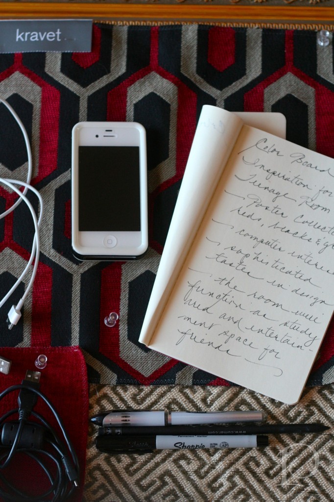
Posh Palettes Presentation Panel: Teenage Boy's Domain
Jul 10 2012 · 0 comments · Posh Palettes Presentation Panel ·0
If you are familiar with my blog, you know that one of my favorite things to do at the outset of a large design project is to put together a Presentation Panel. Whether virtually (as I showed you last week) or on an actual inspiration board using real materials (my Posh Palettes Presentation Panels), I love pulling together inspiration as I begin to design a space.
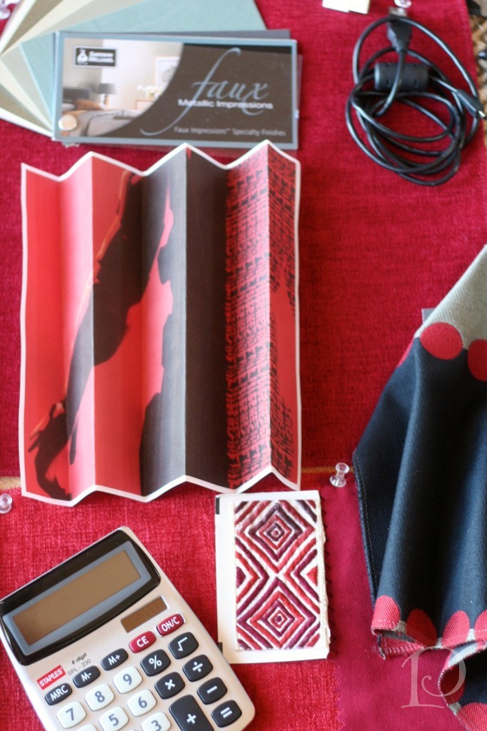
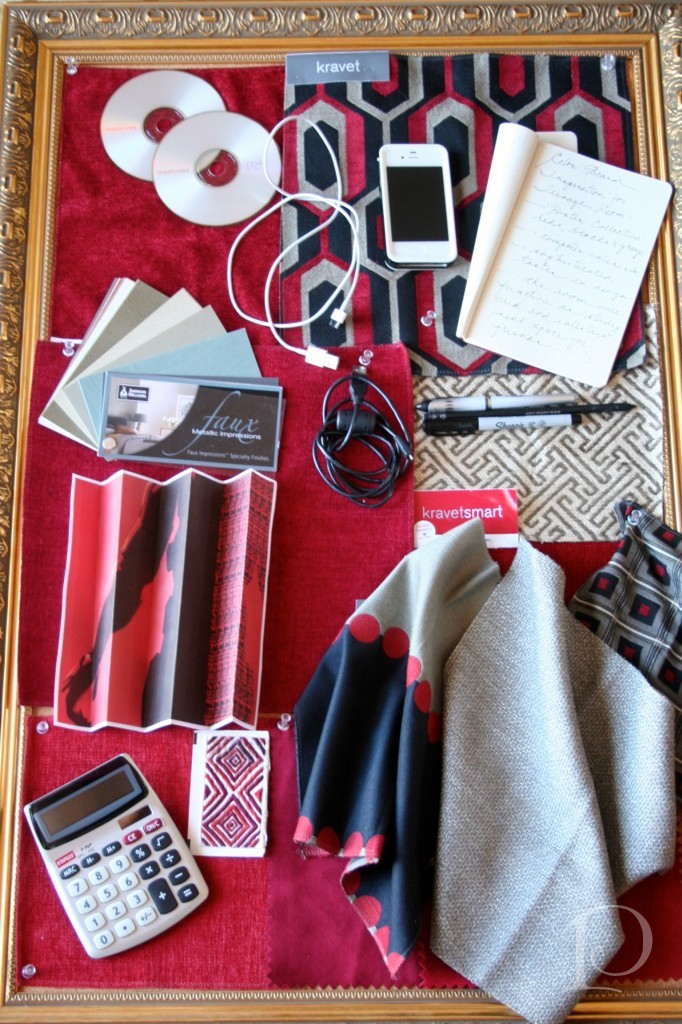
Today’s Posh Palettes Presentation Panel is for the same teenage boy I’ve introduced you to over the past few blogs. Last week I shared the mood board for his en suite bathroom, today I’m sharing a peek at the design for his Bedroom.
The catalyst for the entire suite was a collection of posters my client acquired last summer. These bold, graphic posters, which will be framed and hung artfully in one area of the room, provided us with the inspiration point for the design. Once this decision was made, the color palette and other finishes fell easily into place.
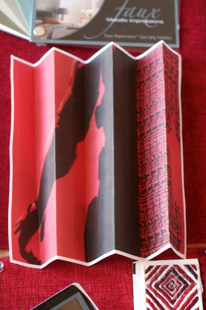
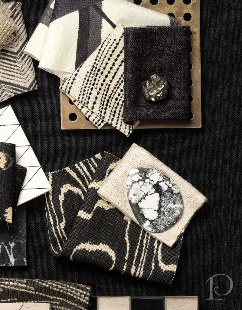
This section of the panel gives you some idea of the red and black values we are working with:
I love the richness of the Kravet fabrics we’ve selected!
When I put together a Presentation Panel, I try to add every element we might consider using in the design such as trim and coordinating fabrics. While not everything will end up in the completed space, it helps reinforce the mood and style of the design.
Finally, I always add details that reflect the client’s life and personality. On this panel you can see that there are pencils and pens, a notebook, a calculator, computer cords etc. ~ my effort to capture the technology savvy side of this young man.
This is going to be a vibrant, striking and unique space, I am so looking forward to seeing it come together ~ and of course sharing it here!
“Creativity is just connecting things. When you ask creative people how they did something, they feel a little guilty because they didn’t really do it, they just saw something. It seemed obvious to them after a while. That’s because they were able to connect experience they’ve had and synthesize new things.”
~Steve Jobs
xo,
Pamela
Contact me about Pamela Copeman Design Group services.
To follow me on Pinterest, click here.
To follow Pamela Copeman Design Group on Facebook, click here.
To follow me on Twitter, click here
Pamela's Posh Picks: Sophisticated Seashells
Jul 06 2012 · 0 comments · Posh Picks ·0
Summer is in full swing and every time I look out onto my terrace to the ocean beyond, I am reminded at just how much I love living at the beach. I also love strolling on the beach and discovering Mother Nature’s keepsakes, seashells. This week’s Posh Picks are all about elevating seashells from kitschy knick-knacks to sophisticated home decor.
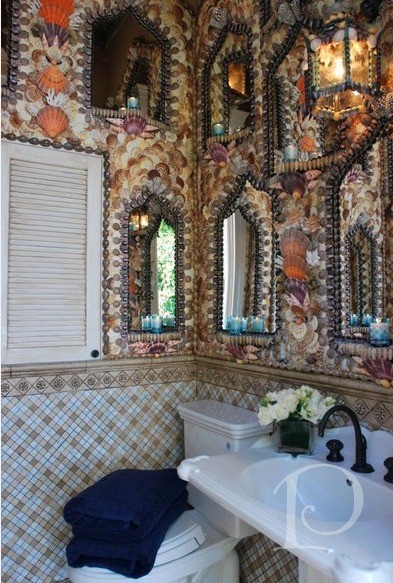
My first Posh Pick is this incredible custom pool cabana bathroom.
The seashell mosaic in this Moroccan inspired design is full of color, imagination and pure fantasy. The arched mirrors are not only functional but are also reflective of the seashell encrusted walls, contributing to the feeling of being in an underwater cavern. Amazing!
My next pick is this stunning table from the Kips Bay Show House I visited during Blogfest this year.
This elegant sofa table emanates sophistication. The shape of the table, the graceful curves of the legs and the dark tortoise shell color of the shells help make this table a beautiful conversation piece.
This seashell chandelier is totally over-the-top in the best possible way.
It is fabulous and wildly creative while still in excellent taste. I love the pearl dot seashell covered lampshades ~ beautiful attention to detail! I could see this chandelier hanging in a ladies boudoir or over a feminine writing desk. Better yet, how about over a mermaid’s breakfast table??
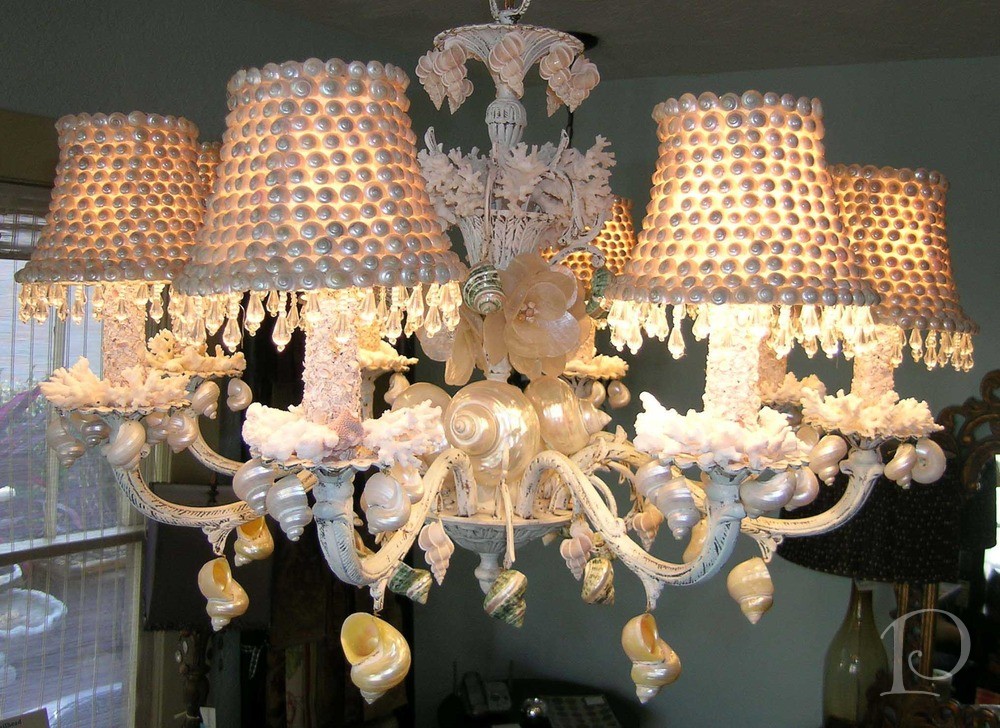
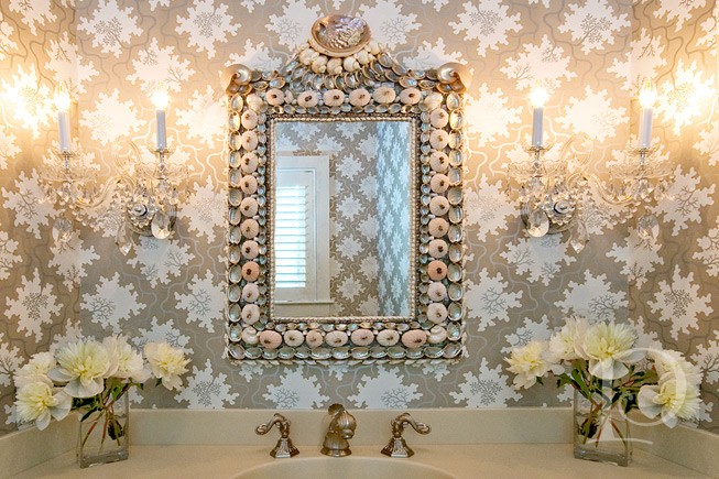
Perhaps my favorite seashell mirror ever, this amazing piece is from Currey & Co.
I used this stunner in a powder room I designed on Cape Cod. It was love at first sight! The amazing collection of silvery, iridescent seashells on this traditionally shaped mirror are the perfect complement to the luminescent wallpaper. What a shame this mirror is no longer available ~ I’d love to have one in my own home!
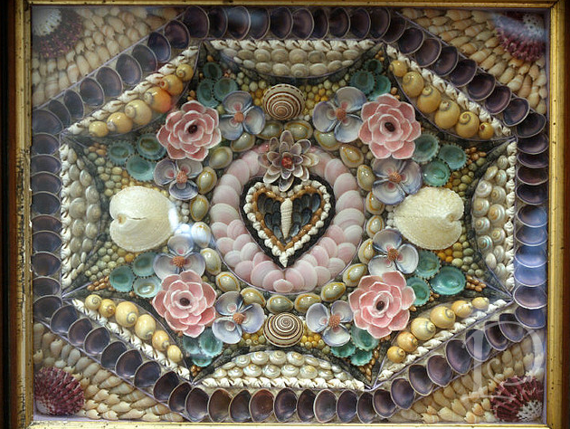
My final Posh Pick of the week is a sentimental one: a Sailor’s Valentine.
These beauties are steeped in history and romance and the delicacy of the seashell arrangement captures my heart. An antique Sailor’s Valentine such as this one is a wonderful way to add sweet seashell sophistication to a space.
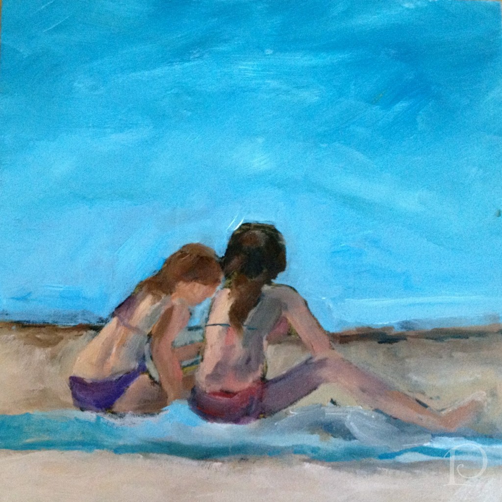
In keeping with the seaside theme, this week’s petite oil painting features two young girls at the beach. Sharing secrets, perhaps?
“Don’t grow up too quickly, lest you forget how much you love the beach.”
~Michelle Held
xo,
Pamela
Contact me about Pamela Copeman Design Group services.
To follow me on Pinterest, click here.
To follow Pamela Copeman Design Group on Facebook, click here.
To follow me on Twitter, click here
The 4th of July: Time to Celebrate…and Decorate!
Jul 03 2012 · 0 comments · Holiday, Inspiration, Outdoor Living, Personal ·0
Happy July 4th! Time to take a break from our routines and celebrate our country and enjoy the summer sunshine. Time to take out the patriotic plates, red, white and blue buntings and American flags. Time to gather with family and friends.
Here are a few ideas to help you jazz up your home and terraces for your 4th of July celebration~
Set the table with stars and stripes.
Go ahead and mix in some seasonal paper goods. There are so many great patterns to choose from and paper plates help make clean-up a breeze.
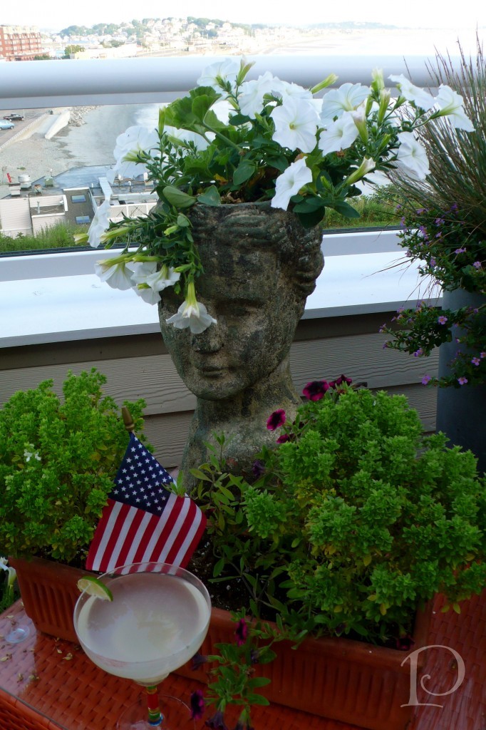
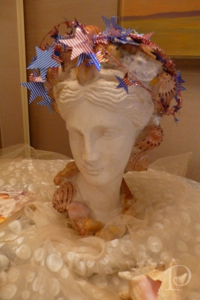
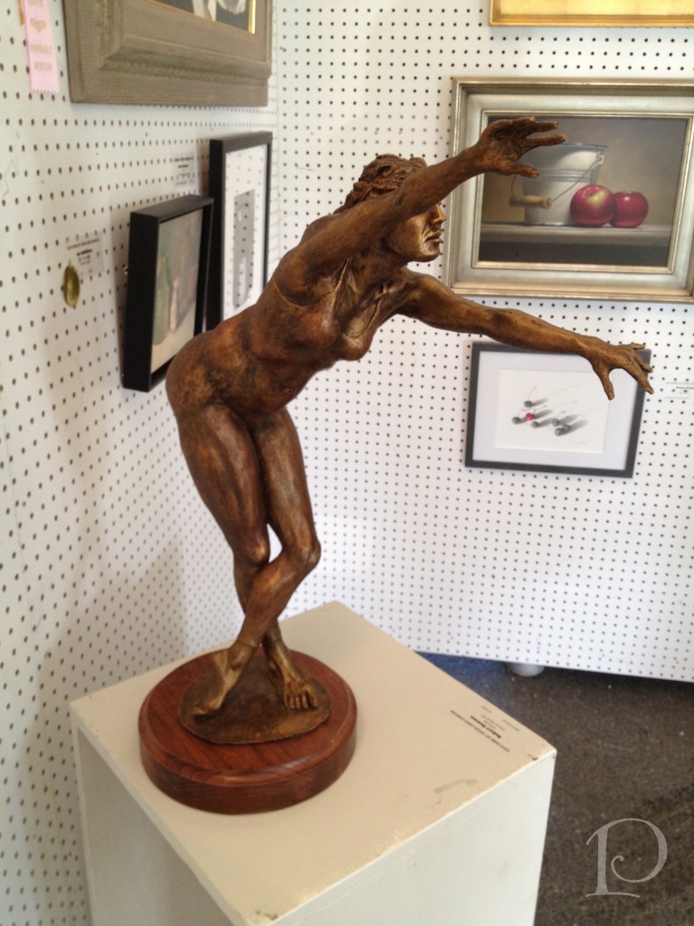
Don’t forget to add decorations in unexpected places. Even the sculpture in my Foyer “dresses” for the 4th of July!
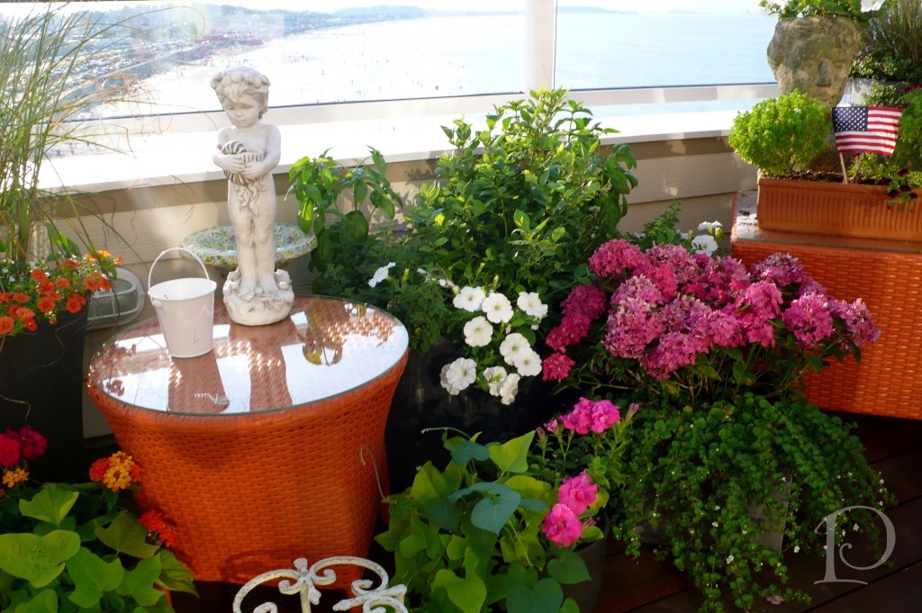
One of the best parts about a summer holiday is enjoying your outdoor spaces. This time of year my deck is in full bloom ~ and the perfect spot to watch fireworks from afar. I love to accent the fleurs with a small flag…
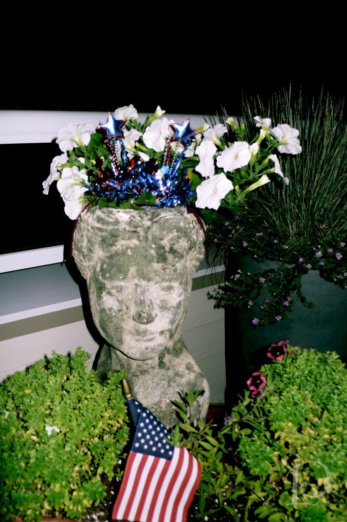
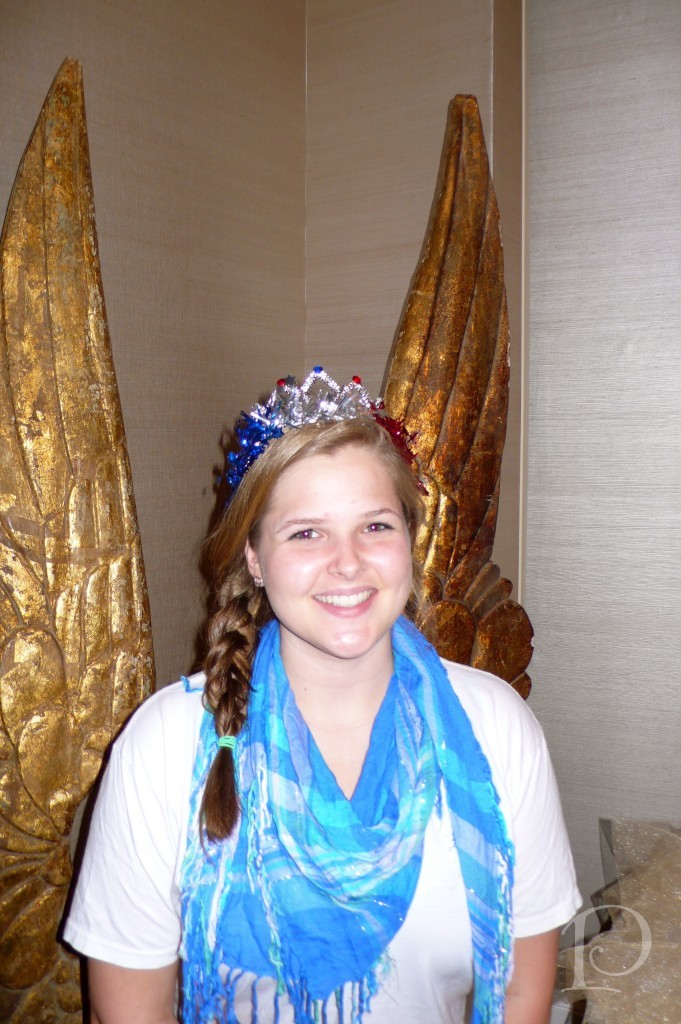
and a well-placed tiara or two! Isn’t she beautiful?
Don’t forget about crowns for you and your guests as well.
I use my collection year after year, adding to my stockpile when a festive headpieces catches my eye.
Patriotic tiaras make for great photo ops!
At my home, the main event on the 4th is always the fireworks display from Boston decorating the night sky…
The most perfect spot to view fireworks has to be with a reflection on the water, how lovely!
As you can see I must perfect my ability to photograph at night~but believe me, it is stunning!
After a night of patriotic revelry, I always love knowing a fun time was had by all…
Oh beautiful for spacious skies,
For amber waves of grain,
For purple mountains majesties Above the fruited plain.
America! America!
God shed his grace on thee,
And crown thy good with brotherhood
From sea to shining sea.
As much as I enjoy this fun and festive summer celebration, l do hope you’ll join me in remembering the heroes who help make our freedom possible. I’ll be raising a glass to my dad Marston who served in WW II, 8th Armored Division. Thank you for your service!
Wishing you a happy and safe 4th of July!
xo,
Pamela
Contact me about Pamela Copeman Design Group services.
To follow me on Pinterest, click here.
To follow Pamela Copeman Design Group on Facebook, click here.
To follow me on Twitter, click here
Pamela's Posh Picks: 50 Shades of Grey
Jun 29 2012 · 1 comment · Posh Picks ·0
I’ll bet that got your attention!?
I’m such a tease because really, my Posh Picks for this week are 5 shades of gray…paint!
We will be using all 5 of these gray paint colors in the teenage boy bedroom project I’m currently working on. Take a look…
The main bedroom color is from the Sherwin Williams Faux Metallic Impressions Collections: Rare Gray Metallic:
I always paint the ceiling a color, it is one of my signature design elements. The ceiling in the bedroom will be Benjamin Moore Wickham Gray:
The bathroom walls will be Benjamin Moore Gray Owl:
The ceiling in the bathroom will also be Benjamin Moore Wickham Gray:
The trim will feature Benjamin Moore White Wisp:
The subtle differences between the paint colors will serve to both unify and enliven the space. I can’t wait to see these colors in action!
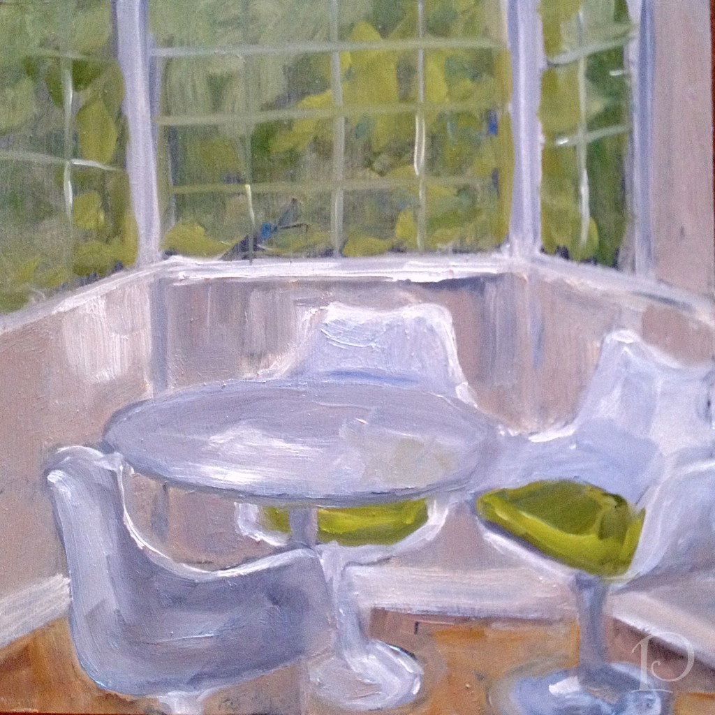
Last but not least, this week’s petite oil painting, also featuring shades of gray (and white and green…)
I’d love to hear your thoughts…and your book reviews!
xo,
Pamela
Contact me about Pamela Copeman Design Group services.
To follow me on Pinterest, click here.
To follow Pamela Copeman Design Group on Facebook, click here.
To follow me on Twitter, click here
My Design Projects: Teen Bathroom
Jun 26 2012 · 0 comments · Behind the Design, Design Elements, My Designs ·0
A transformation is in the works!
I am excited to share with you one of several new projects that I am currently working on. You are in for a treat because I am able to show you the progression of this project in real time, as I am working on it. I hope you enjoy being along for the design journey!
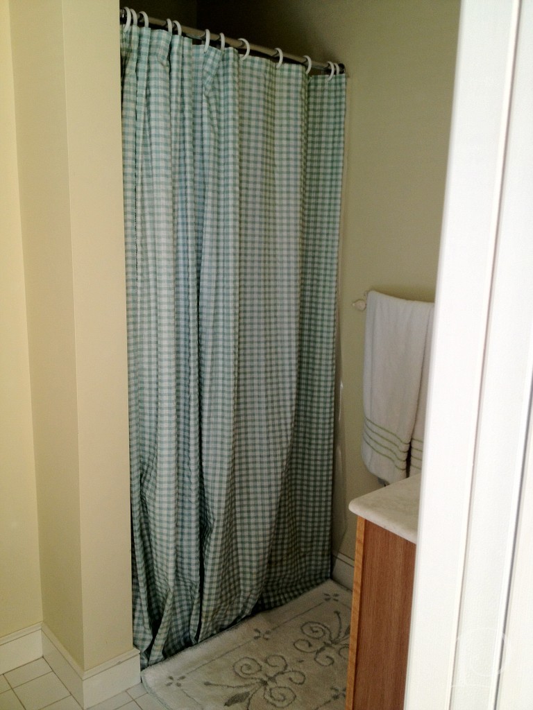
Prioritized as the one of first spaces to be transformed in a larger project, this en suite bathroom for a teenage boy is quite small and ready for an update.
Here is the requisite “before” shot of the vanity in the existing bathroom:
and the 1 piece shower:
While certainly functional, the space does not reflect the aesthetic of the teenage boy who lives here.
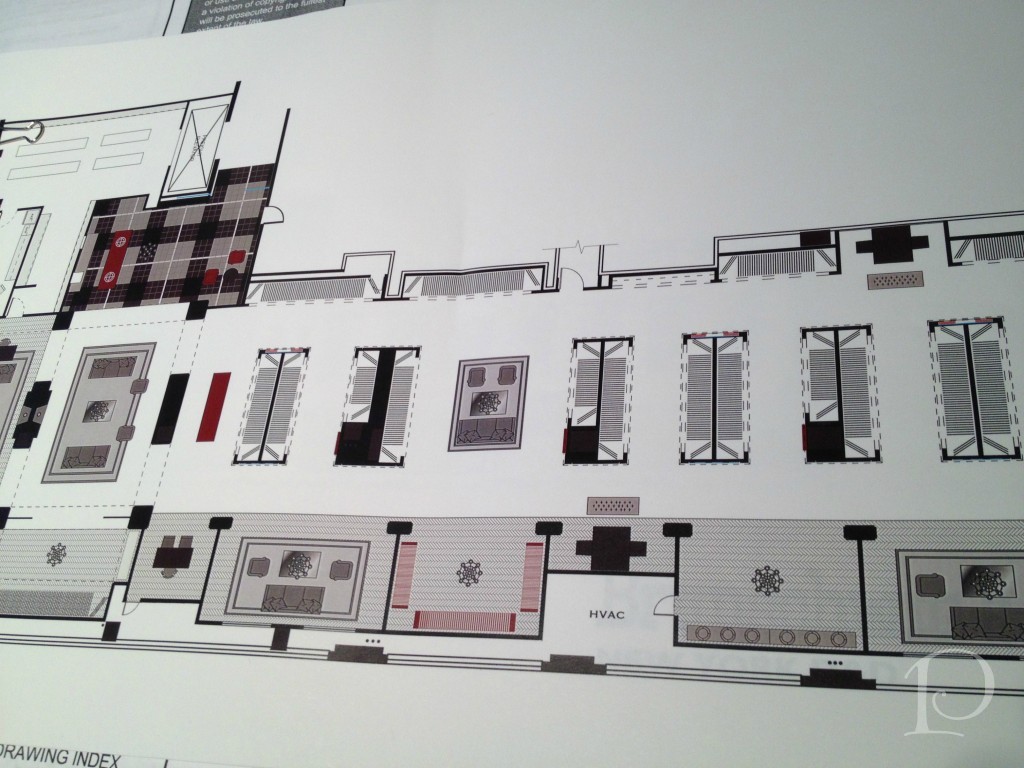
My first step was to draw up a floor plan, a must for planning the space and ordering materials.
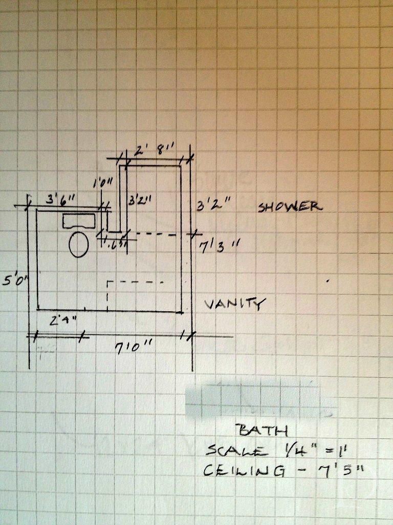
While we knew this bathroom would need to coordinate with the adjoining bedroom, I was curious to see what ideas my young client had for the overall design. During our initial design meeting we discussed the function of the room (sleeping, studying, entertaining friends) and color preferences (red). I knew I was going to have a great time with this young man he likes the color red! After a bit more delving, he told me about some posters he collected last summer. The posters are sophisticated in shades of charcoal, reds and other vivid hues. What a great jumping off point for the design of our project! Every design has to have an inspiration and this young man’s poster collection is ours.
After our discussion, I wrote up my ideas and met with Christine at Tile Showcase at the Boston Design Center.
We found some wonderful tile selections and Christine sketched a quick plan:
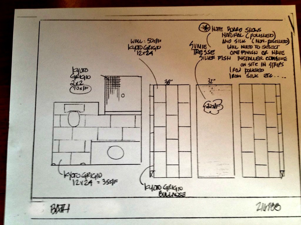
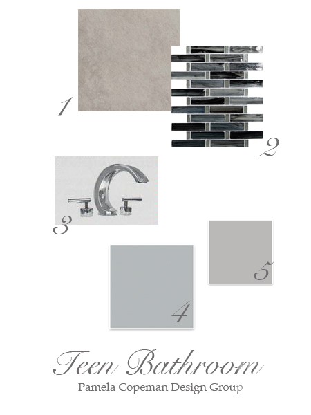
To make the plan come to life for you, I put together this mood board for the space:
Details:
1. Kyoto Grigio tile for the back wall
2. Sumi-e Tresse Silver Fish Natural glass mosaic tile for the side walls on the vertical and the floor ~ using the same tile on both surfaces will give the illusion of a larger space
3. Sigma Palermo faucet is one of the options for faucetry, I love the modern look of the polished chrome
Two of our options for wall color, both from Sherwin-Williams:
4. Monorail Silver
5. March Wind
Stay tuned to see progress, plus more on the bedroom design. I promise it is creative and amazing ~ and just wait until I show you the inspirational posters!
“Design is a constant challenge to balance comfort with luxe, the practical with the desirable”
~Donna Karan
xo,
Pamela
Contact me about Pamela Copeman Design Group services.
To follow me on Pinterest, click here.
To follow Pamela Copeman Design Group on Facebook, click here.
To follow me on Twitter, click here
Pamela's Posh Picks: Royal Ascot Hats 2012
Jun 22 2012 · 0 comments · My Paintings, Posh Picks ·0
The United States may have the Kentucky Derby, but our Derby headpieces are no match for the outrageous hats seen at this week’s Royal Ascot races in England!
What is the Royal Ascot?
“Royal Ascot is one of the pinnacle events of the summer social season and the racecourse will be playing its part, in this historic year, in celebration of Her Majesty The Queen’s Diamond Jubilee. The Royal Meeting will certainly be one of the must-attend events of the year to enjoy all of the pageantry and history of a quintessentially British day out.”
This week’s Posh Picks are all about the wonderfully imaginative, must-be-seen-to-be-believed hats of the Royal Ascot…
I love this spirited, bedazzled tribute to the Queen’s Jubilee
These gray beaded flowers are a-mazing
And then things go a bit over-the-top…
A proper English breakfast…on your head??
Did someone say Royal Ascot was a BYOB event??
Can you imagine sitting behind (or beside) this spectacularly bizarre birdcage hat??
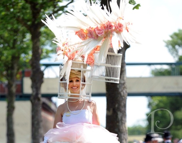
And of course, this week’s petite oil painting:
Have an outrageously enjoyable weekend!
xo,
Pamela
Contact me about Pamela Copeman Design Group services.
To follow me on Pinterest, click here.
To follow Pamela Copeman Design Group on Facebook, click here.
To follow me on Twitter, click here

The Bliss of Summer Arts Festivals
Jun 19 2012 · 0 comments · Art Exhibits & Events, Artists ·0
“When we artists put a painting on a wall at an exhibition, we bare our souls…at that time everyone becomes a critic.”
~Sidney Hermel
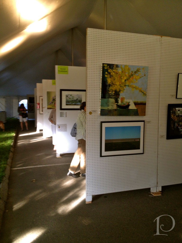
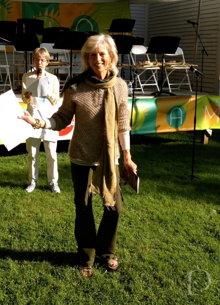
This weekend the South Shore Art Center sponsored the 57th Annual Arts Festival on the Cohasset Common and once again it was outstanding!
The festival is truly a celebration of the arts with nearly 100 juried exhibitor booths, a variety of live music performances, delicious food, artist demonstrations, children’s art activities and a young artists’ exhibition. For me, the highlight of the festival is always the juried art exhibition and members’ show. This year was no exception.
The Art Exhibit is staged under large, peaked tents which not only allows ample viewing space for each piece, but also make a beautiful statement on the Common with their iconic silhouettes.
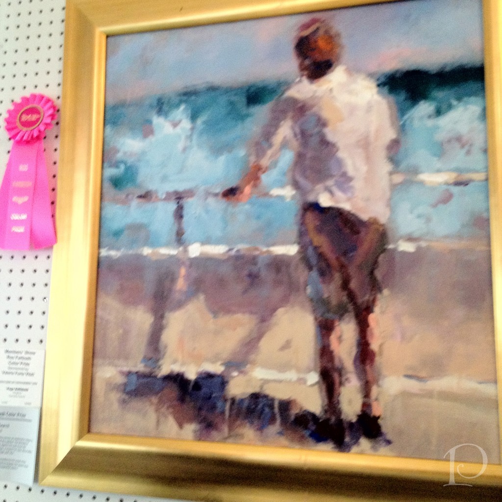
On Friday, the festival officially opened with the distribution of ribbons for the the “Best of the Best” artworks. My dear friend and fellow GJP‘er, Page Railsback won a bright Pink ribbon in honor of Roz Farbush for her painting and she was thrilled (as was I).
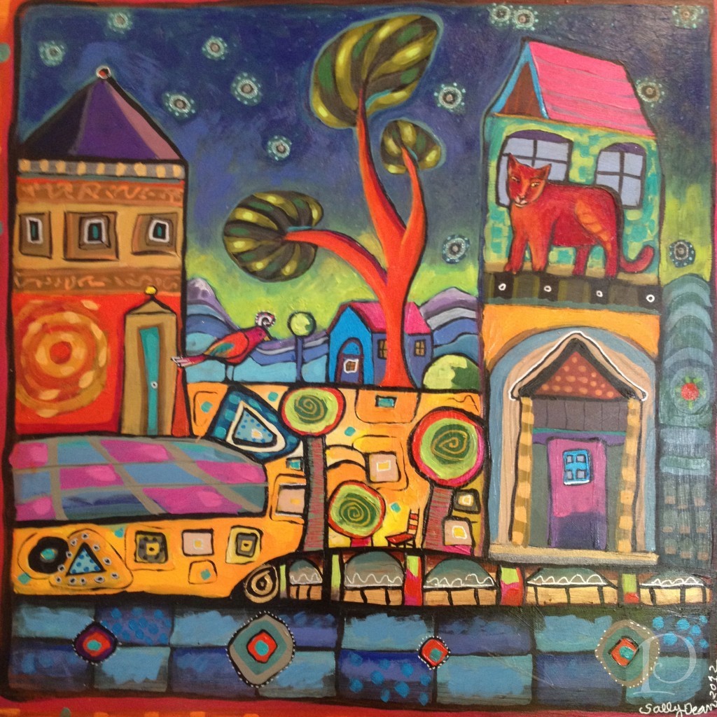
My friend and another Girls Just Wanna Paint member, Sally Dean was not only the cover artist for the festival program and posters, but also won a ribbon for her beautiful and imaginative painting~
The art on display included many mediums, the broad array is one of the things that makes the outdoor festivals so appealing. Don’t you love this sculpture? I think this would look divine in a foyer.
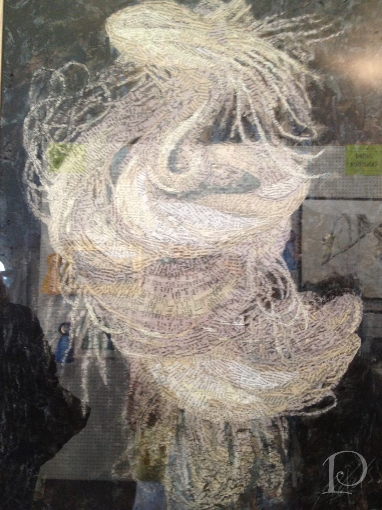
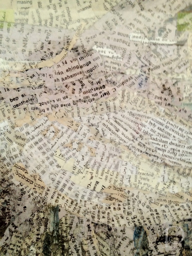
This mixed media piece is nothing short of amazing. As you view it from a distance, it appears to be a swirling mermaid or goddess.
But then as you look closer… Such attention to detail and composition, isn’t that incredible?
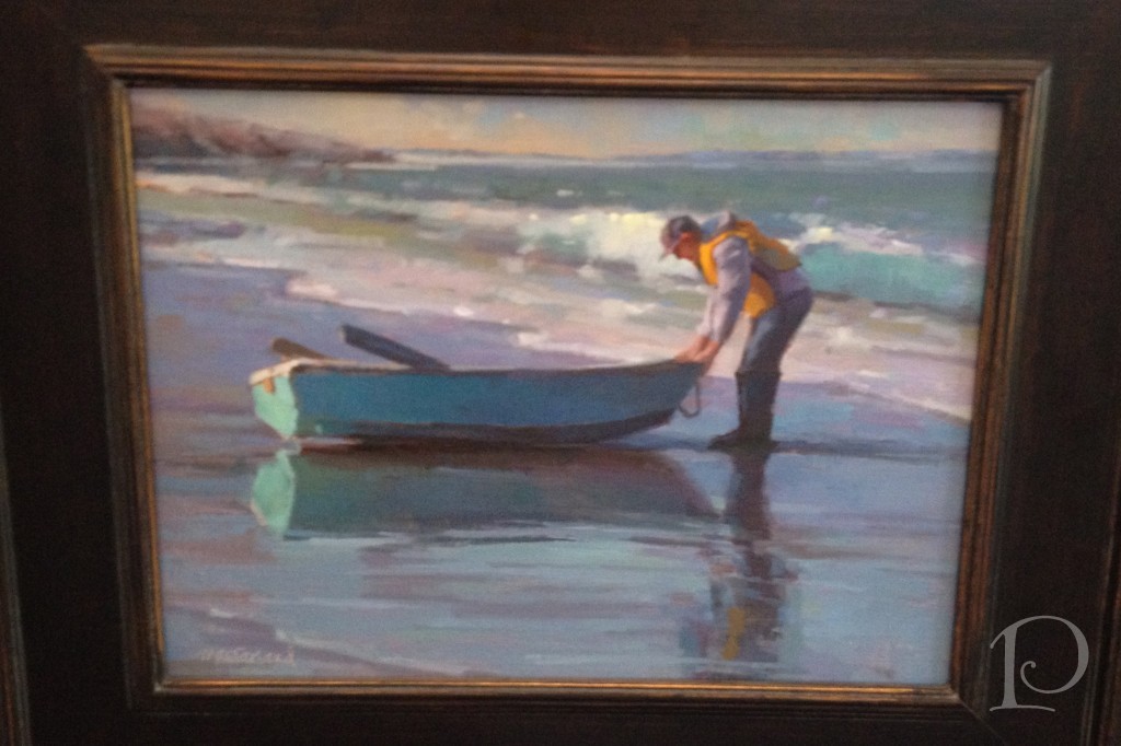
Jeanne MacFarland is a very well respected artist (and another GJP‘er) and her paintings have an “old world” quality to them. This boat at water’s edge is serene…
Watercolors are always very popular and this is a masterful example:
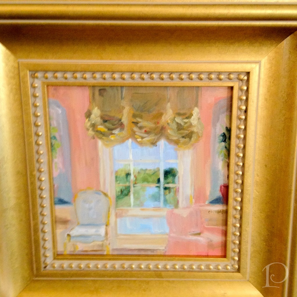
You may recognize this last painting, though it is a bit more fancy than the last time I showed it…
Dressed up in a new frame, it is one of my “petite interiors”. I was so proud to have it in the member’s show!
Art shows and festivals are truly for people of all ages…. I hope you get a chance to enjoy an Arts Festival this summer, always a delightful way to spend the day!
xo,
Pamela
Contact me about Pamela Copeman Design Group services.
To follow me on Pinterest, click here.
To follow Pamela Copeman Design Group on Facebook, click here.
To follow me on Twitter, click here
Pamela's Posh Picks: Fab & Frivolous Finials
Jun 16 2012 · 0 comments · Posh Picks ·0
Lamp finials are such a fun and easy way to add detail to a lamp. This week’s Posh Picks will help you transform your lighting into a true design statement!
Looking for something uber-masculine? How about these Antler lamp finials?
These exotic lamp finials are handcrafted in Africa~ from telephone wire believe it or not! The swirl pattern reminds me of lollipops and ocean waves, so colorful and fun.
Zulu Love Train lamp finials
This beautiful glass finial is also handcrafted. Local artist Marj Bates has used Venetian glass to create a finial whose colors “glow, sparkle and dazzle” as the light shines through. Just lovely!
For a touch of refined elegance, this clear crystal cube lamp finial from Antique Lamp Supply is perfect.
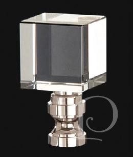
How adorable is this pink birdie finial from Stray Dog Designs? I would love to see this used in a child’s space or even a ladies’ retreat~this finial is the essence of fab and frivolous!
Finials are like jewelry for your lamps~and who couldn’t use more jewelry! I hope you’re inspired to add a fab and frivolous finial to one of your lamps, the variety, and fun is endless!
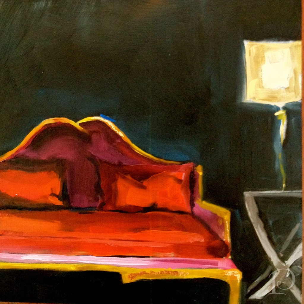
Finally, this week’s petite Interior oil painting:I’d love to hear your thoughts!
xo,
Pamela

Blogfest 2012: Publishing Powers
Jun 12 2012 · 2 comments · Design Events ·0
“I deeply believe that a beautiful decor can have a beneficial influence on our lives.”
~Albert Hadley
For my final Blogfest 2012 wrap-up post I want to focus on the morning we spent at Hearst Tower with some of the most powerful people in the design publishing world. The publishers and editors from Veranda and House Beautiful magazines moderated panels with elite designers who have been published in these national magazines. It was a wonderful opportunity to hear about how designs are chosen for publication and how great designers work.
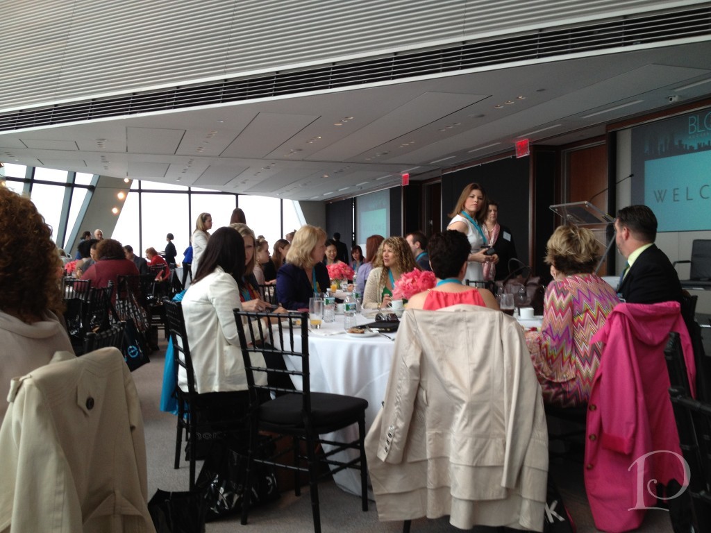
We gathered on the 44th floor of the Hearst Tower for breakfast. What a beautiful location!
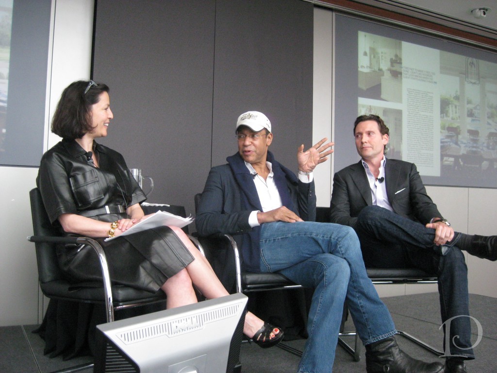
We went Inside the Issue with the Veranda panel: Publisher Jennifer Levene Bruno, Editor-in-Chief Dara Caponigro, designers Darryl Carter and Timothy WhealonThis panel offered behind the scene glimpses of their designs. Featured in the May/June issue, both Darryl Carter and Timothy Whealon shared their personal stories about coming into the design profession after they were trained in the field of Law.
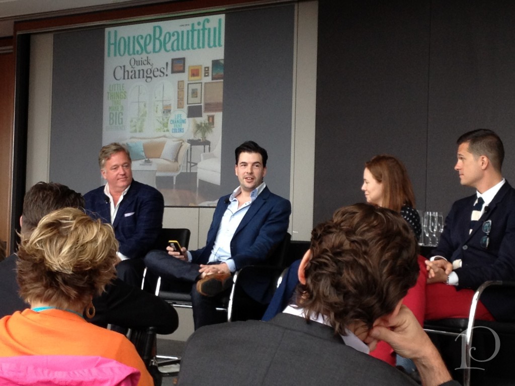
During the next segment, House Beautiful Editor-in-Chief Newell Turner moderated a panel with the theme “Creating the A-Ha Moment”. His panel included three of House Beautiful’s Next Wave Designers: Michael Herold, Jill Goldberg, and Jon Call.
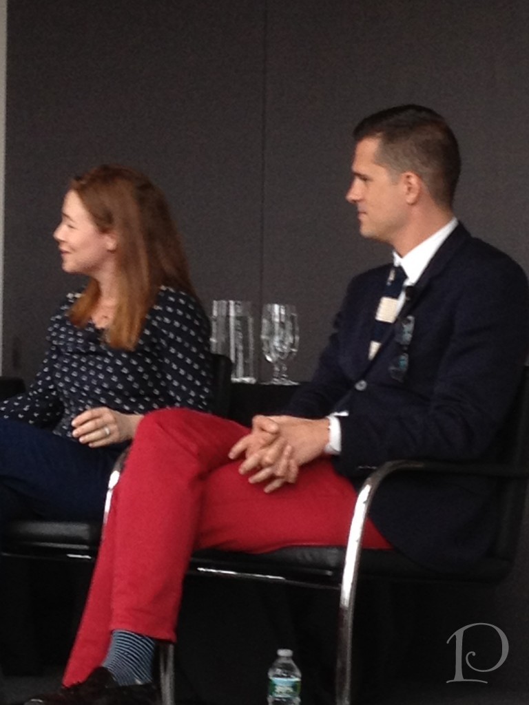
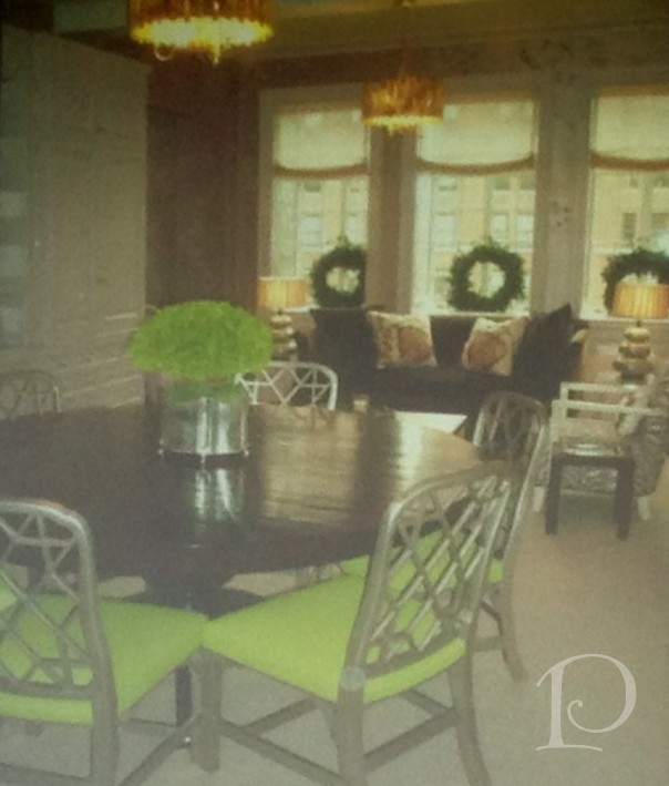
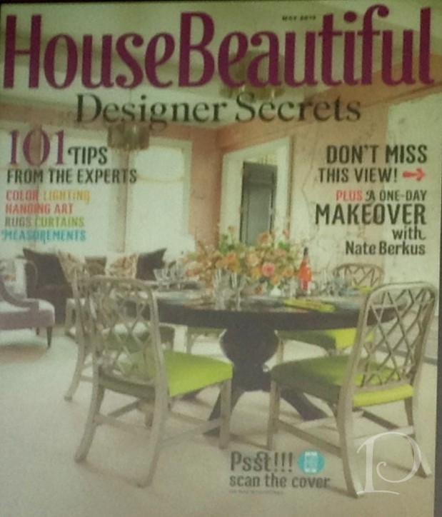
The next few photos were taken of the screen presentation so the quality is lacking but they illustrate some striking “A-Ha Moments”. This first example is a scouting shot from a few years ago that was submitted for publication. The editors liked the fact that there was interesting seating (the sofa near the window) in a Dining Room.
This is how the room looked on the cover shot. Notice how subtle tweaks: changing the angle of the shot, taking away the wreaths and adding fresh flowers, make this room a star!
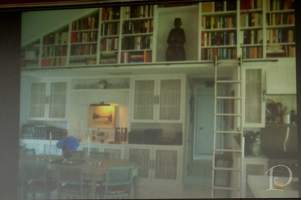
I love the transformation of this library:
What a difference some fleurs and a beautiful tablescape can make when the bones of the room are perfect!
Both of the panels were relaxed yet informative. All of the designers were charming, humorous and very articulate. They were generous with their trade secrets and lingered patiently for photographs.
Of course how could I post about the Publishing Powers of the Design World without including Margaret Russell? Editor-in-Chief of Architectural Digest, Margaret elegantly welcomed us to the Kips Bay Showhouse on our first day in NYC.
Blogfest 2012 was such a wonderful experience for me on so many levels. It was a whirlwind full of amazing people and a wealth of design information and inspiration. I can hardly wait to see what’s in store for Blogfest 2013!
xo,
Pamela
Pamela's Posh Picks: Kelly Wearstler Fabric for Lee Jofa
Jun 08 2012 · 1 comment · My Paintings, Posh Picks ·0
In keeping with the Kravet family theme, this week’s Posh Picks are from Kelly Wearstler’s Groundworks fabric collection for Lee Jofa. I’ve seen this collection in person at both the Boston and New York Kravet showrooms and I can tell you that it absolutely swoon-worthy!
My first pick is Water Stripe in the Juniper/Lake colorway
This embroidered fabric is the result of Kelly being challenged to create a contemporary fabric based on an older fabric. The embroidered threads are stitched on a bias which is not an easy task. This fabric is magnificent, particularly in person when you can truly appreciate the color and texture.
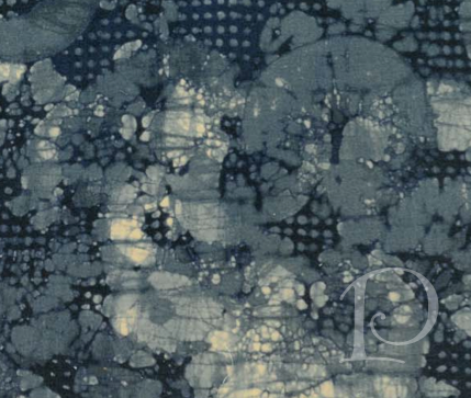
My next Posh Pick from this line is Mineral in Indigo/Slate
I love how this fabric is reminiscent of a batik print with a contemporary kick.
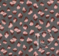
Posh Pick No. 3 is Feline in Graphite/Rose
No matter how you read this pattern, perhaps as an animal print or even falling rose petals, it adds lots of interest when draped. I particularly adore this gorgeous colorway, it speaks to me with its uniqueness.
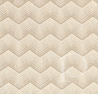
Next up: Tempest in Linen
This fabric is wonderfully “noticeable in neutral”. The zig zag pattern would work wonderfully as either a complement to another fabric or as a stand alone statement.
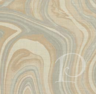
Finally, Barcelo in AlabasterI love the organic pattern of this fabric. It looks both like a geode and a beautiful marbleized motif. Lovely, dynamic and soothing all at once!
Should you like to view any of these amazing fabrics in person, contact me to arrange a trip to the Lee Jofa showroom at the Boston Design Center!
Finally, as promised, this week’s petite Interior oil painting:
I’d love to hear your feedback!
xo,
Pamela
Contact me about Pamela Copeman Design Group services.
To follow me on Pinterest, click here.
To follow Pamela Copeman Design Group on Facebook, click here.
To follow me on Twitter, click here
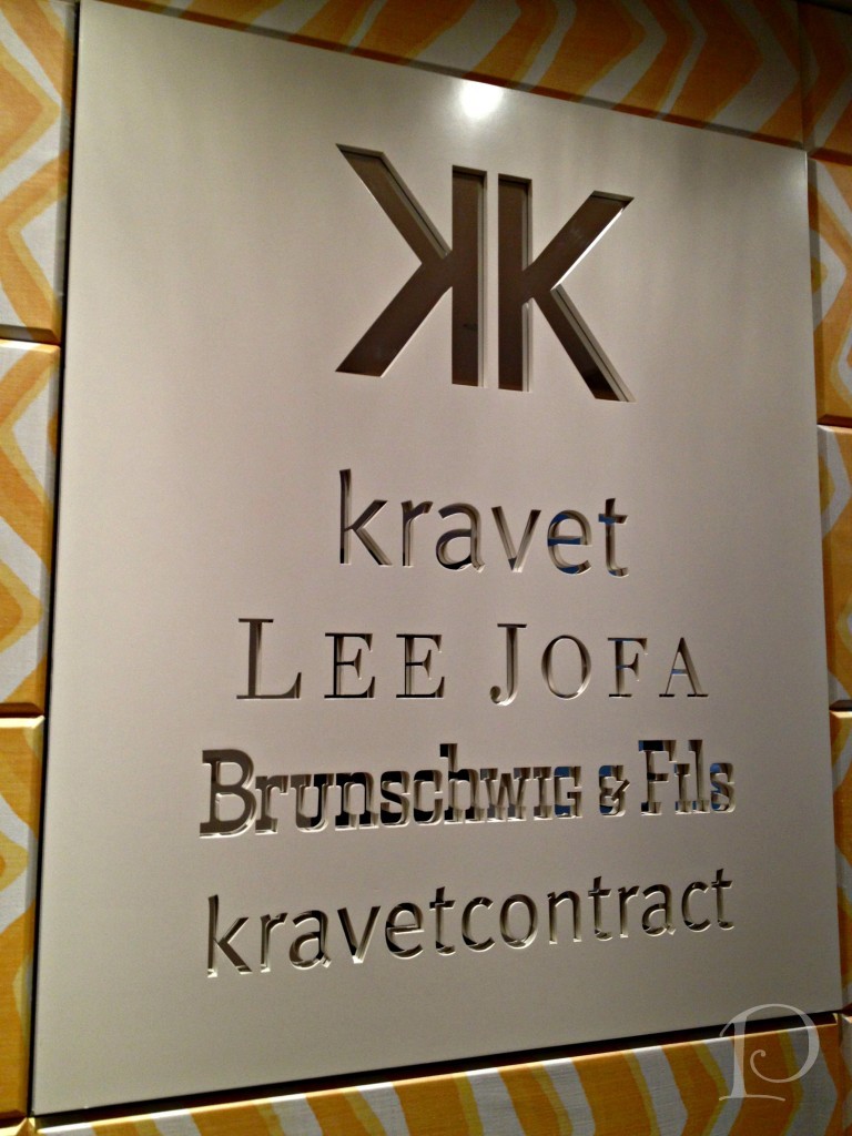
Blogfest 2012: Kravet Studio Tour
Jun 07 2012 · 0 comments · Behind the Design, Inspiration ·1
“Creativity involves breaking out of established patterns in order to look at thing in a different way .”
~Edward de Bono
Without a doubt, the highlight of Blogfest 2012 in New York City for me was the Kravet Studio Tour. When I begin a design project I always start with fabrics for inspiration. Naturally, on the morning of the Kravet Studio Tour I was the first one to arrive and secure my place on the first tour of the day. You can imagine what a thrill it was for me to have a chance to get a behind-the-scenes look at the studio where so many of my favorite lines are created!
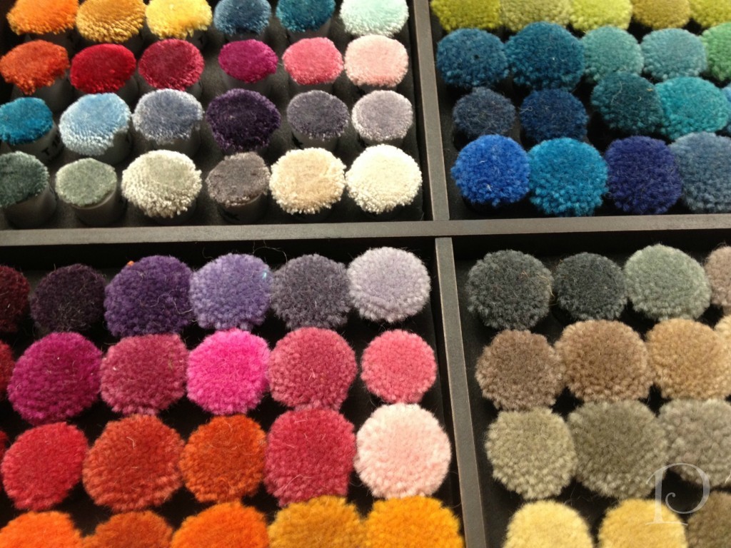
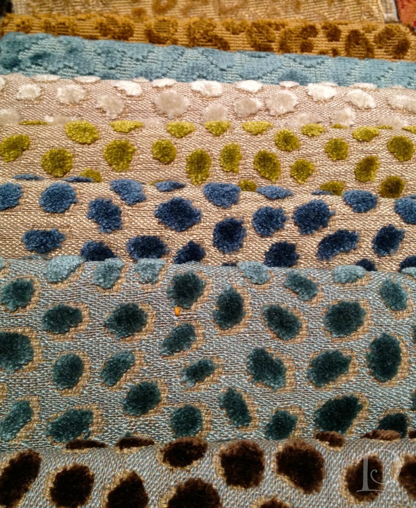
The first studio we visited was the carpet shop. Look at this array of wool yarns ~ the colors are so pure and glorious.
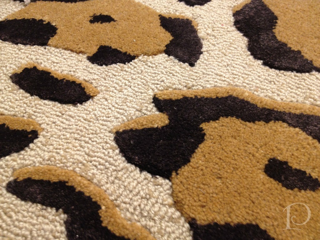
This is a carpet sample that caught my eye~animal print of course. I can think of a dozen spaces this would be perfect in.
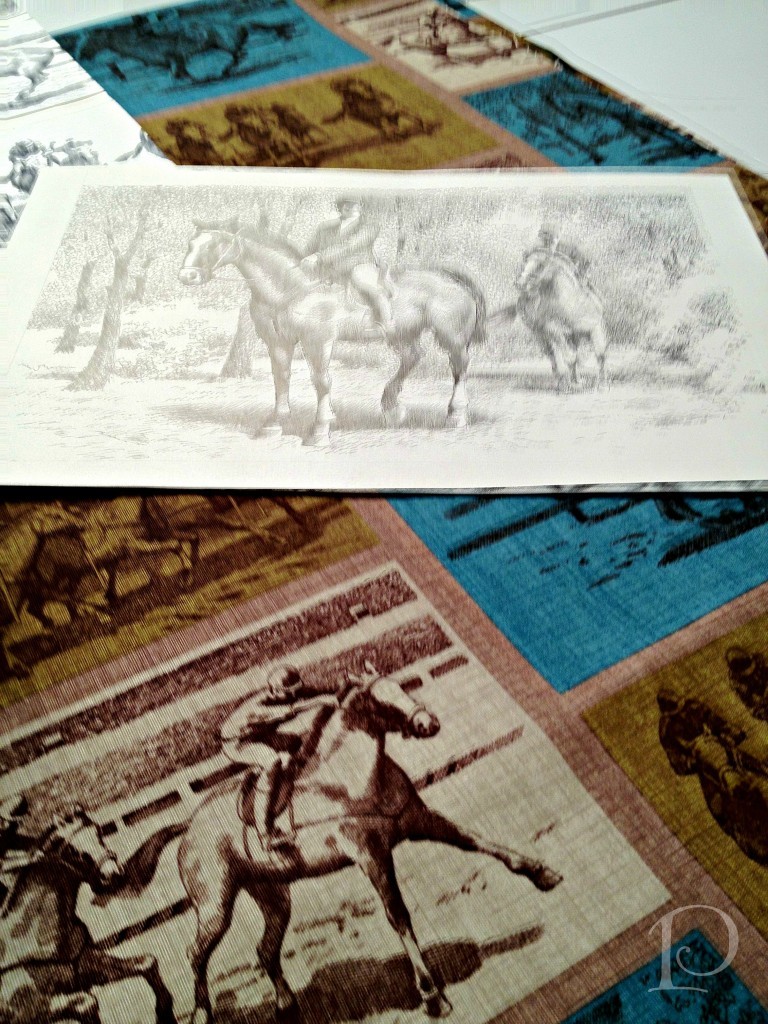
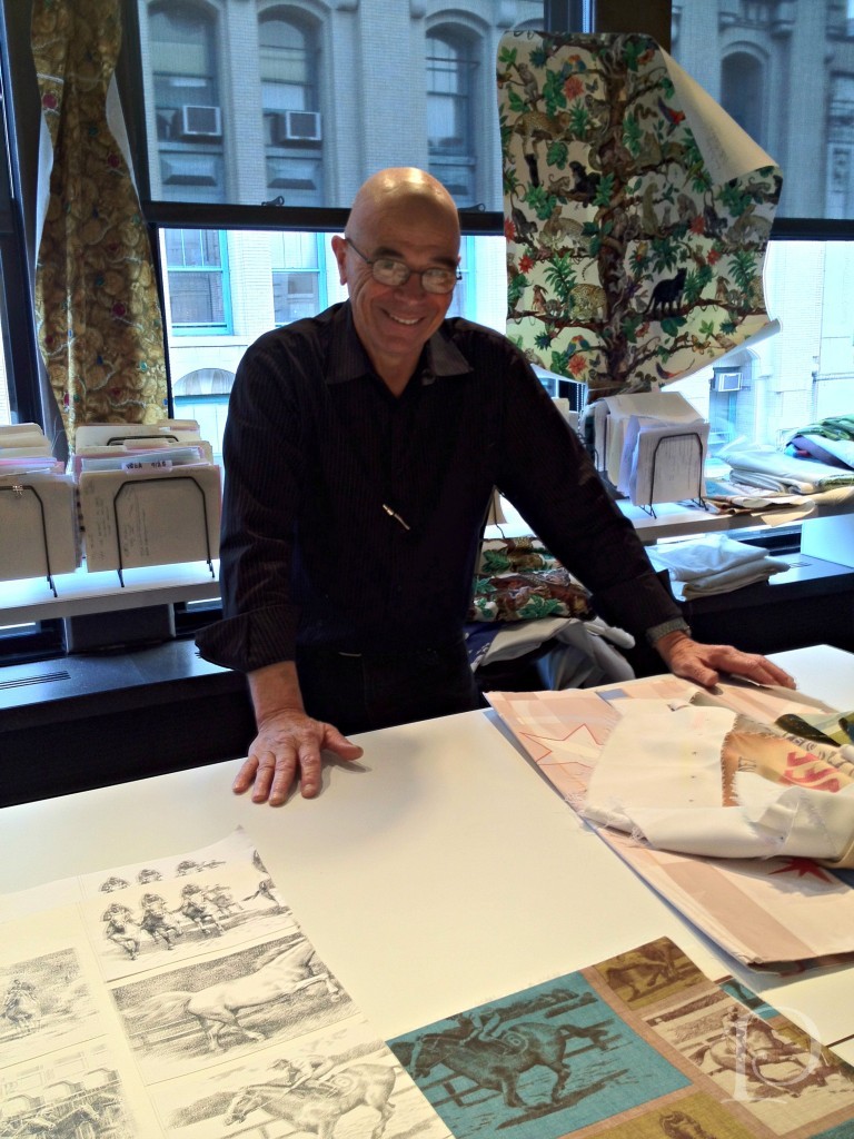
The next studio we visited displays Kravet fabrics that are available in showrooms across the country, I have used many of these and they are luxurious…The next stop on our tour really captivated me. Here we got a peek at custom fabric design. The designer starts with original artwork, in this case a pencil drawing. Using a sophisticated scanning process to digitize the artwork, the design is then tweaked and reproduced on either cotton, linen or a leather-like fabric.
The designer extraordinaire has created this “racing” fabric from these original sketches, isn’t it amazing? He was so proud to share his story, can’t you see it in his smile?In the Brunschwig & Fils area we saw architectural plans for a brand new showroom.
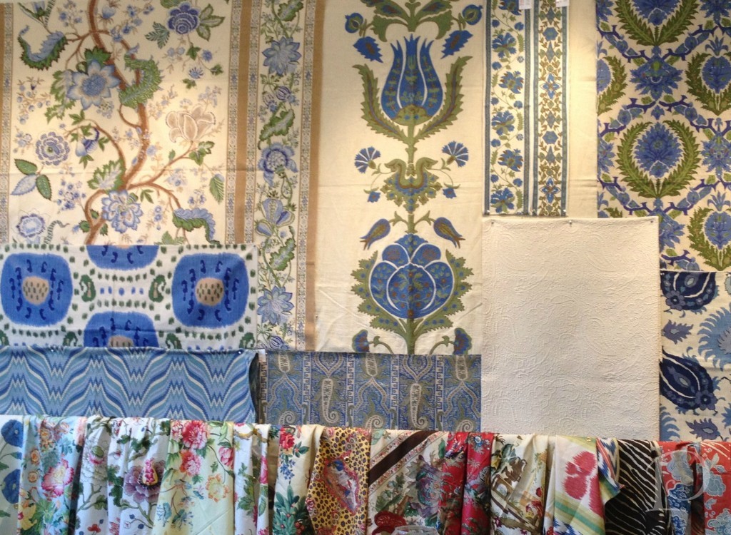
Here is a Studio wall filled with colorful Brunschwig &Fils fabrics.
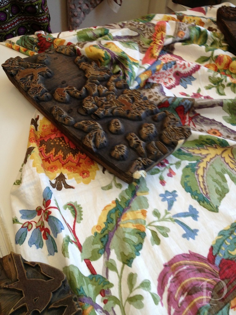
Can you believe that once upon a time, this wood block was used to print this Lee Jofa fabric? So interesting to get a glimpse into history.
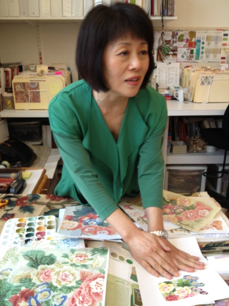
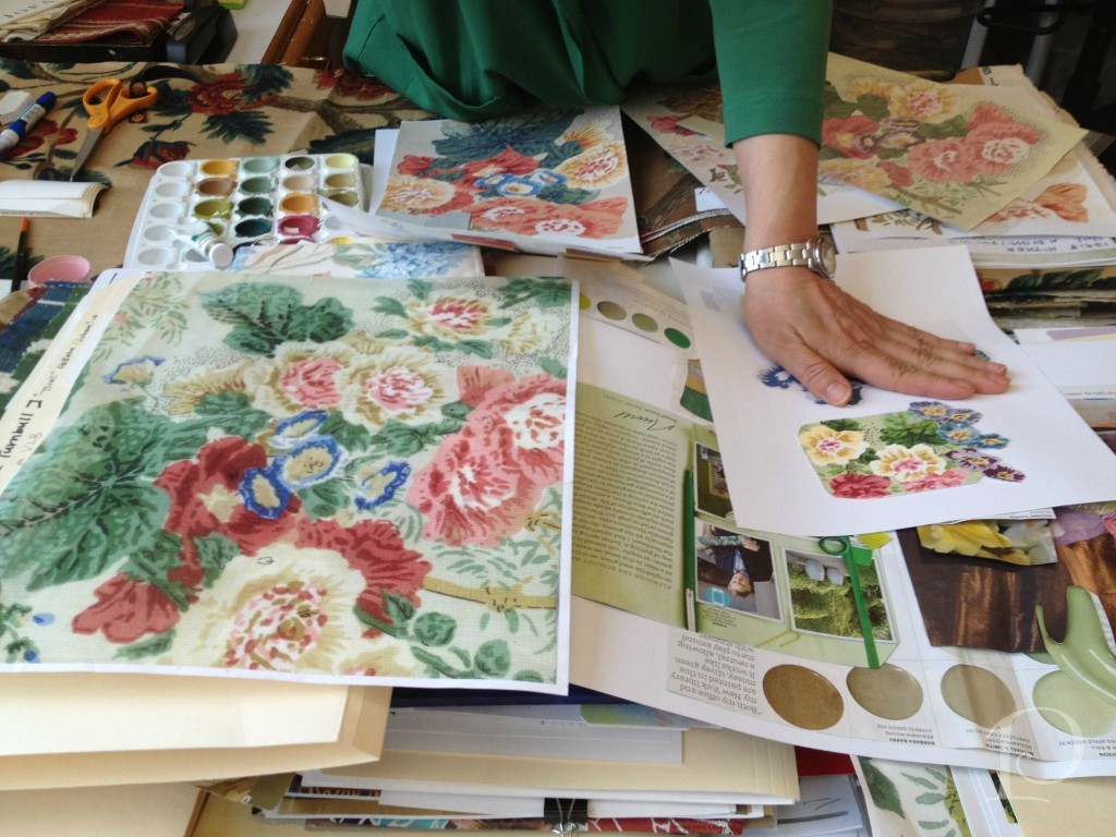
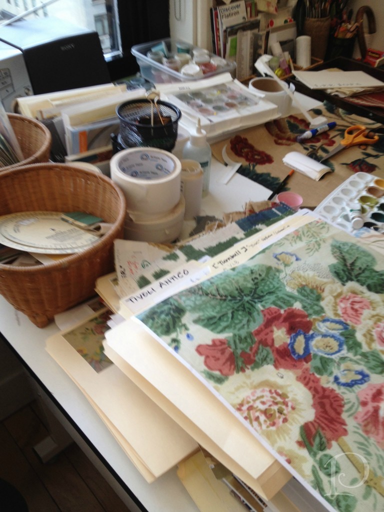
I felt right at home in this section of the studio. This small corner is where an artist paints designs for some of the fabrics. I would love to have this job for a week…or maybe even two??
Her desk is quite petite but somehow she makes it all work, such a delightful jumble!
Her creative corner…
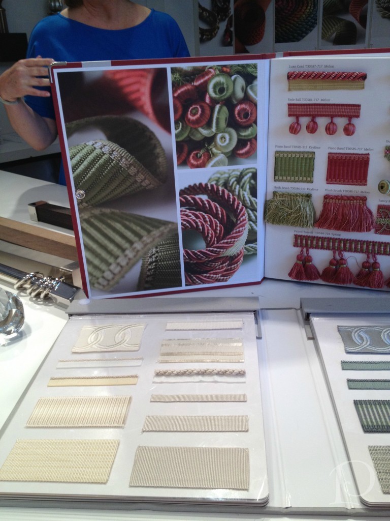
Finally, no fabric line would be complete without fabric trim. Luxurious trim is a favorite accessory of mine when creating pillows and other accessories. Take a peek at this sumptuous trim book:
As you can see, the two floors of the Kravet Studio are jam packed with talent and creativity. Having been treated to this incredible tour, I will certainly appreciate the beauty in every fabric and textile I touch more than ever. Above all, I will think of all the people I met who take such pride in their creation. Thank you!
xo,
Pamela
Contact me about Pamela Copeman Design Group services.
To follow me on Pinterest, click here.
To follow Pamela Copeman Design Group on Facebook, click here.
To follow me on Twitter, click here
Girls Just Wanna Paint
Jun 04 2012 · 0 comments · Art Exhibits & Events, Artists, Personal ·0
As many of you know, along with being an interior designer I am also an oil painter. I am constantly working to improve my skills by taking classes with local artists and painting as frequently as possible. What a thrill it was then when I was recently invited to join the women artists of Girls Just Wanna Paint.
Formed in 2009, Girls Just Wanna Paint is group of 12 artists who challenge themselves each month to incorporate a selected object or idea into a painting. The paintings are posted at the beginning of each month on the Girls Just Wanna Paint blog where we invite your comments and feedback.
The group meets during the first week of every month. We view each other’s work in person, enjoy some great food and wine, and decide what the next month’s subject will be. This is a collection of serious artists who also have a lot of fun–right up my alley!
I am delighted to be a part of this esteemed group of women. Most of the artists are professionals and teachers and all are very inspiring. Their individual spirit and soul comes through in their work. I invite you to visit the Girls Just Wanna Paint site and peruse the artists’ websites and blogs. I guarantee you will fall in love with their work as I have~
My next painting as part of the Girls Just Wanna Paint group will be up at the beginning of July. As a complement to this new venture, I am pleased to announce a new weekly feature on my blog. Each week at the end of one of the blog posts (typically Pamela’s Posh Picks) I will be sharing one of my petite Interiors oil paintings. I would love to hear your feedback on these paintings. Of course I am also open to painting custom pieces of your special Interior space in oil. These works can be framed or reproduced as beautiful stationery.
I hope you will enjoy this new feature and look forward to sharing my painting journey with you!
xo,
Pamela
Contact me about Pamela Copeman Design Group services.
To follow me on Pinterest, click here.
To follow Pamela Copeman Design Group on Facebook, click here.
To follow me on Twitter, click here
{featured paintings are from the GJWP May challenge: “Tools of the Trade”}
Blogfest 2012: Designer Show House Trends
May 31 2012 · 0 comments · Design Events ·0
I’ve been back from New York City for a week now, but it seems I’m just beginning to process all of the amazing and inspiring things I experienced during Blogfest 2012. First off, I want to extend my sincere thanks to the entire Kravet team for a wonderful event. Beginning with the welcome from Cary Kravet at the opening night reception and throughout the jam-packed agenda of the following two days, this was a truly incredible gathering.
Today I wanted to share some of the trends I noted while touring not one, but two, designer show houses during Blogfest.
On Monday, Margaret Russell hosted the kickoff to Blogfest at the Kips Bay Boys and Girls Club Designer Show House. This year’s space featured two adjoining penthouse apartments on Manhattan’s West Side. Here, city chic and glamour ruled the day~right up my alley!
As I toured the rooms, the first trend that caught my eye (literally), was the abundance and variety of reflective and metallic surfaces.
This reflective table is a functional piece of contemporary art.
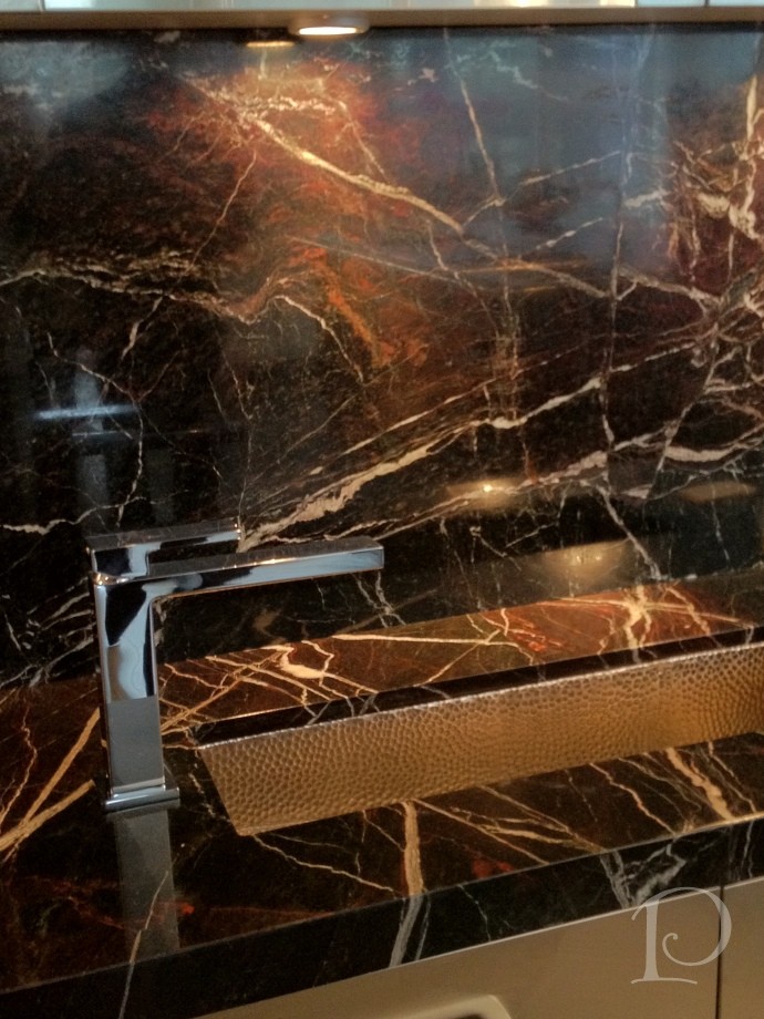
I love this shiny granite surface along with the trough-like sink and sleek faucet.
In the Alexa Hampton designed bedroom the walls were lacquered in Dragon’s Breath by Benjamin Moore.
The use of a reflective, hard surface on the wall, coupled with a silver ceiling, is an unexpected design choice in a bedroom, yet it turned out beautifully.
Even fabrics are part of the reflective trend! Here, metallic textiles cover a sofa and coordinating pillows.
This intricate metallic wall art adds drama as light plays off its reflective surface.
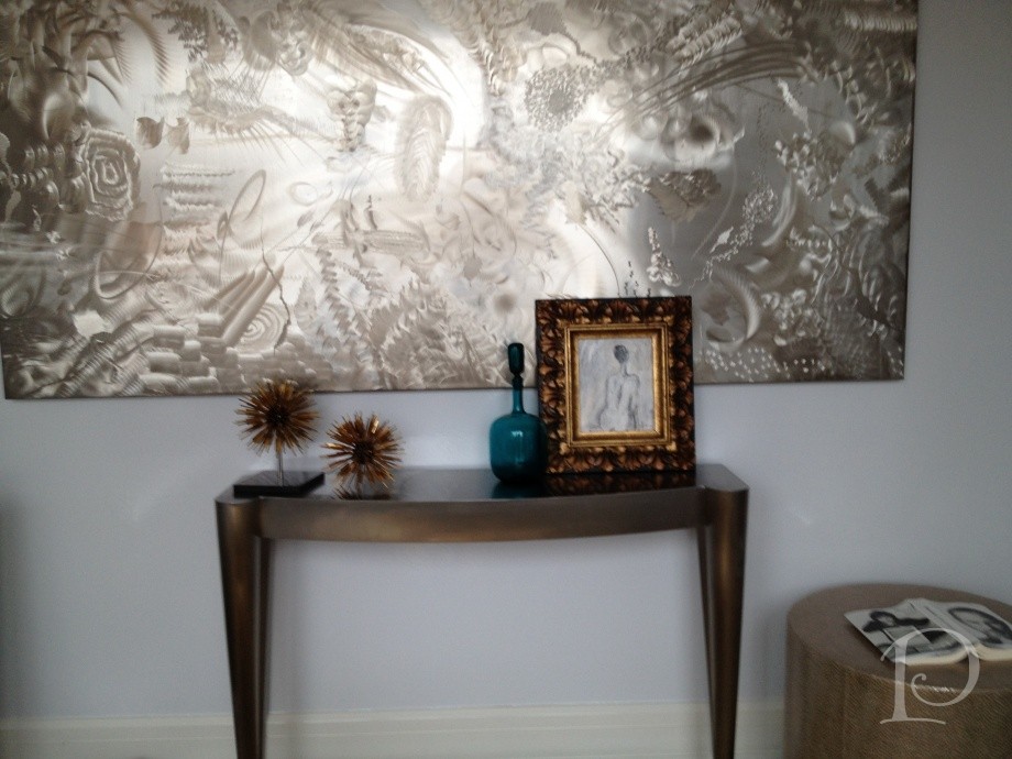
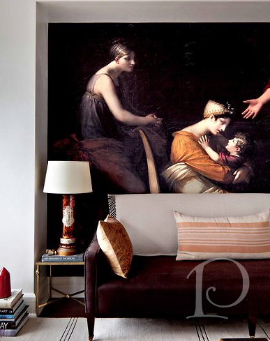
The other notable trend from the Kips Bay Show House was the creative use of digital imaging.
This digital image of a classic painting was blown up to mural size and fit perfectly into this niche. Surrounded by modern furnishings, it was striking and effective.
Across the room, this is an image the designer captured while in Europe. This touch is at once personal, unique and classic~a winning combination to be sure!
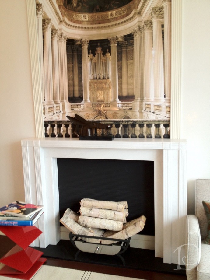
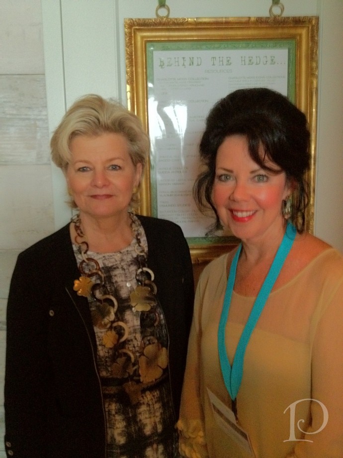
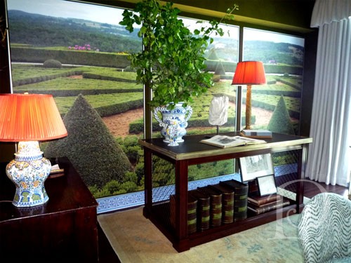
Charlotte Moss’ space was entitled Behind the Hedge and was filled with an abundance of creative ideas. My favorite detail in this space was once again the use of digital photography murals. Charlotte explained that this mural was made from photographs she had taken while traveling. Even the blue and white tile “baseboard” is digitally produced–amazing!
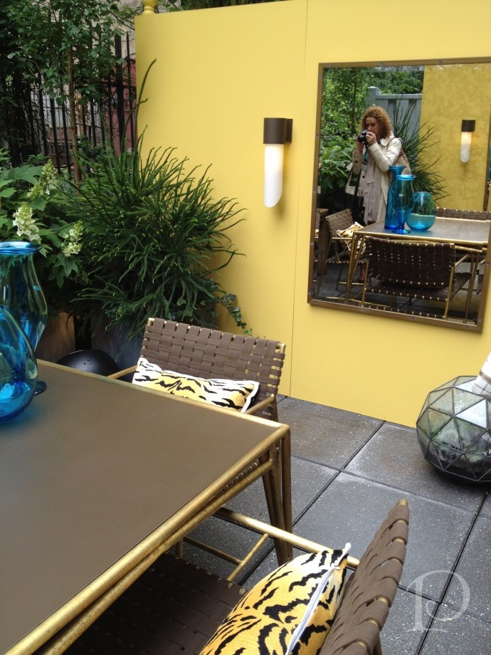
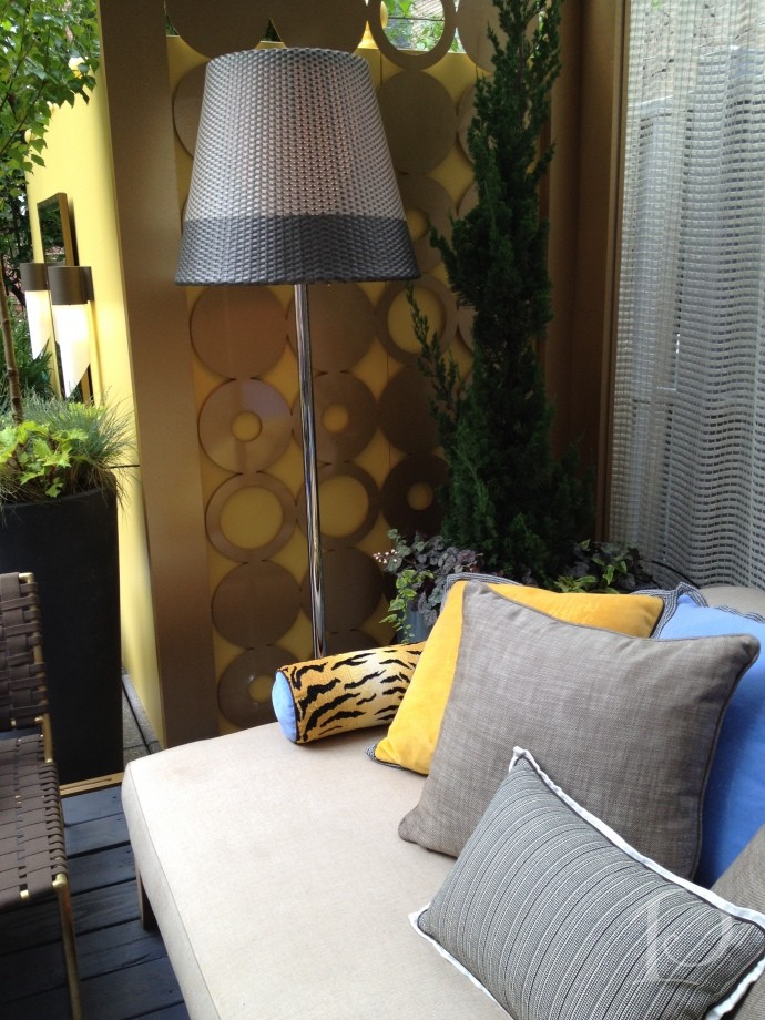
The trend spotting continued on Tuesday as we toured the Elle Decor Modern Concept House. While overall this space wasn’t as appealing to me as the Kips Bay house, I adored the terrace at the Modern Life house. Attention to detail and design and extending the living space of a home to the outdoor space is a trend I very much embrace.
Despite persistent clouds and sprinkles, the terrace was sunny and bright~thanks in part to the dazzling metal circle screen panels. I love this idea and can think of a dozen ways to use it!
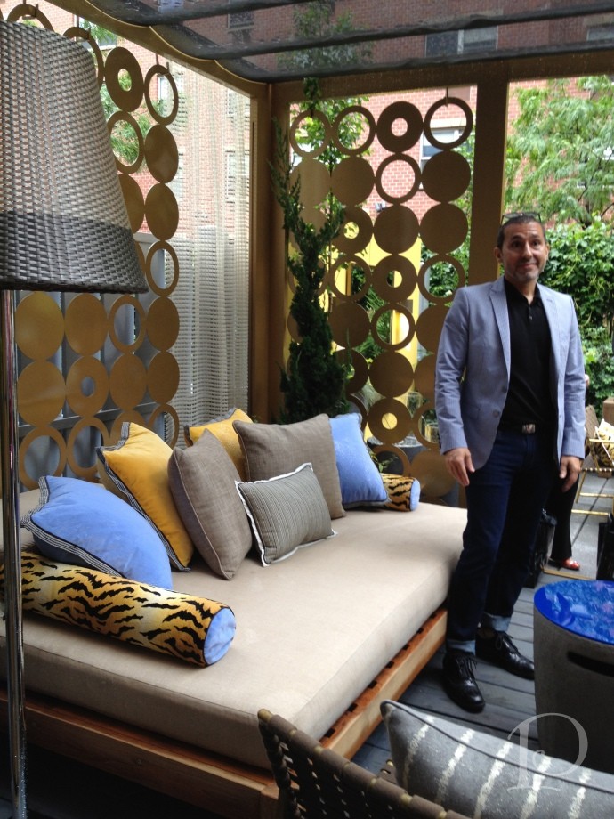
Designer Michael Tavano used screen material to drape over the sofa area to provide shelter and all of the fabrics are weather and sun resistant–including the animal print!
Another area of the compact terrace that is given depth by the use of the mirror. Using mirrors outside to reflect water views or to expand our spaces is something I’d love to see more of.
Overall I loved touring both of these fabulous show houses. I also love that the trends I highlighted are so versatile and easy to re-create. Incorporating reflective surfaces and metallics instantly provides contrast and brings a modern flair into a space. As for the digital photography murals–my mind is twirling with ideas! I can not wait to use this idea in my own home. I hope that you too can find an inspiring idea to use in your home or outdoor space.
Stay tuned for more inside scoop on my trip to Blogfest coming up soon!
xo,
Pamela
Contact me about Pamela Copeman Design Group services.
To follow me on Pinterest, click here.
To follow Pamela Copeman Design Group on Facebook, click here.
To follow me on Twitter, click here
Pamela's Posh Picks: NYC, Blogfest 2012 edition
May 26 2012 · 1 comment · Posh Picks ·0
As many of you know, this week I spent four days in New York City at Blogfest 2012. It was truly spectacular in every way! Here are a few of my favorite things, aka Posh Picks, from this week.
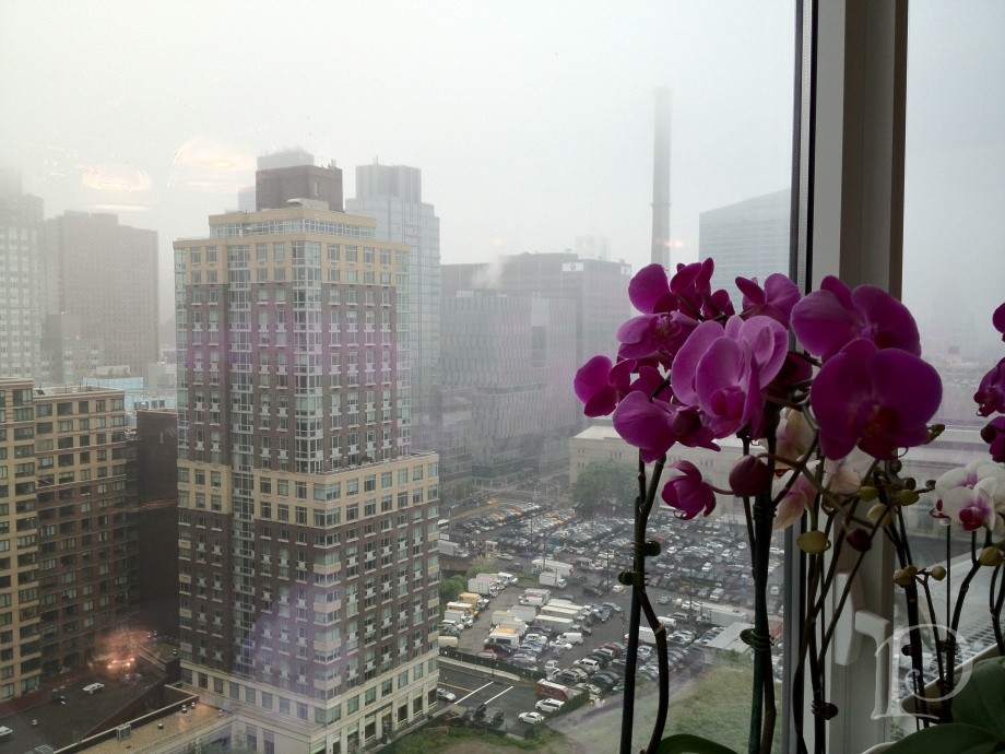
The New York City skyline is like no other, too bad I only got a peek of it this trip because of the cloud cover…
Some of my favorite sights came in small sizes~
Then again some were very grand…
Outstanding Speakers at the Hearst Tower on Day 2 of Blogfest
Baccarat Chandelier with the signature red crystal, don’t you love the denim shades?
The tour of the Kravet Studio was a definite highlight, here is the desk of a fabric designer with her paint palette (so jealous)…
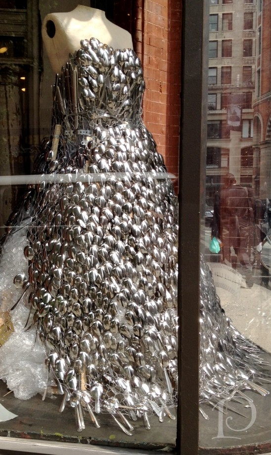
The store windows in NYC are always over-the-top. Please pass me a spoon (SoHo)…
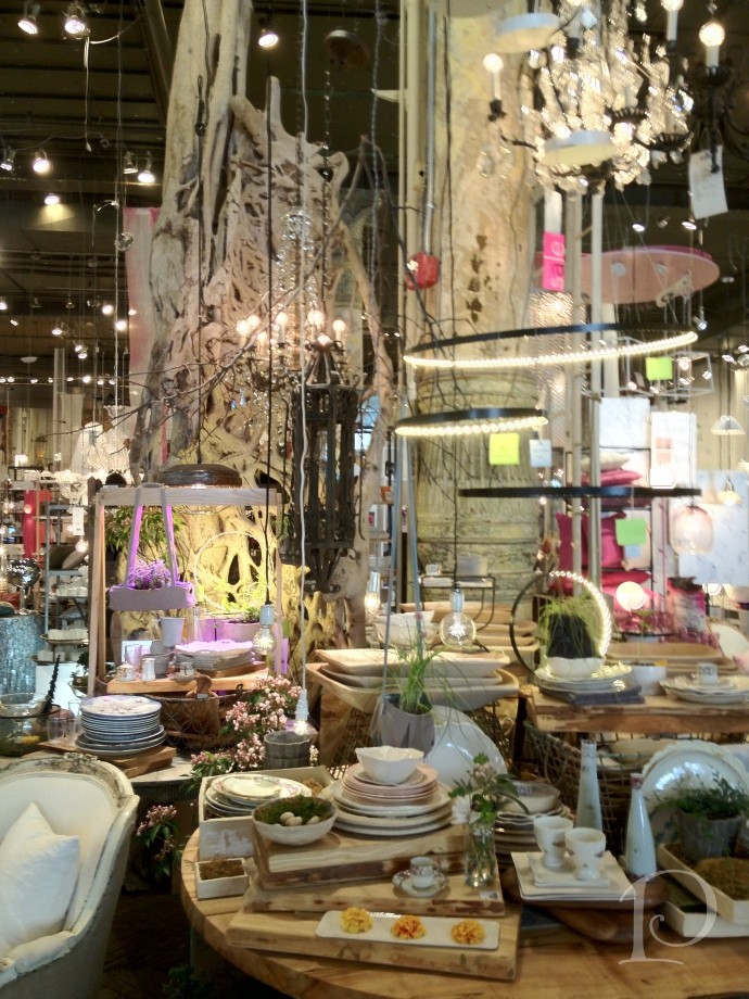
My favorite store for inspiration and fantasy: ABC Carpet and Home, I heart you!
I love New York!
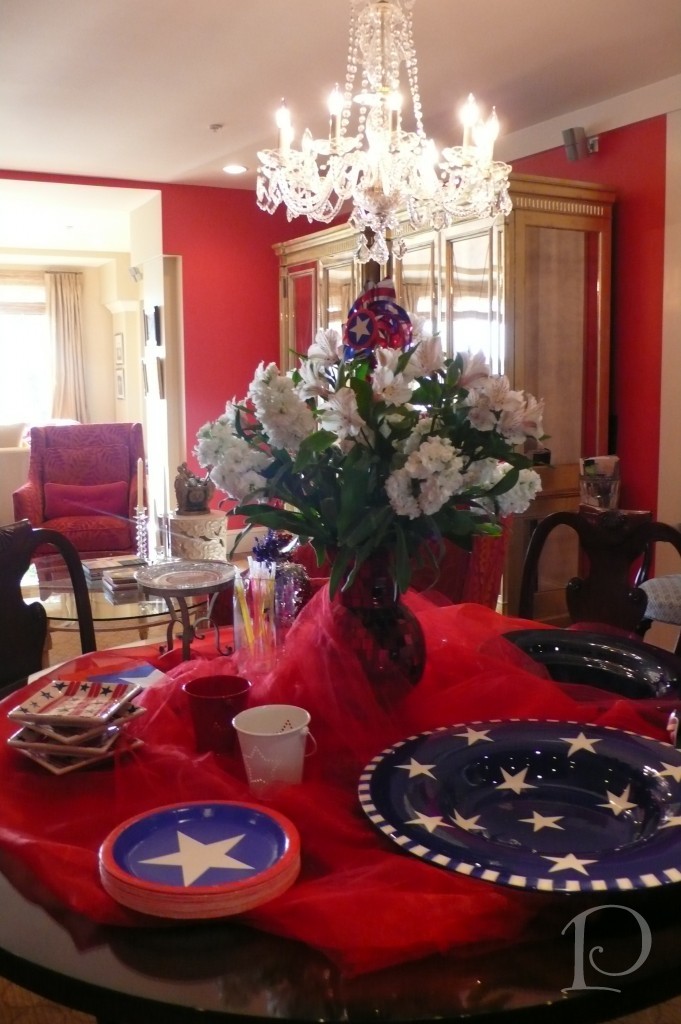
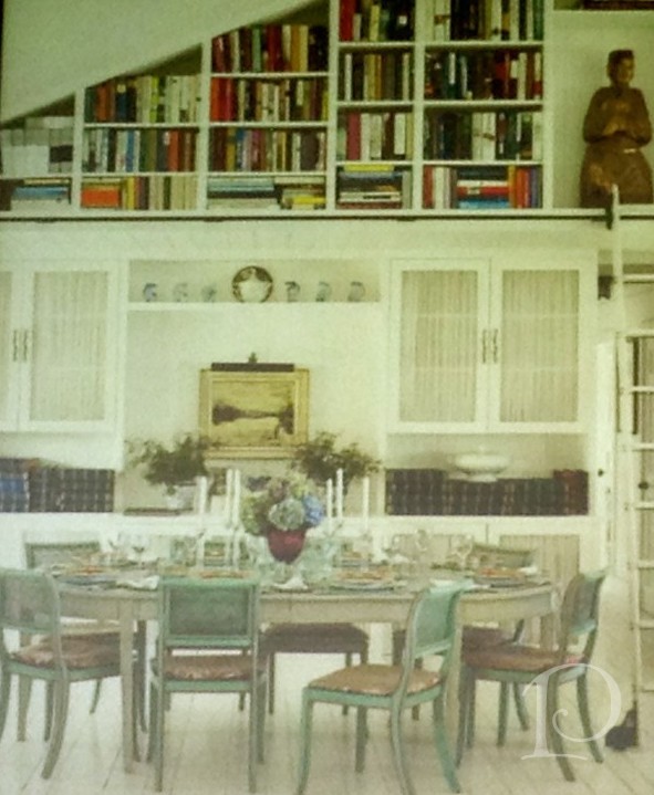
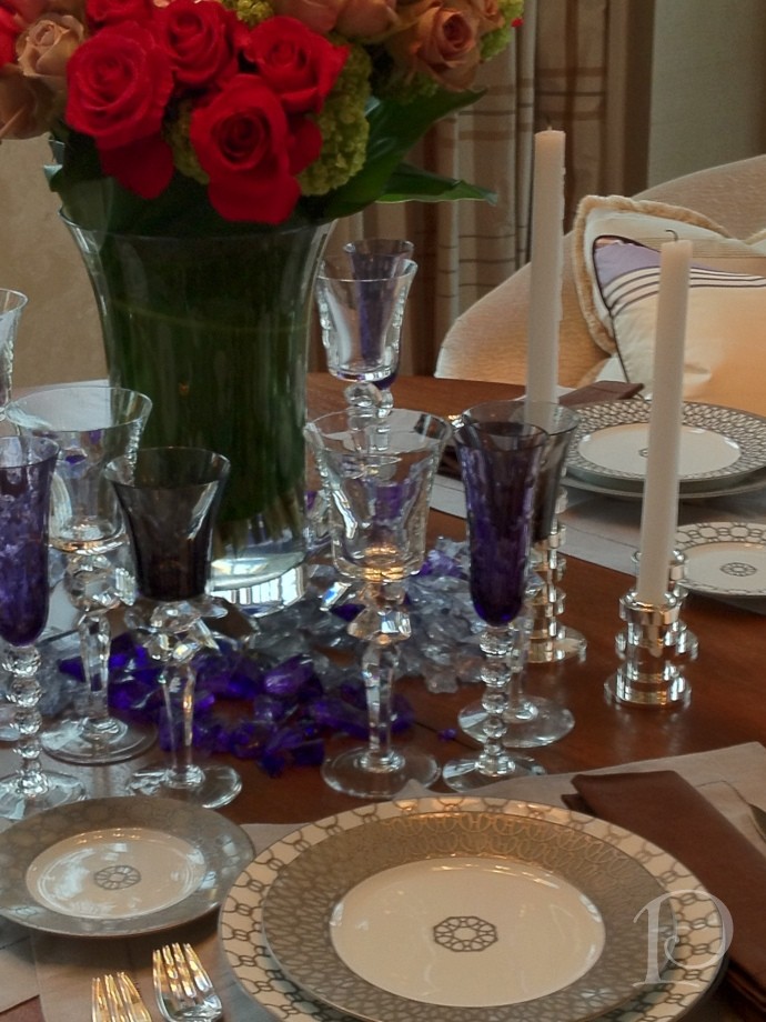
Beautiful tablescape with red, white, and blue accents…
Much more from Blogfest next week, until then, wishing you a wonderful Memorial Day weekend as we cherish and remember the heroes in our lives.
xo,
Pamela
Contact me about Pamela Copeman Design Group services.
To follow me on Pinterest, click here.
To follow Pamela Copeman Design Group on Facebook, click here.
To follow me on Twitter, click here