Archive
for June, 2012
Pamela's Posh Picks: 50 Shades of Grey
Jun 29 2012 ·0I’ll bet that got your attention!?
I’m such a tease because really, my Posh Picks for this week are 5 shades of gray…paint!
We will be using all 5 of these gray paint colors in the teenage boy bedroom project I’m currently working on. Take a look…
The main bedroom color is from the Sherwin Williams Faux Metallic Impressions Collections: Rare Gray Metallic:
 I always paint the ceiling a color, it is one of my signature design elements. The ceiling in the bedroom will be Benjamin Moore Wickham Gray:

The bathroom walls will be Benjamin Moore Gray Owl:

The ceiling in the bathroom will also be Benjamin Moore Wickham Gray:
The trim will feature Benjamin Moore White Wisp:
 The subtle differences between the paint colors will serve to both unify and enliven the space. I can’t wait to see these colors in action!
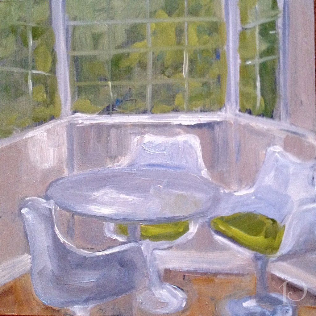
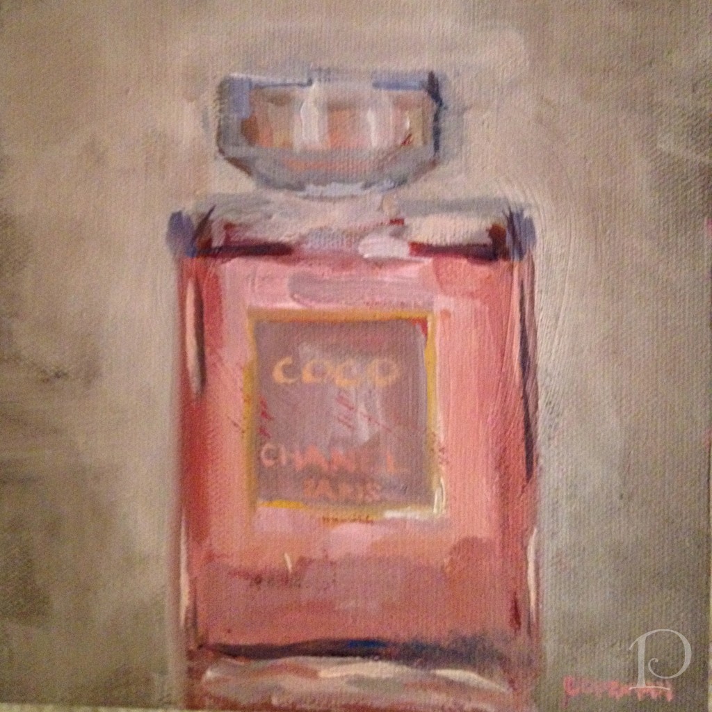
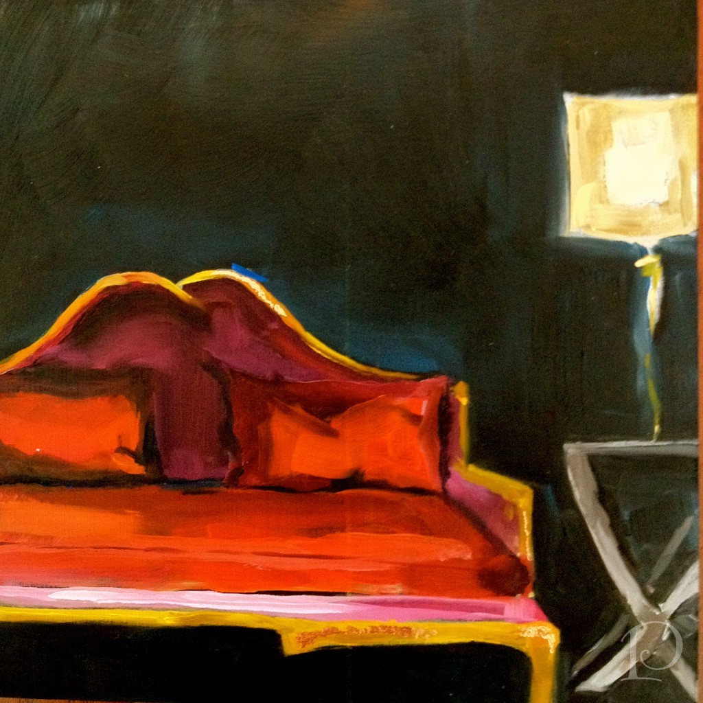
Last but not least, this week’s petite oil painting, also featuring shades of gray (and white and green…)
I’d love to hear your thoughts…and your book reviews!
xo,
Pamela
Contact me about Pamela Copeman Design Group services.
To follow me on Pinterest, click here.
To follow Pamela Copeman Design Group on Facebook, click here.
To follow me on Twitter, click here
My Design Projects: Teen Bathroom
Jun 26 2012 ·0A transformation is in the works!
I am excited to share with you one of several new projects that I am currently working on. You are in for a treat because I am able to show you the progression of this project in real time, as I am working on it. I hope you enjoy being along for the design journey!
Prioritized as the one of first spaces to be transformed in a larger project, this en suite bathroom for a teenage boy is quite small and ready for an update.
Here is the requisite “before” shot of the vanity in the existing bathroom:
 and the 1 piece shower:
While certainly functional, the space does not reflect the aesthetic of the teenage boy who lives here.
My first step was to draw up a floor plan, a must for planning the space and ordering materials.

While we knew this bathroom would need to coordinate with the adjoining bedroom, I was curious to see what ideas my young client had for the overall design. During our initial design meeting we discussed the function of the room (sleeping, studying, entertaining friends) and color preferences (red). I knew I was going to have a great time with this young man he likes the color red! After a bit more delving, he told me about some posters he collected last summer. The posters are sophisticated in shades of charcoal, reds and other vivid hues. What a great jumping off point for the design of our project! Every design has to have an inspiration and this young man’s poster collection is ours.
After our discussion, I wrote up my ideas and met with Christine at Tile Showcase at the Boston Design Center.
We found some wonderful tile selections and Christine sketched a quick plan:

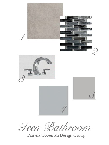
To make the plan come to life for you, I put together this mood board for the space:
Details:
1. Kyoto Grigio tile for the back wall
2. Sumi-e Tresse Silver Fish Natural glass mosaic tile for the side walls on the vertical and the floor ~ using the same tile on both surfaces will give the illusion of a larger space
3. Sigma Palermo faucet is one of the options for faucetry, I love the modern look of the polished chrome
Two of our options for wall color, both from Sherwin-Williams:
4. Monorail Silver
5. March Wind
Stay tuned to see progress, plus more on the bedroom design. I promise it is creative and amazing ~ and just wait until I show you the inspirational posters!
“Design is a constant challenge to balance comfort with luxe, the practical with the desirable”
~Donna Karan
xo,
Pamela
Contact me about Pamela Copeman Design Group services.
To follow me on Pinterest, click here.
To follow Pamela Copeman Design Group on Facebook, click here.
To follow me on Twitter, click here
Pamela's Posh Picks: Royal Ascot Hats 2012
Jun 22 2012 ·0The United States may have the Kentucky Derby, but our Derby headpieces are no match for the outrageous hats seen at this week’s Royal Ascot races in England!
What is the Royal Ascot?
“Royal Ascot is one of the pinnacle events of the summer social season and the racecourse will be playing its part, in this historic year, in celebration of Her Majesty The Queen’s Diamond Jubilee. The Royal Meeting will certainly be one of the must-attend events of the year to enjoy all of the pageantry and history of a quintessentially British day out.”
This week’s Posh Picks are all about the wonderfully imaginative, must-be-seen-to-be-believed hats of the Royal Ascot…
I love this spirited, bedazzled tribute to the Queen’s Jubilee

These gray beaded flowers are a-mazing
 And then things go a bit over-the-top…
A proper English breakfast…on your head??

Did someone say Royal Ascot was a BYOB event??

Can you imagine sitting behind (or beside) this spectacularly bizarre birdcage hat??

And of course, this week’s petite oil painting:
Have an outrageously enjoyable weekend!
xo,
Pamela
Contact me about Pamela Copeman Design Group services.
To follow me on Pinterest, click here.
To follow Pamela Copeman Design Group on Facebook, click here.
To follow me on Twitter, click here
The Bliss of Summer Arts Festivals
Jun 19 2012 ·0“When we artists put a painting on a wall at an exhibition, we bare our souls…at that time everyone becomes a critic.”
~Sidney Hermel
This weekend the South Shore Art Center sponsored the 57th Annual Arts Festival on the Cohasset Common and once again it was outstanding!
The festival is truly a celebration of the arts with nearly 100 juried exhibitor booths, a variety of live music performances, delicious food, artist demonstrations, children’s art activities and a young artists’ exhibition. For me, the highlight of the festival is always the juried art exhibition and members’ show. This year was no exception.
The Art Exhibit is staged under large, peaked tents which not only allows ample viewing space for each piece, but also make a beautiful statement on the Common with their iconic silhouettes.
On Friday, the festival officially opened with the distribution of ribbons for the the “Best of the Best” artworks. My dear friend and fellow GJP‘er, Page Railsback won a bright Pink ribbon in honor of Roz Farbush for her painting and she was thrilled (as was I).
 My friend and another Girls Just Wanna Paint member, Sally Dean was not only the cover artist for the festival program and posters, but also won a ribbon for her beautiful and imaginative painting~
The art on display included many mediums, the broad array is one of the things that makes the outdoor festivals so appealing. Don’t you love this sculpture?  I think this would look divine in a foyer.
This mixed media piece is nothing short of amazing. As you view it from a distance, it appears to be a swirling mermaid or goddess.
But then as you look closer… Such attention to detail and composition, isn’t that incredible?
Jeanne MacFarland is a very well respected artist (and another GJP‘er) and her paintings have an “old world” quality to them. This boat at water’s edge is serene…
Watercolors are always very popular and this is a masterful example:
You may recognize this last painting, though it is a bit more fancy than the last time I showed it…

Dressed up in a new frame, it is one of my “petite interiors”. I was so proud to have it in the member’s show!
Art shows and festivals are truly for people of all ages…. I hope you get a chance to enjoy an Arts Festival this summer, always a delightful way to spend the day!
xo,
Pamela
Contact me about Pamela Copeman Design Group services.
To follow me on Pinterest, click here.
To follow Pamela Copeman Design Group on Facebook, click here.
To follow me on Twitter, click here
Pamela's Posh Picks: Fab & Frivolous Finials
Jun 16 2012 ·0Lamp finials are such a fun and easy way to add detail to a lamp. This week’s Posh Picks will help you transform your lighting into a true design statement!
Looking for something uber-masculine? How about these Antler lamp finials?

Antler lamp finials
These exotic lamp finials are handcrafted in Africa~ from telephone wire believe it or not! The swirl pattern reminds me of lollipops and ocean waves, so colorful and fun.

Zulu Love Train lamp finials
This beautiful glass finial is also handcrafted. Local artist Marj Bates has used Venetian glass to create a finial whose colors “glow, sparkle and dazzle” as the light shines through. Just lovely!

Aqua blue glass lamp finial
For a touch of refined elegance, this clear crystal cube lamp finial from Antique Lamp Supply is perfect.

Crystal cube lamp finial
How adorable is this pink birdie finial from Stray Dog Designs? I would love to see this used in a child’s space or even a ladies’ retreat~this finial is the essence of fab and frivolous!

Pink birdie finial
Finials are like jewelry for your lamps~and who couldn’t use more jewelry! I hope you’re inspired to add a fab and frivolous finial to one of your lamps, the variety, and fun is endless!
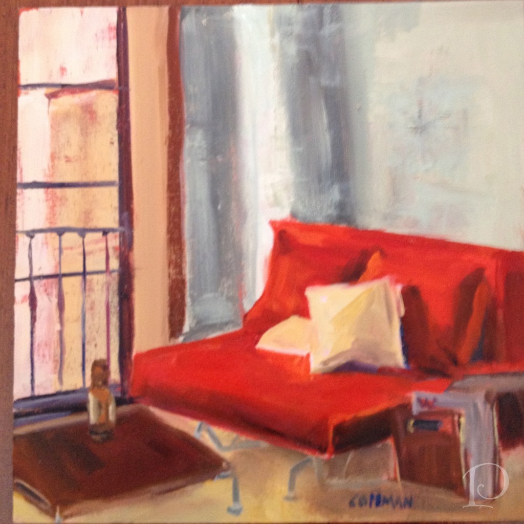
Finally, this week’s petite Interior oil painting:I’d love to hear your thoughts!
xo,
Pamela

Blogfest 2012: Publishing Powers
Jun 12 2012 ·0“I deeply believe that a beautiful decor can have a beneficial influence on our lives.”
~Albert Hadley
For my final Blogfest 2012 wrap-up post I want to focus on the morning we spent at Hearst Tower with some of the most powerful people in the design publishing world. The publishers and editors from Veranda and House Beautiful magazines moderated panels with elite designers who have been published in these national magazines. It was a wonderful opportunity to hear about how designs are chosen for publication and how great designers work.
We gathered on the 44th floor of the Hearst Tower for breakfast. What a beautiful location!
 We went Inside the Issue with the Veranda panel: Publisher Jennifer Levene Bruno, Editor-in-Chief Dara Caponigro, designers Darryl Carter and Timothy Whealon
 This panel offered behind the scene glimpses of their designs. Featured in the May/June issue, both Darryl Carter and Timothy Whealon shared their personal stories about coming into the design profession after they were trained in the field of Law.

via Savvy Interior Design
During the next segment, House Beautiful Editor-in-Chief Newell Turner moderated a panel with the theme “Creating the A-Ha Moment”. His panel included three of House Beautiful’s Next Wave Designers: Michael Herold, Jill Goldberg, and Jon Call.


Love those striped socks, Jon!
The next few photos were taken of the screen presentation so the quality is lacking but they illustrate some striking “A-Ha Moments”. This first example is a scouting shot from a few years ago that was submitted for publication. The editors liked the fact that there was interesting seating (the sofa near the window) in a Dining Room.
 This is how the room looked on the cover shot. Notice how subtle tweaks: changing the angle of the shot, taking away the wreaths and adding fresh flowers, make this room a star!
I love the transformation of this library:
 What a difference some fleurs and a beautiful tablescape can make when the bones of the room are perfect!
Both of the panels were relaxed yet informative. All of the designers were charming, humorous and very articulate. They were generous with their trade secrets and lingered patiently for photographs.
Of course how could I post about the Publishing Powers of the Design World without including Margaret Russell? Editor-in-Chief of Architectural Digest, Margaret elegantly welcomed us to the Kips Bay Showhouse on our first day in NYC.
Blogfest 2012 was such a wonderful experience for me on so many levels. It was a whirlwind full of amazing people and a wealth of design information and inspiration. I can hardly wait to see what’s in store for Blogfest 2013!
xo,
Pamela
Pamela's Posh Picks: Kelly Wearstler Fabric for Lee Jofa
Jun 08 2012 ·0In keeping with the Kravet family theme, this week’s Posh Picks are from Kelly Wearstler’s Groundworks fabric collection for Lee Jofa. I’ve seen this collection in person at both the Boston and New York Kravet showrooms and I can tell you that it absolutely swoon-worthy!
 My first pick is Water Stripe in the Juniper/Lake colorway
This embroidered fabric is the result of Kelly being challenged to create a contemporary fabric based on an older fabric. The embroidered threads are stitched on a bias which is not an easy task. This fabric is magnificent, particularly in person when you can truly appreciate the color and texture.
My next Posh Pick from this line is Mineral in Indigo/Slate
I love how this fabric is reminiscent of a batik print with a contemporary kick.
Posh Pick No. 3 is Feline in Graphite/Rose
No matter how you read this pattern, perhaps as an animal print or even falling rose petals, it adds lots of interest when draped. I particularly adore this gorgeous colorway, it speaks to me with its uniqueness.
Next up: Tempest in Linen
 This fabric is wonderfully “noticeable in neutral”. The zig zag pattern would work wonderfully as either a complement to another fabric or as a stand alone statement.
Finally, Barcelo in Alabaster I love the organic pattern of this fabric. It looks both like a geode and a beautiful marbleized motif. Lovely, dynamic and soothing all at once!
Should you like to view any of these amazing fabrics in person, contact me to arrange a trip to the Lee Jofa showroom at the Boston Design Center!
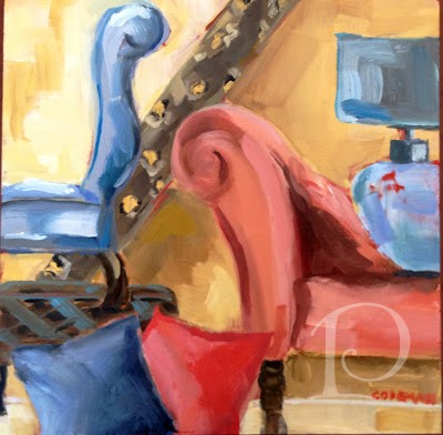
Finally, as promised, this week’s petite Interior oil painting:
I’d love to hear your feedback!
xo,
Pamela
Contact me about Pamela Copeman Design Group services.
To follow me on Pinterest, click here.
To follow Pamela Copeman Design Group on Facebook, click here.
To follow me on Twitter, click here
Blogfest 2012: Kravet Studio Tour
Jun 07 2012 ·1“Creativity involves breaking out of established patterns in order to look at thing in a different way .”
~Edward de Bono
Without a doubt, the highlight of Blogfest 2012 in New York City for me was the Kravet Studio Tour. When I begin a design project I always start with fabrics for inspiration. Naturally, on the morning of the Kravet Studio Tour I was the first one to arrive and secure my place on the first tour of the day. You can imagine what a thrill it was for me to have a chance to get a behind-the-scenes look at the studio where so many of my favorite lines are created!
The first studio we visited was the carpet shop. Look at this array of wool yarns ~ the colors are so pure and glorious.
 This is a carpet sample that caught my eye~animal print of course. I can think of a dozen spaces this would be perfect in.
The next studio we visited displays Kravet fabrics that are available in showrooms across the country, I have used many of these and they are luxurious… The next stop on our tour really captivated me. Here we got a peek at custom fabric design. The designer starts with original artwork, in this case a pencil drawing. Using a sophisticated scanning process to digitize the artwork, the design is then tweaked and reproduced on either cotton, linen or a leather-like fabric.

The designer extraordinaire has created this “racing” fabric from these original sketches, isn’t it amazing? He was so proud to share his story, can’t you see it in his smile? In the Brunschwig & Fils area we saw architectural plans for a brand new showroom.
Here is a Studio wall filled with colorful Brunschwig &Fils fabrics.
Can you believe that once upon a time, this wood block was used to print this Lee Jofa fabric? So interesting to get a glimpse into history.
I felt right at home in this section of the studio. This small corner is where an artist paints designs for some of the fabrics. I would love to have this job for a week…or maybe even two??
Her desk is quite petite but somehow she makes it all work, such a delightful jumble!
Her creative corner…

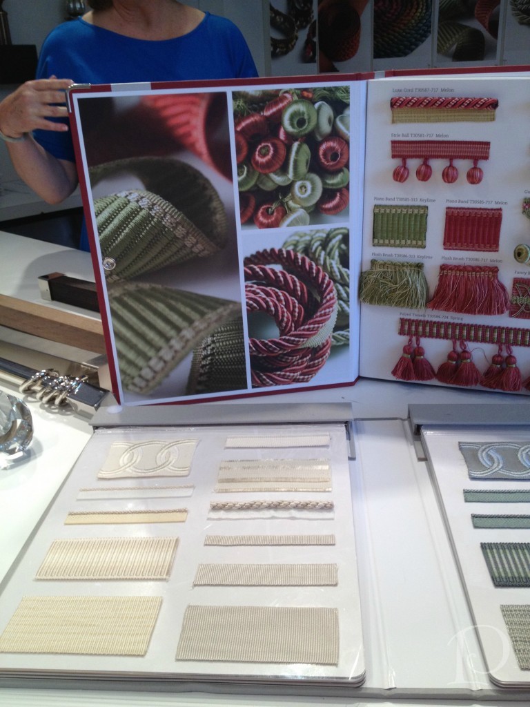
Finally, no fabric line would be complete without fabric trim. Luxurious trim is a favorite accessory of mine when creating pillows and other accessories. Take a peek at this sumptuous trim book:
As you can see, the two floors of the Kravet Studio are jam packed with talent and creativity. Having been treated to this incredible tour, I will certainly appreciate the beauty in every fabric and textile I touch more than ever. Above all, I will think of all the people I met who take such pride in their creation. Thank you!
xo,
Pamela
Contact me about Pamela Copeman Design Group services.
To follow me on Pinterest, click here.
To follow Pamela Copeman Design Group on Facebook, click here.
To follow me on Twitter, click here
Girls Just Wanna Paint
Jun 04 2012 ·0As many of you know, along with being an interior designer I am also an oil painter. I am constantly working to improve my skills by taking classes with local artists and painting as frequently as possible. What a thrill it was then when I was recently invited to join the women artists of Girls Just Wanna Paint.

"I Love Red" 6x6 oil on board by Mary Sheehan Winn
Formed in 2009, Girls Just Wanna Paint is group of 12 artists who challenge themselves each month to incorporate a selected object or idea into a painting. The paintings are posted at the beginning of each month on the Girls Just Wanna Paint blog where we invite your comments and feedback.

"Brush With Great Effort..." by Kelley MacDonald 6"x6"
The group meets during the first week of every month. We view each other’s work in person, enjoy some great food and wine, and decide what the next month’s subject will be. This is a collection of serious artists who also have a lot of fun–right up my alley!
I am delighted to be a part of this esteemed group of women. Most of the artists are professionals and teachers and all are very inspiring. Their individual spirit and soul comes through in their work. I invite you to visit the Girls Just Wanna Paint site and peruse the artists’ websites and blogs. I guarantee you will fall in love with their work as I have~
My next painting as part of the Girls Just Wanna Paint group will be up at the beginning of July. As a complement to this new venture, I am pleased to announce a new weekly feature on my blog. Each week at the end of one of the blog posts (typically Pamela’s Posh Picks) I will be sharing one of my petite Interiors oil paintings. I would love to hear your feedback on these paintings. Of course I am also open to painting custom pieces of your special Interior space in oil. These works can be framed or reproduced as beautiful stationery.
"Let the Fun Begin" by Pam Copeman
I hope you will enjoy this new feature and look forward to sharing my painting journey with you!
xo,
Pamela
Contact me about Pamela Copeman Design Group services.
To follow me on Pinterest, click here.
To follow Pamela Copeman Design Group on Facebook, click here.
To follow me on Twitter, click here
{featured paintings are from the GJWP May challenge: “Tools of the Trade”}