The Votes Are In…
Mar 12 2012 · 3 comments · Behind the Design, Personal ·0
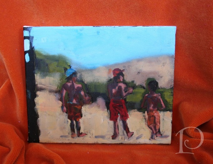
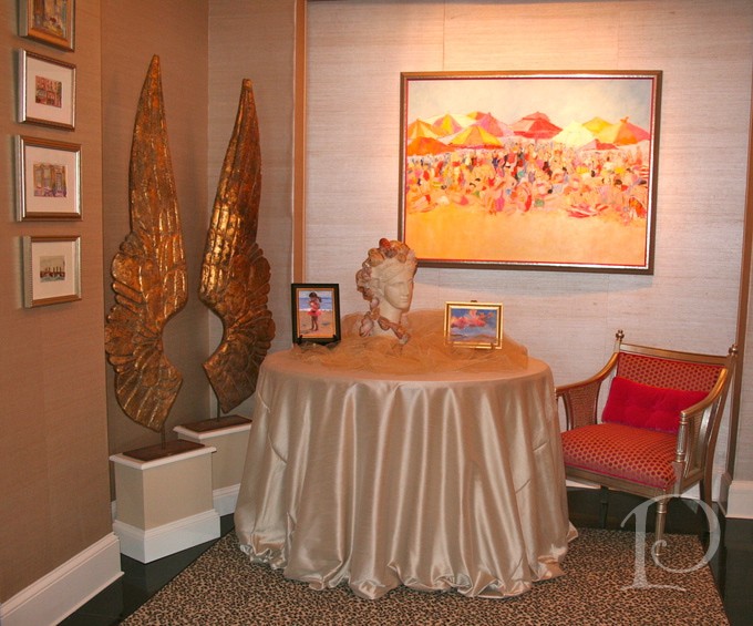
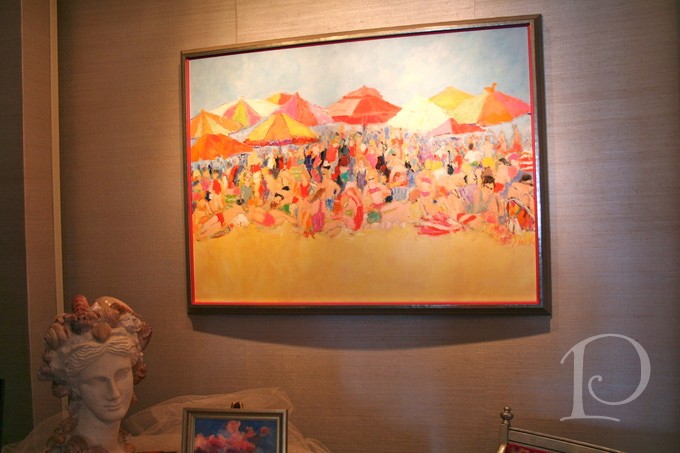
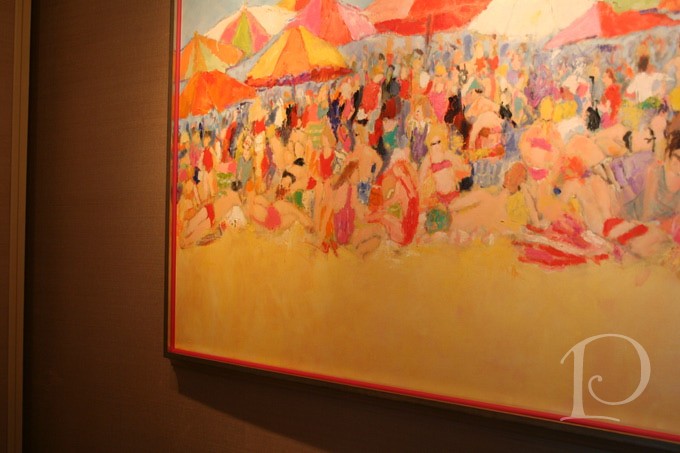
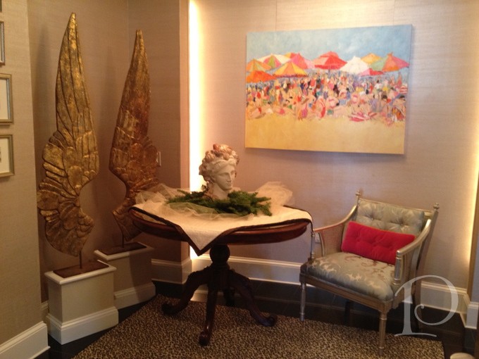
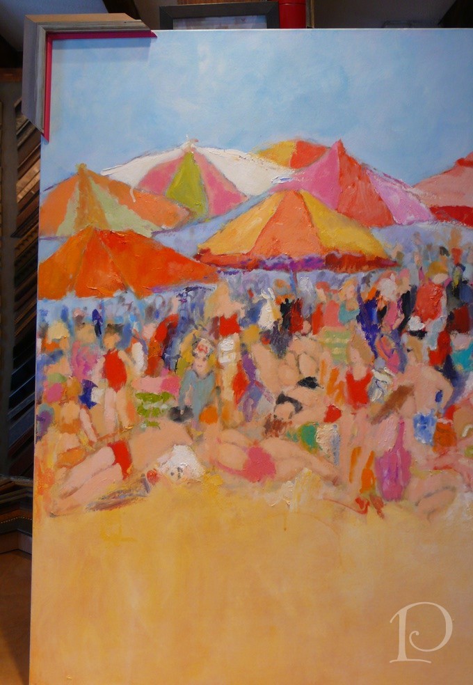
A while back I shared with you my process for selecting a frame to highlight the star piece of artwork for my foyer, a lively and colorful beach scene by my friend, artist Sandy Welch. With the help of Kate from South Street Gallery, we picked out a beautiful, contemporary frame. The question then became to filet or not to filet? That’s where you my dear readers and friends came in. Your votes and comments encouraged me to go for it and to add the filet to the frame! Without further ado, here is the result:
The champagne finish frame adds polish and the poppy colored filet adds “punch”.
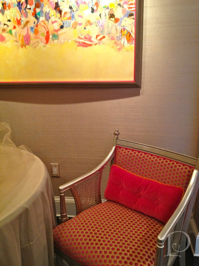
Adding the filet was definitely a risk but I am thrilled I took it! I think it gave this large frame the pizazz it needed to balance the color of the painting and set the tone for my home on the ocean.
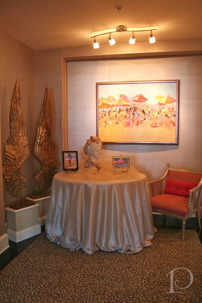
You may notice a few other updates to the space. This newly upholstered french antique chair with the magenta dots against the silvered grey background lends a subtle compliment to the painting and frame. Coupled with the freshly dressed table and new lighting, I’m loving this welcoming entrance. Thank for participating in the first Posh Palettes vote ever!
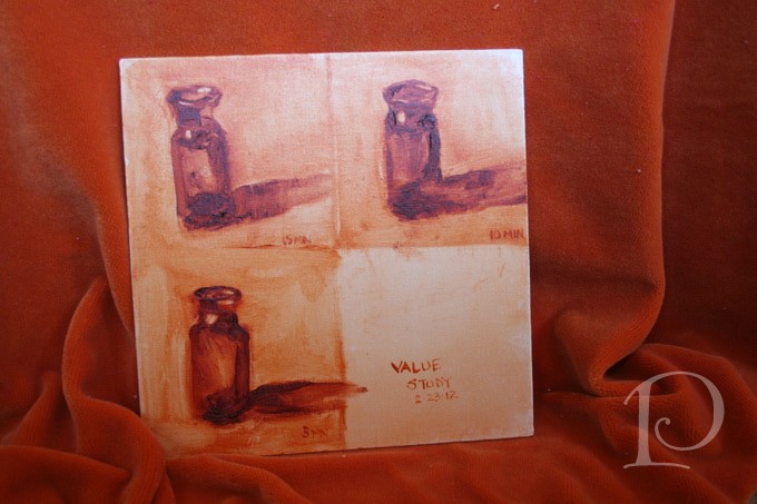
Speaking of painting, this past week I participated in a 2 day painting workshop with Kelley MacDonald at her studio in Warren RI. What a treat. Not only is she one of my favorite artists but she is an intuitive instructor and these 2 days with her were outstanding! During the workshop we practiced several techniques in oil painting.
We worked on value studies (ugh, not my favorite although very necessary). We had 5, 10 and then 15 minutes to complete our work.
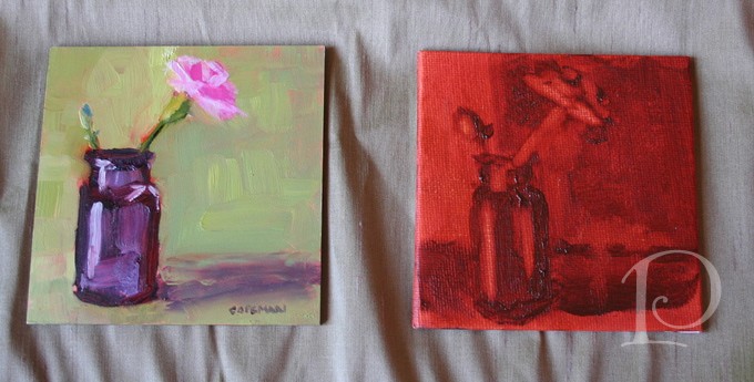
Kelley also had us do timed paintings with other still life subjects.
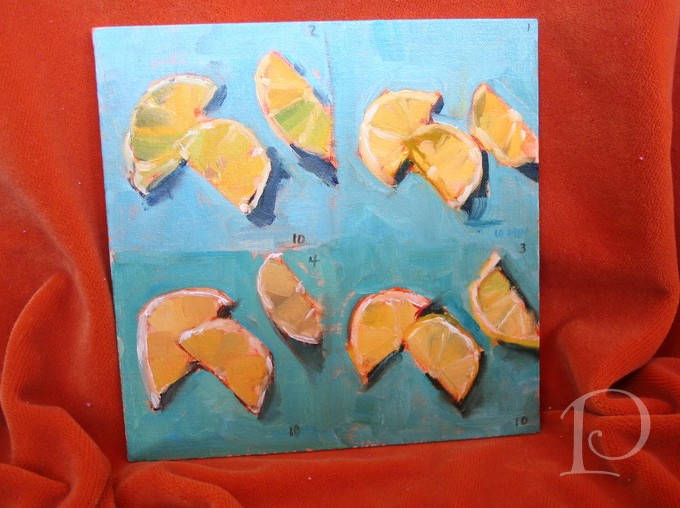
We had 10 minutes to paint 3 lemon sections– wait, REEEALLY??
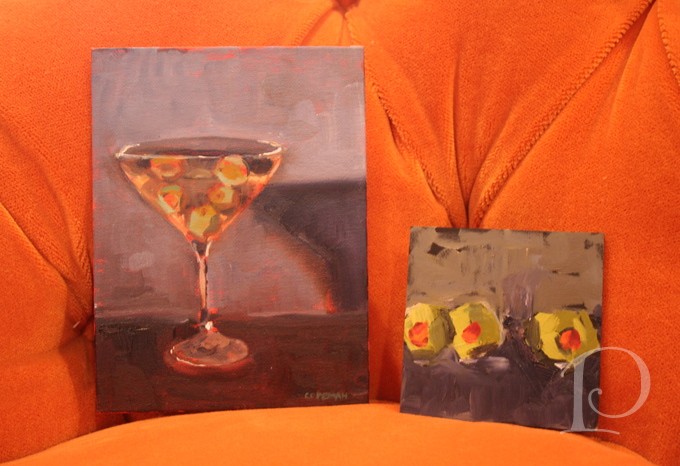
Finally we did a graph painting of 3 forms in 30 minutes.
I was amazed at the paintings I produced and even more amazed at what I learned. Thank you Kelley for an incredible 2 days of inspiration and art!
“Art enables us to find ourselves and lose ourselves at the same time.”
~Thomas Menton
xo,
Pamela
Contact me about Pamela Copeman Design Group services.
To follow me on Pinterest, click here.
To follow Pamela Copeman Design Group on Facebook, click here.
Pamela's Posh Picks: Wall Sconces
Mar 08 2012 · 5 comments · Posh Picks ·0
For this week’s edition of Posh Picks, I’ve chosen to highlight some of my favorite wall sconces from Currey & Company. I love the versatility of wall sconces and the seemingly endless variety of design choices available. Currey & Company is one of my go-to resources for lighting, always providing top quality and such beautiful designs.
Let’s get to the Posh Picks!
Pembroke ~ One Light Wall Sconce
The Pembroke sconce is smart, contemporary, modern, and sure to work perfectly in a wide range of spaces. This sconce would be marvelous above a nightstand in a bedroom. Then again, it would be equally at home in a foyer–perhaps a pair of Pembrokes above a console table flanking a fabulous piece of artwork!
Goddess ~ Two Light Wall Sconce
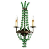
As wonderful as this bead-enhanced sconce is on its own, I would love to add lampshades! I could easily see an animal print or tangerine shades on this sconce–just imagine the added pizzazz! I envision the Goddess in a foyer, in a bedroom entry or perhaps most fittingly, in a luxurious bathroom. Placed at eye level on either side of a mirror, what a glam spot for getting ready for the day–or evening!
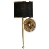
The bold lines of this sconce coupled with stylish details such as the ball finial and moody black shade make this the perfect sconce for a library or tailored office. As part of an integrated illumination design, the Primo would add style and function to a custom bookcase niche. Another design option would be to hang this sconce on the side of above-desk cabinets, with the electrical housed within the cabinetry. While not suitable for task lighting, this type of sconce placement makes a bold design statement and enlivens an otherwise unused space.
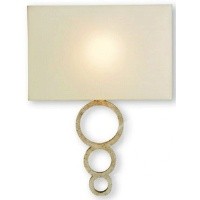
Dorset ~ One Light Wall Sconce
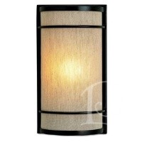
With its tailored, globally-influenced style, this sconce provides soft and chic lighting. A group of Dorset sconces would be perfect for a media room. Arranged in a deliberate, artful grouping, either randomly staggered or installed in a linear pattern, these sconces would add the perfect touch of ambiance, function, and style!
Quantum ~ Two Light Wall Sconce
This playful yet sophisticated sconce would be ideal in a Master Bathroom. Placed on either side of a mirror or flanking a window over a luxurious bathtub, the glass “beads” of the Quantum are reminiscent of delicate soap bubbles. What a wonderful reminder to relax, take a deep breath, and let your cares float away…
Tiny bubbles…Make me happy, Make me feel fine…
~Don Ho
xo,
Pamela
Contact me about Pamela Copeman Design Group services.
To follow me on Pinterest, click here.
To follow Pamela Copeman Design Group on Facebook, click here.
A Golden Transformation
Mar 04 2012 · 3 comments · Behind the Design, My Designs, Posh Partners ·0
When I was growing up, the story of Cinderella was one of my favorite fairy tales. It never failed to enchant me when the Fairy Godmother appeared and magically transformed Cinderella’s tattered rags into a beautiful ball gown complete with glass slippers. I may not be a Fairy Godmother but I am an interior designer and I love transforming pale and boring spaces into jazzy, eye-catching jewels!
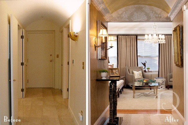
Today I want to share with you one of my more dramatic transformations. The project was a condo on Tremont Street in Boston and the space was a petite Foyer and Entrance Hall.
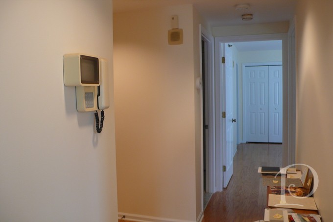
This before photo shows the Hallway that leads to the Master Bedroom. The space is boring, vanilla and dare I say, plain Jane.
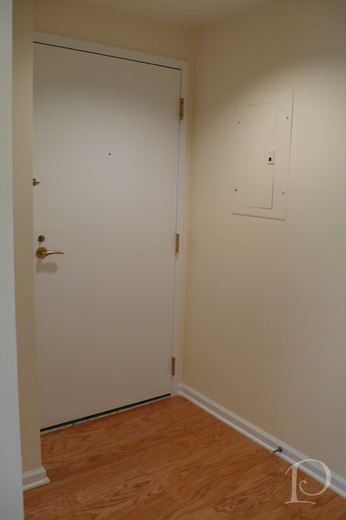
This is the interior shot of the Front Door. So boring, simply no personality at all.
I was determined, along with my client, to banish the boring and have her guests wowed as soon as they walked in the front door. Yes, this space was definitely in need of a touch of interior design “magic”. So I conjured up a dash of sparkle, a dose of glam, a whole lot of gold and… TA-DA:
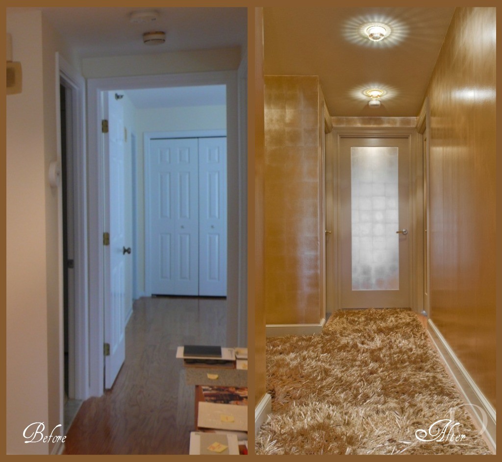
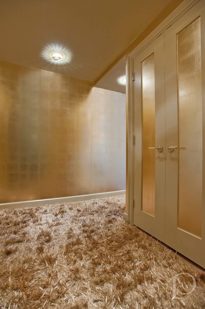
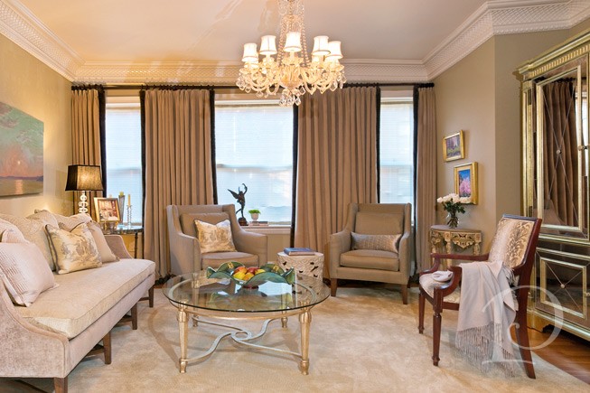
Can you believe this is the same space?? From the incredible Swarovski crystal inserts on the recessed lights (from Chimera) to the stunning metallic wall covering (Maya Romanoff, purchased at Donghia) right down to the amazing custom gold silken carpet (from Colony Rug) there’s no shortage of wow factor! I love how we carried the gold color palette through the entire Foyer using a variety of finishes. Instead of making visitors want to turn around and leave, now this beguiling space makes a statement that says: Do come in and prepare to be amazed!
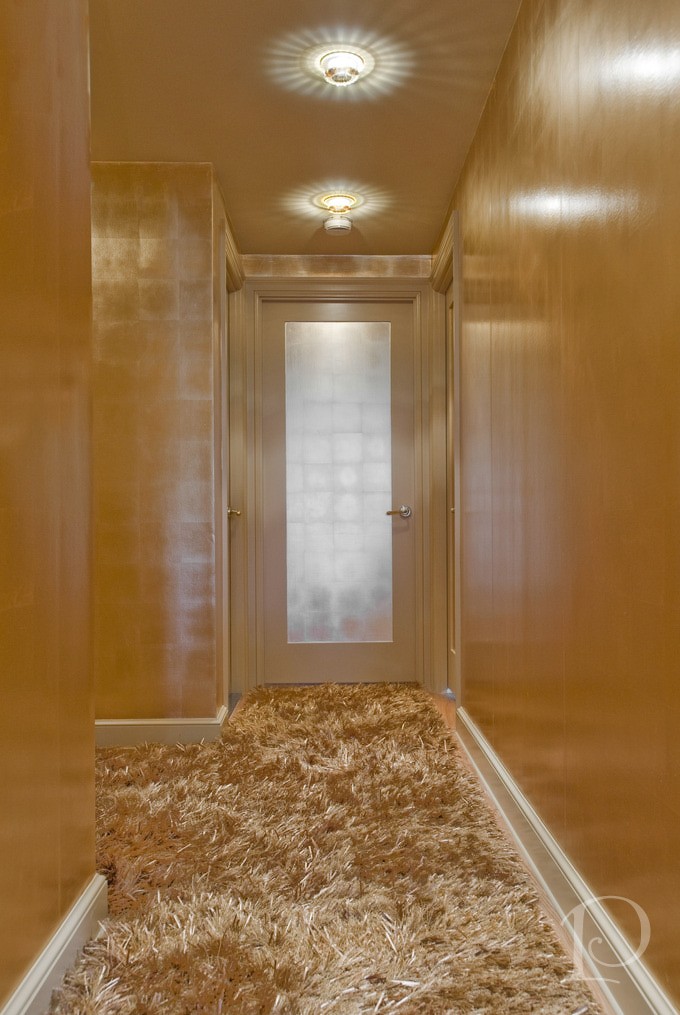
Here is the ‘after’ view of the hallway leading to the Master Bedroom. What a metamorphosis! Of course all good interior designers have a fabulous team that helps them make the magic happen. Contractor John Horgan and Associates did a masterful job with the wallcovering and painting. The carpentry renovations (including sleek new doors) were done by the award winning S+H Construction. Randy Gross of Eric Levin Photography was a superstar during this shoot. He kept his good humor and smile despite the 90 degree heat, working with me to get “the” perfect shot.
I can’t resist showing you one more look at the Golden transformation~
I love this project and I hope you do too. What a wonderful reminder that even a small space can have a big personality so…think BIG!
“Live life big”
~Connie Hilner
xo,
Pamela
Contact me about Pamela Copeman Design Group services, including magical transformations!
To follow me on Pinterest, click here.
To follow Pamela Copeman Design Group on Facebook, click here.
Pamela's Posh Picks: Kravet Soleil Fabrics
Feb 27 2012 · 4 comments · Posh Picks ·0
I must be basking in the afterglow of my trip to South Beach, because I’ve still got sun and warm weather on my mind. This mild New England winter is such a tease, warm days out on the terrace can’t be far away!
Kravet Soleil is a line of indoor/outdoor fabric that marries style and modern technology making it an equally perfect choice for outdoor furniture or family-loved indoor pieces. I absolutely adore the colors these fabrics come in, as well as the playful, modern designs. UV protection, superior durability, and stain resistance all merge to make these fabrics uber-functional. What an outstanding combination!
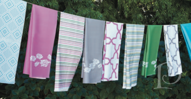
Here are some of my favorites from the Kravet Soleil Lifestyles collection, the fabric names alone will put you in a tropical mood!
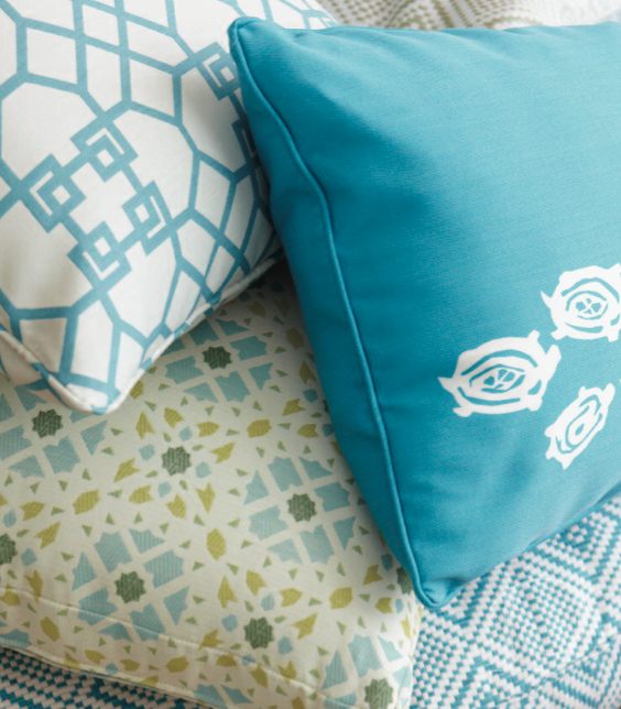
Love the lively turquoise colors and the geometric prints~ where can you envision these fabrics?
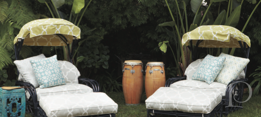
The use of neutrals on these lounge chairs with the punch of citron on the umbrellas is so tropical, love it!
Kanekopa in Akuatic, Kura Kura in Orchid, Halua in Hibiscus, Kura Kura in Haze, Mandella in Orkid, Halua in Parakeet, Kura Kura in Veridian
A clothesline peek of the fabric line~ which ones might you pick for your terrace, boat or deck? They’re all so fun and fashionable, surely there’s not a bad choice amongst them!
xo,
Pamela
Contact me about Pamela Copeman Design Group services.
To follow me on Pinterest, click here.
To follow Pamela Copeman Design Group on Facebook, click here.
Hot in South Beach
Feb 23 2012 · 2 comments · Inspiration, Travel ·0
A few days in South Beach Miami in February is just what this New England girl needed to tide her over until summer. As soon as I stepped foot into the Gansevoort Hotel (soon to be the Perry South Beach) the hot, sexy and colorful vibe put me in the mood to relax and kick up my heels!
The lobby furnishings are colorful and bright, just the way I like them. Just look at this comfortable seating area: the neutral sofa with pillows of purple and gold coupled with the boldly striped lounge and modern purple chairs. Everything about this area says ‘Welcome to South Beach, get ready to have a good time!”.
The palm patterned carpet in magenta and plum is the perfect anchor and accent for this lively, fun seating area.
Elsewhere in the lobby sits this huge, 20 foot wall aquarium. The vibrantly colored tropical fish and contrasting but equally bright glass mosaic tile provide an unmistakable focal point. I love the shape of the mustard colored chair, echoing the colors in the aquarium and again reinforcing the colorful, lush vibe of the space. A wall aquarium is a wonderful design element to consider for an office, a reception area or even a bedroom as it brings light, life, color and movement into area.
In another, more quiet area of the lobby I found these sexy, sculpted chairs. Just perfect for my Em in her stripe shift~ although she seems to compliment any chair!
Moving to the outdoor space of the property brings even more glam South Beach design!
Just look at this rooftop pool~
And oh, the cabanas! The bright red and orange are perfect. In the late afternoon when the sun is setting these colors are echoed in the sky along with purple and pink and endless variations in between.
The beach below boasts the cool colors. I once read that if you consider the hues in nature for design you can’t go wrong because they always work together and flow seamlessly.
What better place to look for inspiration than the view right in front of you?
South Beach is known for its night life and the sensual vibe was easily spotted in the design of the spaces we visited after dark. The vibrant colors of the sunny daylight hours were replaced with dark and sultry shades of brown and grey.At the W, the lobby has individual conversation areas that create intimate meetings spaces. The sleek sofa is done in an ivory linen, and the zebra design carpet is a light weight texture to match the climate while still providing a lush pop of pattern.
My chair fetish should be well-known by now, and here is one that I just loved:I’m not sure how comfortable the faux fur would be in the intense heat, but what a conversation piece! So feminine and curvy, what’s not to love??
Finally, a reminder that any area can be anchored with art work. Although the mood is one of dark sophistication and the furniture is arranged for sipping cocktails, the focal point is the brightly colored painting. To me it reads Hot Miami~ a visual reminder of where you are, just in case you’ve forgotten!
Where ever you may travel this winter take a few moments be aware of different interiors, styles and colors and consider bringing some new ideas home for your own space. After all, wouldn’t it be wonderful to bring that vacation feeling home with you?
“Colors, like features, follow the change of the emotions.”
~Pablo Picasso
xo,
Pamela
Contact me about Pamela Copeman Design Group services.
To follow me on Pinterest, click here.
To follow Pamela Copeman Design Group on Facebook, click here.
Pamela's Posh Picks: Beach Totes
Feb 18 2012 · 1 comment · Posh Picks ·0
Our mild Massachusetts winter and the ocean view out my windows has me dreaming of summer! I’m so looking forward to sunshine, sand between my toes and long, lazy days at the beach. Of course I’ll be needing a new bag to tote all my essentials: towel, sun block, bubble gum, book, shades, lipstick, iPhone, journal of secrets heard and kept…
Here are a few of my Posh Picks for Beach Totes!
Kate Spade’s Daycation tote~ Love the name (A daycation? Yes, please!) and who can resist this bright and cheerful pink?
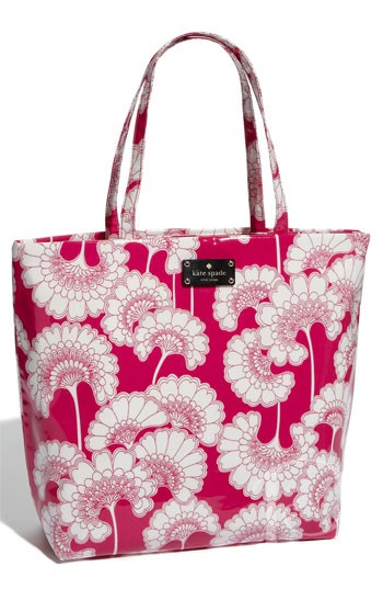
Bring The Sun from Juicy Couture. I think the name says it all, so bright and cheerful with a hint of sparkle!
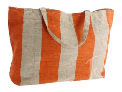
This Resort Stripe tote by Deux Lux is pure Beach Glam!
Gotta love a bag with a graphic design featuring “sunnies” as Rachael Zoe would say~
Marc Jacobs Spectacle Painted Canvas Beach Bag from Saks
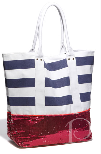
I will always love an awning stripe bag and this one by DKNY in orange is tres chic!
In just a few short months it will be time to pack up our totes and enjoy days by the beach. Which beach tote would you use??
xo,
Pamela
Contact me about Pamela Copeman Design Group services.
To follow me on Pinterest, click here.
To follow Pamela Copeman Design Group on Facebook, click here.
Be My Valentine{s}
Feb 14 2012 · 4 comments · Holiday, Inspiration ·0
“Oh, if it be to choose and call then mine, love, thou art every day my Valentine!”
~Thomas Hood
Valentine’s Day has long been my favorite holiday of the year. There is something so charming and sentimental about a day set aside to celebrate love, don’t you think? I love the symbols and connotations of Valentine’s Day: cupid, pink doilies, red hearts and, who could forget, romance.
Of course Valentine’s Day isn’t just for lovers. It’s a wonderful day to celebrate all the people in your life you love and hold dear. Whether children, friends or family, what a perfect time to share how much someone means to you.
Perhaps not surprisingly, handmade Valentines are one of my most treasured Valentine traditions. I love making them and I love receiving them. I save them all and each year take out some of my most cherished Valentines to display with love every February. Today I’m going to share them with you!
A sweet bird from a sweet friend~We always exchange Valentines, and I always look forward to it!
Love is in the air!
This is from my Freddy when he was into paper airplanes.
Vintage collage Valentine from G
This Valentine from my friend Danielle makes me feel so special, what a wonderful way to kick off the season!
Handmade Valentines are a family tradition, I love this one with a quote from Em.When one heart is just not enough…
Inspired by similar handmade Valentines on this year’s Paper Source catalog, I made this guitar card for Freddy.
Love Rocks!
Watercolor martini painted by me, cheers to you Valentine!
Do you recognize this winged girl? 😉
If your own words fail you, a quote will do wonderfully!
I’m so happy I saved Valentines made by little hands. They bring me back to days at the kitchen table strewn with glitter and glue, making Valentines for each other. These Valentines are so sweet and never fail to touch my heart.
So doll up in pink and red today, don a bright and shiny red lipstick, and go ahead and kiss someone on the lips! It’s time to fall “head over heels” in love with the day set aside to celebrate friendship, love, and happiness!
Happy Valentine’s Day!
xoxo,
Pamela
Contact me about Pamela Copeman Design Group services.
To follow me on Pinterest, click here.
To follow Pamela Copeman Design Group on Facebook, click here.

Love Locks
Feb 11 2012 · 2 comments · Holiday, Travel ·0
“You hold the key to my heart”
As Valentine’s Day approaches, our thoughts turn to love and romance. What city is more synonymous with love and romance than Paris? I thought this would be the perfect opportunity to share a few pictures of one of the most romantic things I saw during my trip to Paris last fall: the Love Locks.
The Love Locks showcase a tradition that couples partake in to show their love. A couple writes their names on a padlock and locks it onto one of two bridges, Pont des Arts and Pont de l’Archevêché in Paris. They then throw the key into the Seine River as a symbol of their undying love.
A French tour guide explained that you must be selective when placing your lock, for each bridge has a different symbolism. The Pont des Arts is for your committed love and the Pont de l’Archevêché is for your lover.
Can you guess which bridge is completely covered with locks??
xo,
Pamela
Read more about this romantic tradition here: Padlocks of Paris
Contact me about Pamela Copeman Design Group services.
To follow me on Pinterest, click here.
To follow Pamela Copeman Design Group on Facebook, click here.
Window Seats
Feb 09 2012 · 1 comment · Design Elements, My Designs, Posh Partners ·0
Window seat.
The name alone seems romantic to me, bringing to mind classic novels and the image of a young girl perched on a window seat looking out, day dreaming or simply gazing at the stars.
Today’s window seats are no less romantic but are also a wonderful opportunity to add function and beauty to a space, as well as a way to connect to the view beyond.
Recently I oversaw the installation of custom window seat designed and built by Michael Cundari of Morpheus in Hingham, MA. The custom carpentry details not only lend beauty to the window seat, but help integrate it into the existing space. This window seat offers storage with drawers which slide out to the side, along with panels that open from the top. We designed a custom cushion to top this roomy, angular window seat, selecting a striking tangerine and ivory geometric print fabric. It makes the perfect perch for enjoying the abundant sunshine and the water views beyond~just ask Bella the cat!
Window seats are one of my favorite features and we integrated several into this seaside home, another recent project of mine.
This window seat in chartreuse velvet compliments the bedroom and is perfect for gauging the weather ~
The children’s suite is this home offers the parents their own bed and gives the child a small nest bed of their own behind this sheer. The treetop view from this window seat plays right into a child’s imagination. What a wonderful spot to curl up with a book, a few toys, or maybe even a nap…
Nothing says ‘we are so glad you’re here‘ like this guest bedroom. Here we find yet another lush window seat to place your “things” or to stretch out and relax as you listen to the ocean and enjoy the garden views.
“[We all] look out the same window without ever seeing the same thing.”
~Gloria Swanson
Might as well get comfortable and enjoy the view!
xo,
Pamela
Contact me about Pamela Copeman Design Group services.
To follow me on Pinterest, click here.
To follow Pamela Copeman Design Group on Facebook, click here.

Pamela's Posh Picks: Color of the Year, Tangerine
Feb 06 2012 · 1 comment · Posh Picks ·0
Pantone Color Institute, known for its trendsetting color predictions, recently announced its 2012 Color of the Year: TANGERINE TANGO
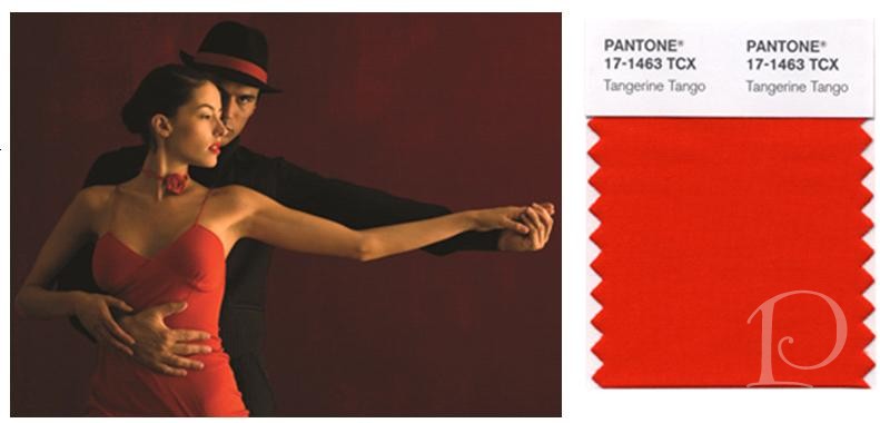
What a glorious color it is! According to Pantone, “Tangerine Tango is a spirited reddish orange, it provides the energy boost we need to recharge and move forward…”
During a recent visit to the Sherwin Williams studio at the Boston Design Center I selected some outstanding tangerine-hued paint colors from this warm palette. I just know one of these would look great in your next project. Take a peek and let me know your favorites~
Oh how I love the boldness of this color! Not shy or retiring, Daring makes a perfect accent paint. I can envision it for a piece of furniture, the edges of a frame or a fab pop of color inside a bookcase.
Mandarin has undertones of yellow which makes it a bit more of a safe choice. It’s a great choice for a wall or a floor in a solarium or even a ceiling. Such a fun color, use your imagination!
This is a true tangerine to my eye: bright, vibrant and warm. Navel would be perfect for a pair of Adirondack chairs on the lawn.
In real life this is a reddish-orange and oh so lovely. Quite truthfully I would be tempted to use it just based on its name: Daredevil. I dare you to use this in a dreary pantry or closet. Just think how it would brighten your day and energize your spirit!
With all this thinking about the color of Tangerine I feel the need to go have a nice big bite of one …..
xo,
Pamela
Contact me about Pamela Copeman Design Group services, including help with selecting your perfect palette of paint colors.
To follow me on Pinterest, click here.
To follow Pamela Copeman Design Group on Facebook, click here.
Fabulous Foyers
Jan 31 2012 · 0 comments · My Designs ·0
Foyers are such unique design spaces because they are typically petite, transitional spaces that serve many functions. However, that doesn’t mean they can’t have BIG personalities. Take a peek at a few Fabulous Foyers.
Here is a foyer I designed for a pied-a-terre in Boston.
As you can see in the “before” side of the shot, it was sad, drab and not too inviting.
My vision was to re-imagine the foyer from a narrow entry to an invitation to enter a jewel box of a space. At only slightly wider that 4′ , this foyer was transformed into a TA DA entry. Taking cues from the living space beyond, the foyer offers a peek of what is to come. The walls were papered in a burnished gold and on the dome ceiling we installed indirect (dimmed, of course) lighting with a Sistene Chapel-esque faux finish. A small sculptured table adds just the perfect contemporary finishing touch.
Commonwealth Avenue in Boston boasts some of the most beautiful homes in the Back Bay, many replete with unusual spaces. This round foyer from another one of my projects is a great example. This space is a perfect circle with no fewer than 5 doorways, can you imagine? What a challenge it was to make this a memorable transition space. Not only did the design succeed in complementing all of the adjacent rooms, the foyer became a star space in its own right. For the the wall covering we chose a textured paper which concealed old walls and leads the eye into the upcoming living room. The wallpaper also provided a perfect backdrop for two original, fanciful dessert prints which my client discovered on Newbury Street. The art works so well in this petite rotunda because you can study it at eye level and appreciate the nuanced charm and detail of the subject matter. This transitional foyer became one of my favorite rooms of this grand home.
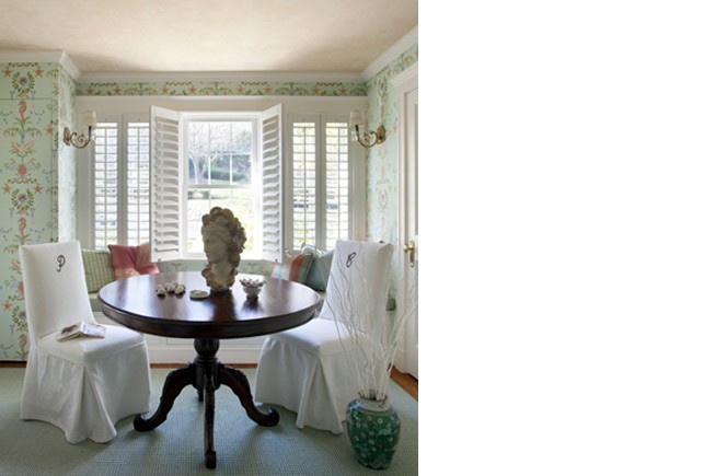
Finally, this charming seaside home is filled with a bevy of small rooms, including this multi-purpose foyer. The challenge for me in this project was to create a welcoming entry that would also serve as a home office. The lady of the house used the round table as her desk as well as a spot for afternoon tea in the winter ~a perfect multi-functional piece. This hard working foyer is also responsible for setting the tone for the entire home. As you can see from the classic yet whimsical seahorse and starfsih themed wall covering, the homeowner has a sense of humor and loves color. Any guesses as to who owned this home at one time??
Remember, no matter how large or small, don’t overlook your foyer. The right design can take your foyer from a boring, pass-through space to a Fabulous one!
xo,
Pamela
For further reading, you may be interested in this article from Sherwin-Williams: All the Way With Hallways
all photos via Pamela Copeman Design Group
Contact me about Pamela Copeman Design Group services, including help with making your foyer Fab!
To follow me on Pinterest, click here.
To follow Pamela Copeman Design Group on Facebook, click here.

Pamela's Posh Picks: {Singin' in the Rain} Boots
Jan 27 2012 · 5 comments · Posh Picks ·0
Today when I woke up the skies were filled with clouds and raindrops were spattering my deck. Naturally, my thoughts turned to colorful rain boots~ which are quite the rage right now. Here are my Posh Picks!
Don’t you just love to mock the weather by wearing yellow, a sunshine color? I adore the name of these boots: Ditsy Dots Rain Boots!
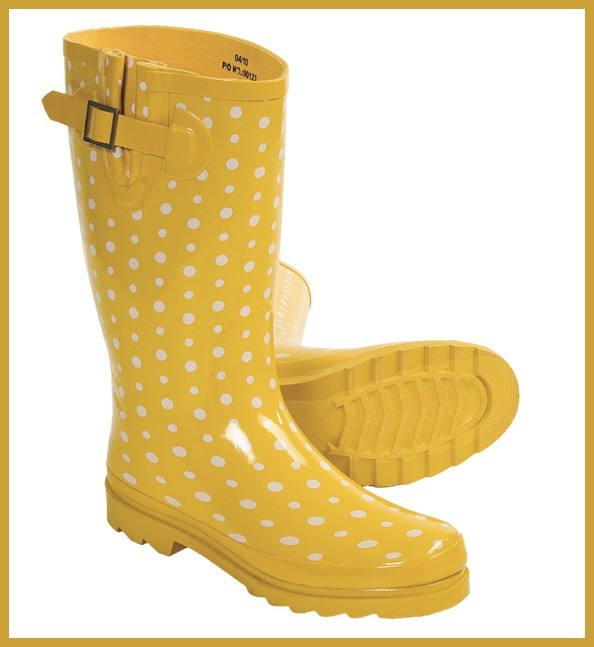
My friend Amy, a barbecue girl, would feel right at home in these sassy, western-style rain boots: Nature’s Breeze Low Cut Rain Boots.
For the Prepster, a black plaid is always in fashion: Sweet Beauty.
The Hunter Original High Gloss is a favorite for another friend, Deneen. So perfect in pink!
Finally, this Crayola-colorful Carmindy rain boot by Jessica Swift is my pick for splashing in the puddles!
I’m singing in the rain
Just singing in the rain What a glorious feelin’
I’m happy again.
I’m laughing at clouds.
So dark up above
The sun’s in my heart
And I’m ready for love…..
xo,
Pamela
Contact me about Pamela Copeman Design Group services.
To follow me on Pinterest, click here.
To follow Pamela Copeman Design Group on Facebook, click here.
It's a Frame Up!
Jan 24 2012 · 11 comments · Artists, Behind the Design ·0
“You have it in you to give that extra little bit. You know that you could add that finishing touch. You know you can take that extra step.”
~Marilyn Moats Kennedy
By now you know the importance I place on original art in an interior space. From its transformative properties to the pure joy and beauty that art brings to a room and the viewer, a wonderful painting (or any piece of art, really) can be the centerpiece of an entire room.
Equally important though not equally discussed, is the value of a custom frame for your prized artwork. That extra step, that finishing touch. That’s why today I’d like you to accompany me on a trip to my fabulous local frame shop, South Street Gallery in Hingham, MA. I’m going to take you through, step-by-step, my process as I select a frame for one of my most favorite pieces of art in my home.
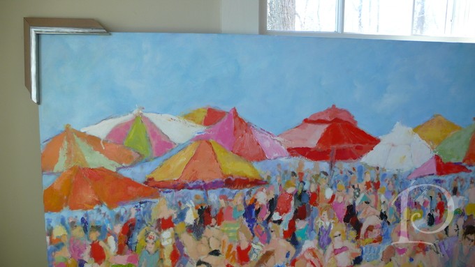
First let me show you the painting we’ll be working with. It’s a colorful beach scene by renowned artist and my dear friend Sandy Welch. Don’t you just love this? I can feel the sun shine when I look at this painting!
The painting hangs in the Foyer of my home, setting the tone for my waterfront abode with its glorious color and seaside scene.
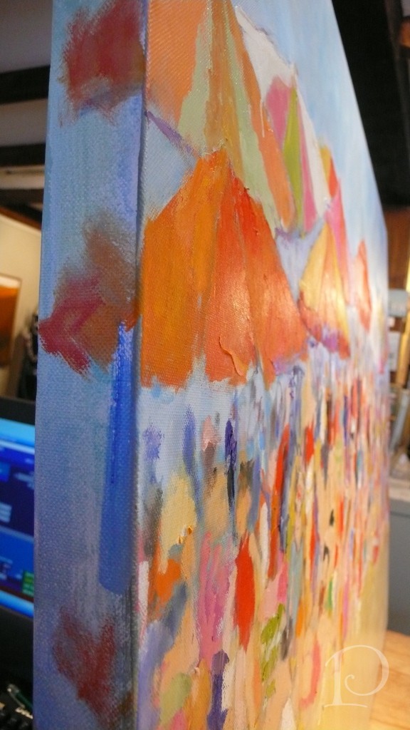
Notice that this painting was created on a deep, finished canvas. The artist continued the painting around the edges giving you the option of hanging it without a frame. I prefer a more traditional and opulent approach however, so off we go to the frame shop!
The best frame shop to seek out is not only one with an outstanding selection but a proprietor who has an artist’s eye and can help you with your options.
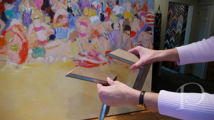
Meet Kate, from South Street Gallery. My personal framing consultant (she could be yours, too!).
Here, Kate is holding up a frame with a “fillet”, a small piece of mulling which fits inside a larger frame for decorative purposes.
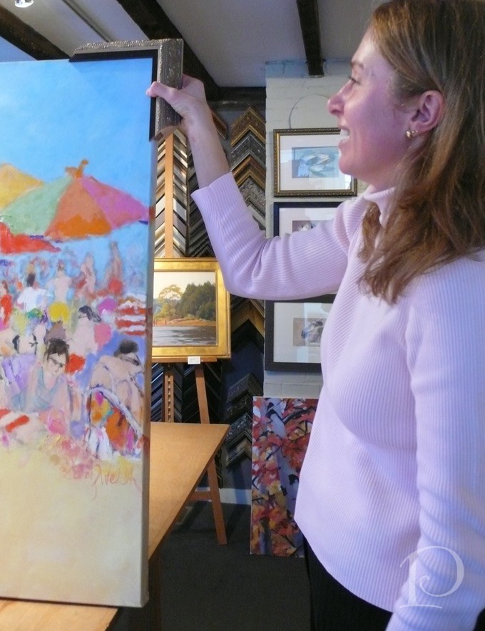
I like the fillet but I think this frame is far too ornate for this painting. While I liked the frame sample on the wall, the only way to discover how it will look with your artwork is to place it on all 4 corners and try to visualize it around the entire piece. The frame should complement the artwork, not compete with it. It is also important to keep in the mind the style of the piece and where it will be installed.
Let’s go back to the drawing board for more selections.
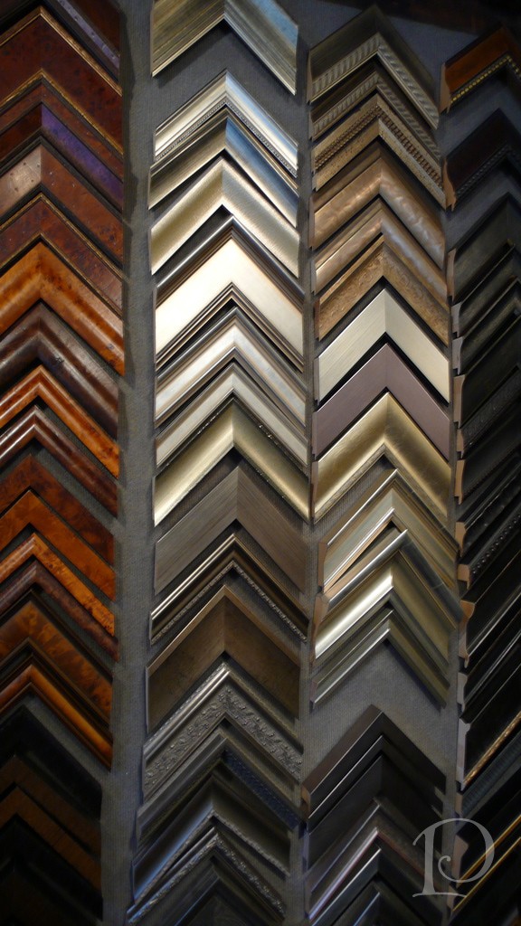
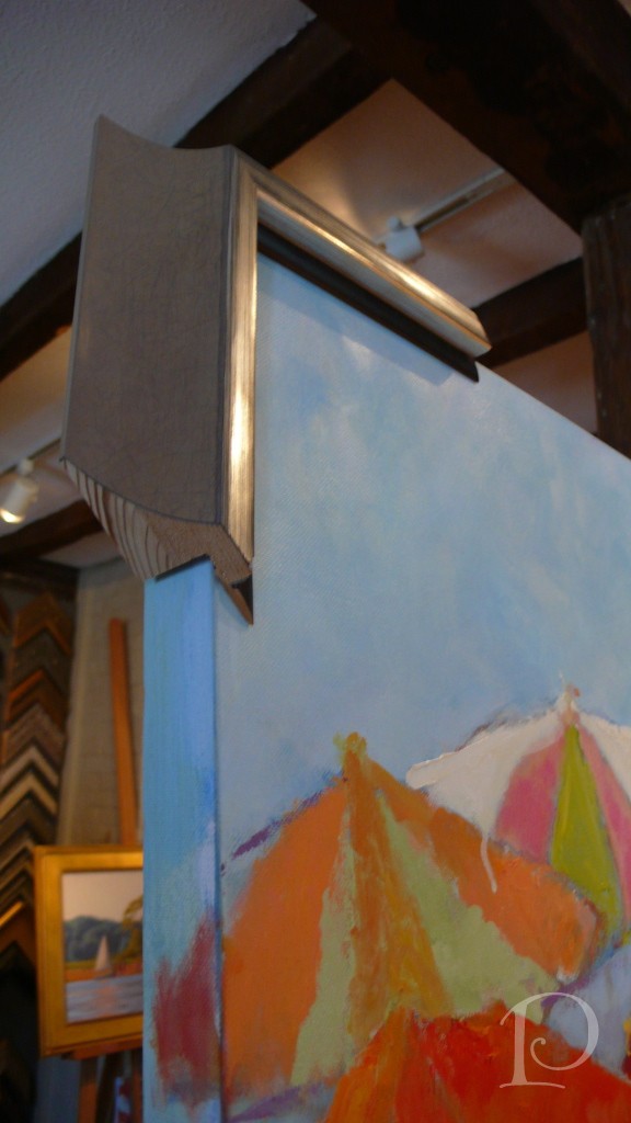
When selecting a frame, keep in mind that the depth of the canvas is critical.
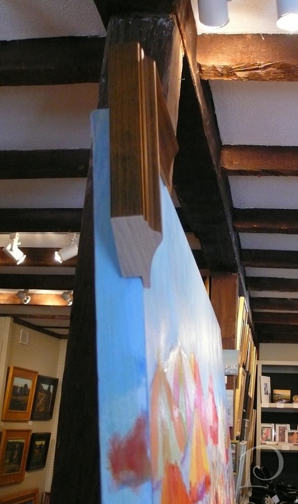
As you can see here, this frame leaves some of the painting exposed. While this would not be an issue if the painting is installed in a space where no view would be seen on either side, I’m going to select a deeper frame.
This is an option:
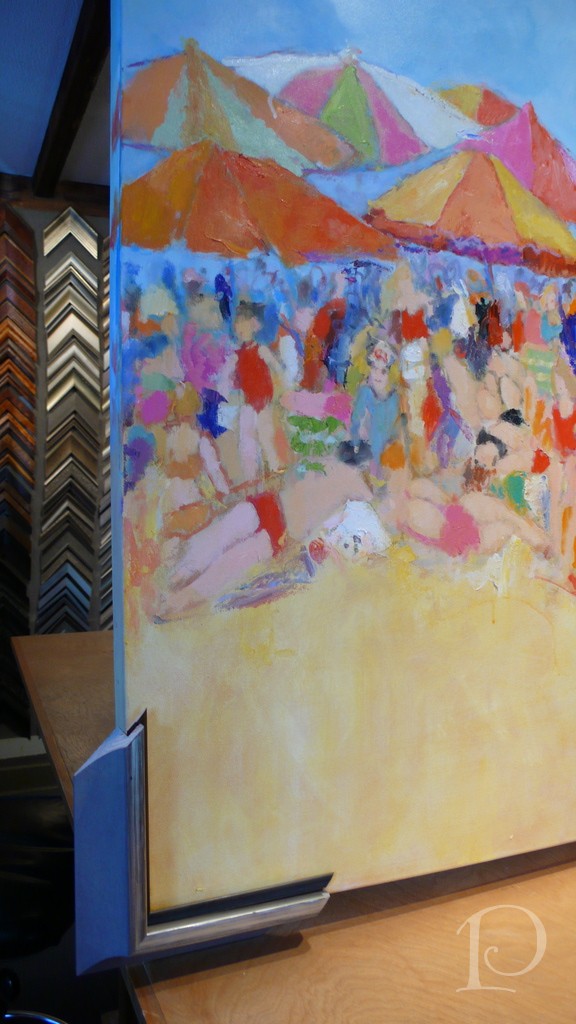
This is one of my favorite contemporary frames
It doesn’t distract from the painting but adds a posh polish. Which finish is best next to the sand? Both work well with the blue sky~ hmmm…
Should we add a dark brown fillet for contrast and a peek of drama? Or will this create a “coloring book” effect when surrounding the entire painting?
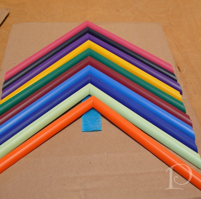
Wait a minute, what’s this? Fillets in color??
Kate have you been holding out on me?? What about the poppy colored one that would draw in the poppy wall from the Living Room? Oh, this could be just perfect!
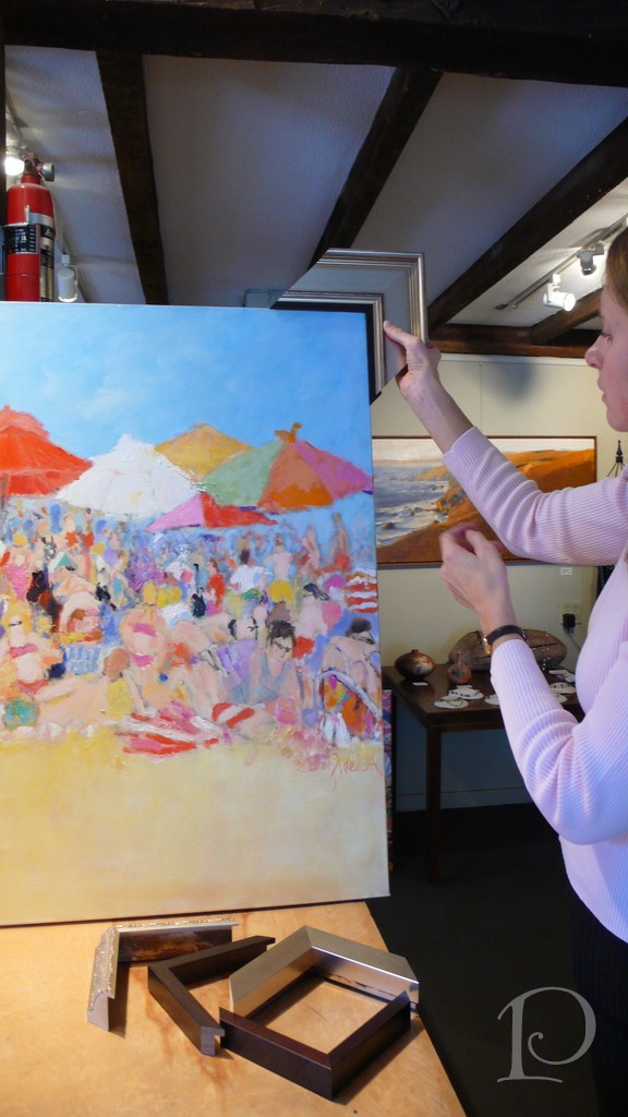
What do you think?
It seems I’m at a crossroads. I love the painting with just the large frame but oh, the pop of color from the poppy fillet ~ I love that too! What’s a designer to do?
Here’s where you step in dear readers and friends.
Should I frame it with the poppy fillet~
or the larger frame only?
(Note: photos taken in natural light)
Please vote this week in the comments section! I will post the winning result soon and then frame my beloved beach painting. Of course I’ll share the new space with you as soon as the framed painting is installed.
Thank you, kind and loyal readers, for participating in my first poll!
xo,
Pamela
Contact me about Pamela Copeman Design Group services.
To follow me on Pinterest, click here.
To follow Pamela Copeman Design Group on Facebook, click here.

Pamela's Posh Picks: iPhone 4 cases
Jan 19 2012 · 5 comments · Posh Picks ·0
Today I’d like to introduce what I hope will become a regular feature here on the Posh Palettes blog: Pamela’s Posh Picks. Each week (or so), I’ll share some of my favorite things with you from the world of design. Whether it’s a product category, designs for a particular room in the home or variations on a design idea, I’ll pick my favorites and highlight them here.
To kick of this series I’m featuring my Posh Picks for iPhone 4 cases. Yes, I FINALLY traded up to an iPhone and now I am obsessed with the variety of chic, sassy and fashionable covers available by designers for all lifestyles. Here are a few of my FAVES~
Kate Spade is my hero~ so imaginative yet sophisticated
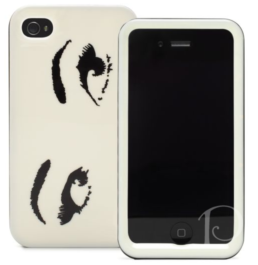
What are these eyes saying? Seeing? Perhaps they’re flirting while you’re whispering sweet love secrets…
This cover by Cath Kidston is so appealing~ I wish this was available when my darling Em was studying in London… how lovely!
Who can resist this Chanel evening iPhone cover dressed in Swarovski crystals?
Oh what the heck, use it daily~isn’t a day dripping in diamonds, crystals and glitter a FAB day? I certainly think so!
I did promise a cover option for everyone…
My rock star son Fred, now playing RENT on 3 keyboards at Shadowbox Theater, would love this skull and crossbones design~ it’s edgy and modern, don’t you agree?
Of course I *must* include an animal print option~
Tory Burch‘s traditional leopard print embellished with her signature initials makes for a perfectly divine case.
Finally, for those of you still using a Blackberry, don’t fret~
I love the message on this Kate Spade pouch. Go ahead and be a petite rebel!
I hope you’ve enjoyed this edition of Pamela’s Posh Picks~and if you have any recommendations for iPhone apps, I’m all ears!
xo Pamela
Contact me about Pamela Copeman Design Group services.
To follow me on Pinterest, click here.
To follow Pamela Copeman Design Group on Facebook, click here.
Resolutions and Intentions 2012
Jan 09 2012 · 0 comments · Inspiration ·0
“Cheers to a New Year and another chance for us to get it right.”
~Oprah Winfrey
It’s the beginning of a new year, a clean slate, a chance to reflect on what we want to accomplish in the coming 12 months. To this end, each January my friend Amy and I have a lunch date where we discuss our intentions (resolutions) for the upcoming year. When we first started this tradition several years ago I was skeptical. So many times you make resolutions that only last a short time and then fall by the wayside. However Amy encouraged me to record my goals and to break them down into achievable steps so I could accomplish them. Furthermore, we agreed to check in with one another periodically throughout the year to revisit our intentions and our progress. By following Amy’s lead and being specific and accountable, I was happily surprised to discover that I really did succeed in many of my intentions.
Of course resolutions and goals don’t always have to be personal. To that end, might I suggest that for 2012 you compile a list of DESIGN INTENTIONS?
Begin by taking a walk around your home with a notebook and pen and make notes regarding areas you would like to improve. As you go room by room, try to think creatively and a bit “outside the box”. Act like a designer and write down your ideas; you can even jot down quick sketches. Review your notes and come up with a list of specific design intentions for your home.
Here are a few suggestions to get you started:
~Make a space more colorful. Fabric, paint, and accessories are a great way to add color.
~If a room is not working quite right for you and your family, resolve to make it more functional.
~ Invest in a storage system to help de-clutter and organize that closet that annoys you every time you have to look for something.
Source: Organized closet via wildflower on Pinterest
~Add more art to your home, particularly pieces that transport you to another place or make you feel calm.
Source: Paige Railsback via Pamela on Pinterest
~Embellish windows with woven wood blinds and new drapes.
~Change the pillows in one room for that extra punch of color.
~Change the paint color on the walls in a room or two. A can of paint gives the most impact and it is the most reasonable of all design investments!
By thinking about the overall concept and then breaking the process down into smaller steps, you can create a manageable, do-able list of intentions. There’s no time like the present to get started, it is after all the 2nd week of January ;-).
Just as personal intentions and resolutions help us grow in strength and character, design intentions will help you to create a home that is personal, stylish, functional and fresh.
Good Luck, Happy New Year and Best of Design in 2012!
xo,
Pamela
Should you like some professional assistance in compiling or completing your Design Intentions do contact me about my design services.
To follow me on Pinterest, click here.
To follow Pamela Copeman Design Group on Facebook, click here.

The Gift of a Gift
Dec 19 2011 · 0 comments · Holiday, Inspiration ·0
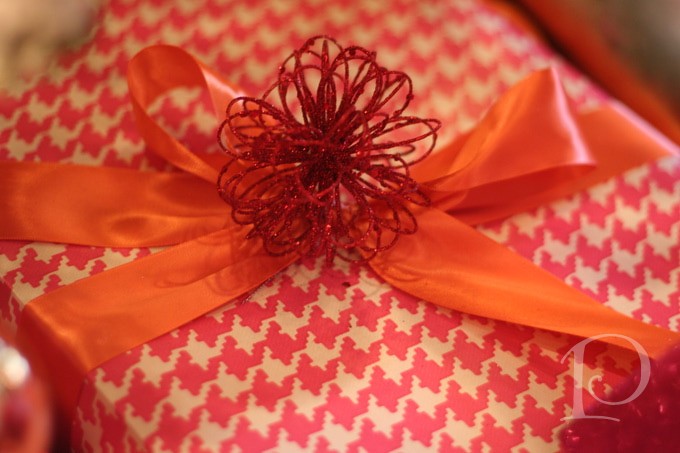
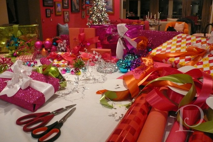
Anyone who knows me knows that I love to wrap gifts. It gives me great pleasure to embrace my presents with papers and ribbons that tease the recipient with anticipation of what might be inside. To me, the gift wrapping is a further expression of my creativity and as much a part of the present as the gift inside.
As always, my gifts are wrapped in colors that compliment my room designs. This year the color scheme is orange and poppy. I’ve chosen double satin ribbons and adorned them with a myriad of sparkly embellishments. They look so beautiful under the Christmas tree just waiting to make someone happy~
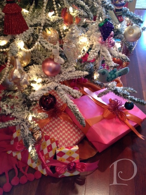
This is an overview of the gift wrap materials I use. Ribbons sourced from Jacobson Floral.
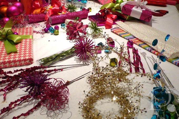
Papers and embellishments from Michaels and The Container Store, aren’t they fun?
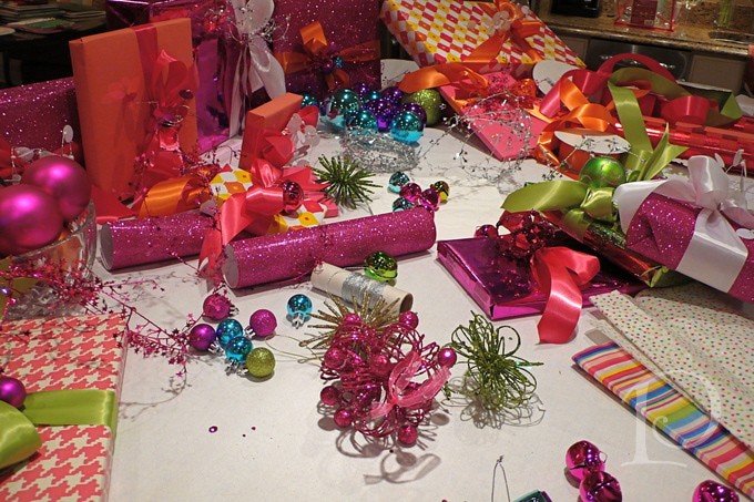
Ahhh, now to use everything creatively.
Don’t forget the jingle bells for the children. Come to think of it, aren’t we all young at heart at Christmas time? Bells for everyone~
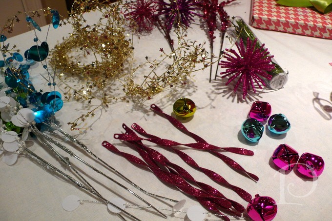
Ornaments make perfect present toppers, especially if they’re ½ price!
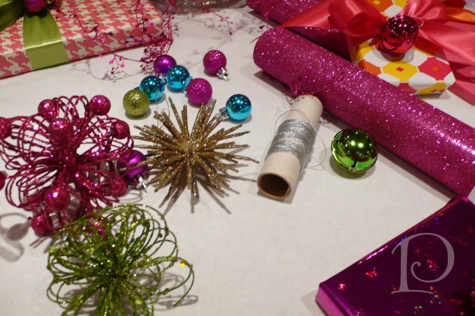
Of course, the more design elements that reflect light the better. Nothing beats that festive holiday sparkle!
I love GLITTER wrapping paper! If I don’t have a bit of glitter on me from December 1st to the 25th, I just don’t think I’m fully enjoying the season~
A few ideas for gift tags…
You can hand paint (or make) your gift tags and copy them~ have fun and personalize your gifts.
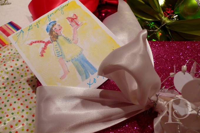
You can also use photos as gift tags, similar to the place card idea I shared a couple of weeks ago.
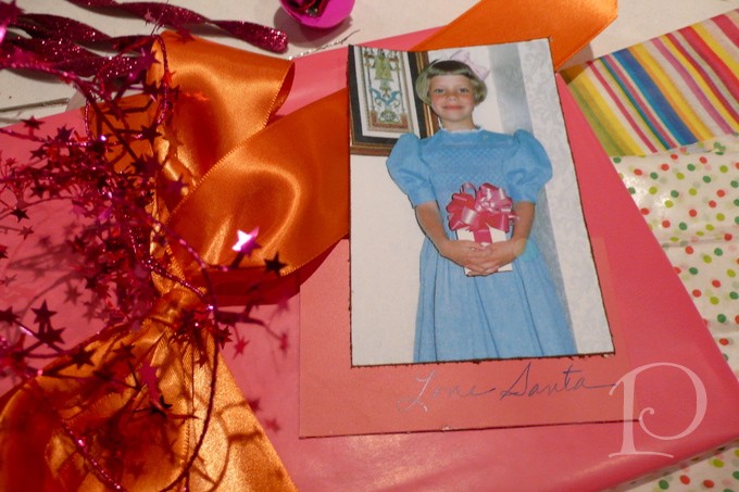
Voila here are the gifts under my tree~ isn’t it a beautiful sight? I’m so happy I can enjoy this for a few days before these gifts are given away to make even more people happy!
For more truly outstanding gift wrap ideas visit A Gift Wrapped Life, one my favorite blogs.
“ The best of all gifts around any Christmas tree is the presence of happy family and friends
all wrapped up in each other.”
~ B Hillis
Merry Christmas!
XO,
Pamela
May I Toot My Own Horn?
Dec 17 2011 · 3 comments · Design Events, Publication ·0
Recently I learned that I am appearing in not one, but two design publications. I’m feeling quite flattered and wanted to share!
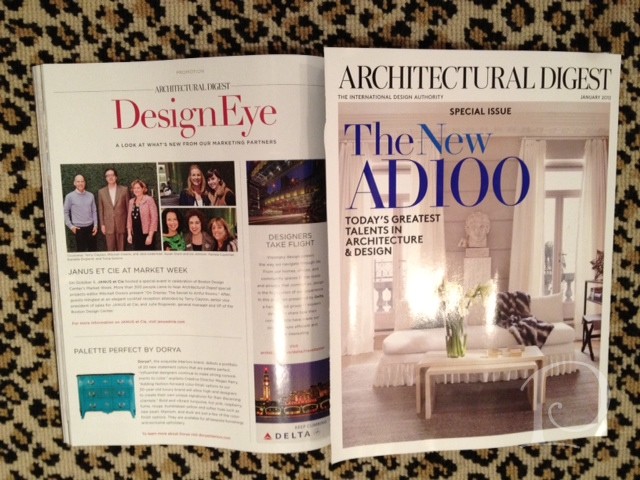
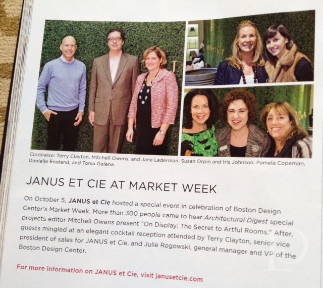
First, I was pleasantly surprised to find myself in the January issue of Architectural Digest. What an honor to be included in the Design Eye special section featuring one of my favorite companies, Janus et Cie. I attended a wonderful lecture back in October as part of Design Days at the Boston Design Center and there I am pictured with two of my dear friends, Danielle England and Toni Galeno from the Ailanthus showroom. Thank you Architectural Digest!
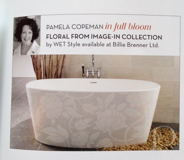
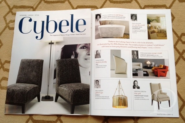
I am also honored to be included in the newly revamped Cybele, the magazine of the Boston Design Center. Featured along with 11 other designers in the Trends 2012 report, my favorite trend for the new year was highlighted. The In Full Bloom trend is beautifully illustrated with the gorgeous Billie Brenner tub I selected. Wouldn’t it be lovely featured as part of an outdoor terrace under the stars in a Caribbean hideaway? Oh, to dream!
Hoping some unexpected, happy news comes your way this holiday season!
xo,
Pamela
Decking the Halls
Dec 13 2011 · 4 comments · Holiday, Inspiration, Personal ·0
“ Yes, we need a little Christmas right this very minute, candles in the window, carols at the spinet, Yes, we need a little Christmas now….”
~Mame
This is one of my favorite times of the year~ and there are so many reasons why. Tiny white and colored lights everywhere~ remember my motto, “too much of a good thing is wonderful”. Every interior is a bit overdressed (which I love). At my house, champagne and Prosecco are the drinks of choice. Christmas trees come in all shapes and sizes (just like all of us) and they are all beautiful (just like all of us). We are surrounded by family and friends singing Christmas carols with glorious voices and twinkles in their eyes, exchanging warm, meaningful embraces. Oh I just love the Holidays, if only they could last a bit longer!
One of my most enjoyable days of the season is always the one I spend decorating my home for Christmas. This year I have a new space with a new palette so my creativity was heightened and ready to go with new ideas and designs. Come and take a peek at what I came up with. I hope you can glean some inspiration to try something new for your own holiday decorating this year!
The Foyer sets the tone with a simple balsam wreath at the base of this sculpture
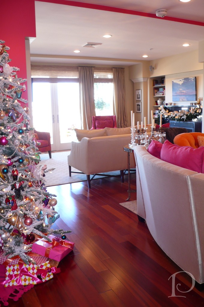
I love to place the Christmas tree in an area that can be viewed from as many seating areas as possible
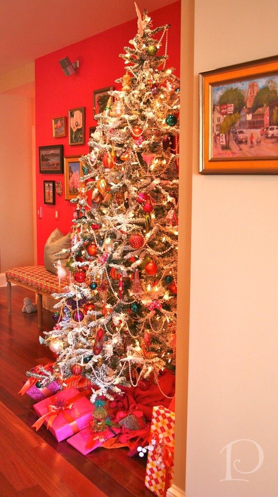
This year I treated myself to a new flocked tree (similar tree available from Amazon.com). This is an artificial tree which means I can leave it up as long as I like. The base color of the branches is green which are then beautifully layered with a thick covering of velvetesque snow. It’s quite striking against my poppy-colored art wall.
Each year I add additional ornaments to my collection this year I added orange (a nod to the Pantone color of the year for 2012, Tangerine Tango) and turquoise for depth. These bold glass balls really enhanced my extra special ornaments.
Fireplace mantels offer an unbeatable focal point to hang a festive seasonal swag. This year I used an artificial green base and embellished it with one-of-a-kind treasures from Jacobson’s Floral in Boston.
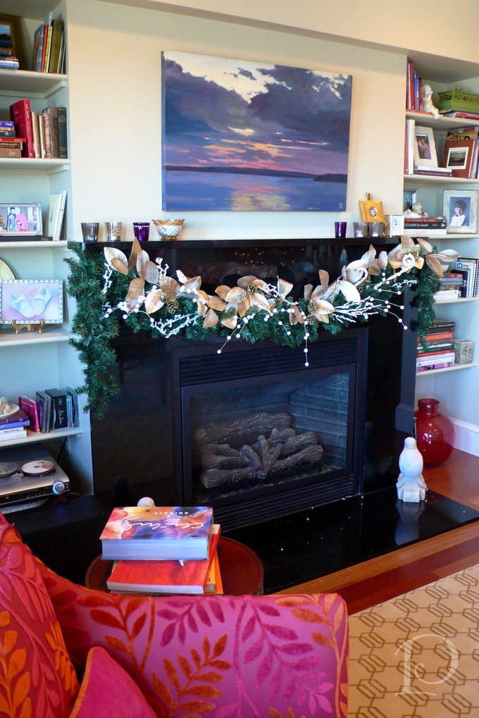
Here I used golden leaves, flocked fiddle heads and cascading snow dots. You can use whatever baubles strike your fancy ~ just don’t forget to wire them all together!
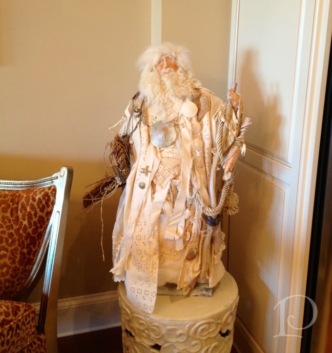
One of my favorite parts of decorating is rediscovering my treasures that have been hidden away for the year. Here is a hand made Santa by Maine artist Pat Frost. I love his plaster face and hands, vintage clothing and his sand dollar collar.
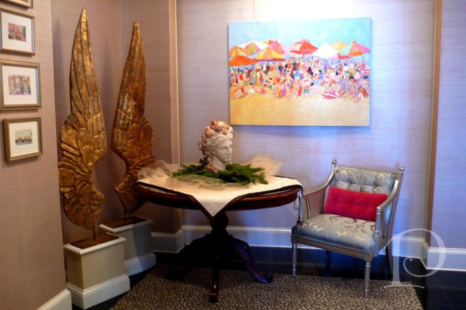
Every nook and cranny can be “Christmas-ified”. One of my favorite vignettes is this collection of art by Sandy Welch. The wall surface of opalescent seashells by Maya Romanoff (sourced at Donghia, Boston Design Center ) plays perfectly off the sparkle of the antique glitter stars.
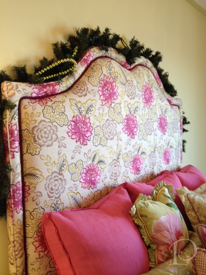
Don’t forget the bedrooms. You can trim the headboards with garlands and add wreaths to the windows. We want everyone to have visions of sugar plums dance in their heads on Christmas Eve!
‘Tis the season to enjoy your holiday home!
xo,
Pamela
Shopping the Fleas
Dec 06 2011 · 2 comments · Inspiration, Travel ·0
As the holiday season kicks into high gear, one of the things on my to do list (along with decorating, of course) is picking out the perfect gifts for those on my list. Lucky for me, I’ve already gotten a jump start on my holiday shopping–in Paris! During my September trip I visited two of the legendary Paris flea markets: Vanves, the smallest flea market and Clignancourt, the largest market with over 2500 stalls.
Whether you are a passionate collector, a lover of a one of a kind antiques or an early holiday shopper you will certainly appreciate the “fleas” of Paris.
Come and take a peek…
First, some of my favorite vistas of Vanves:
This is a view of the vendors lining the street at Vanves, you really have to walk right up to each table to see their precious pieces
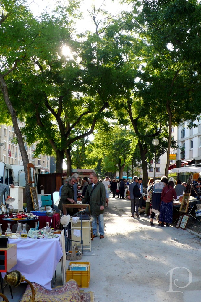
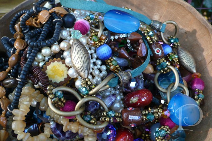
This cupid was so pretty among the rosy crystal and china
Baubles galore, how can you go wrong??
The way the sunlight beamed through the impeccable antique linens was so beautiful. In Paris it seems everything is more romantic.
I wish I had a grandchild I could’ve purchased these precious fur booties for….
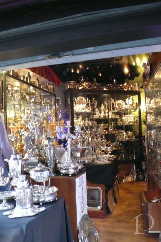
Next, a visit to Clignancourt. With its many meandering alleyways gleaming with treasures, the selection here is definitely more upscale– and so are the price tags. Fortunately it doesn’t cost anything to look…
The silver was polished and simply glowed under the well placed lights
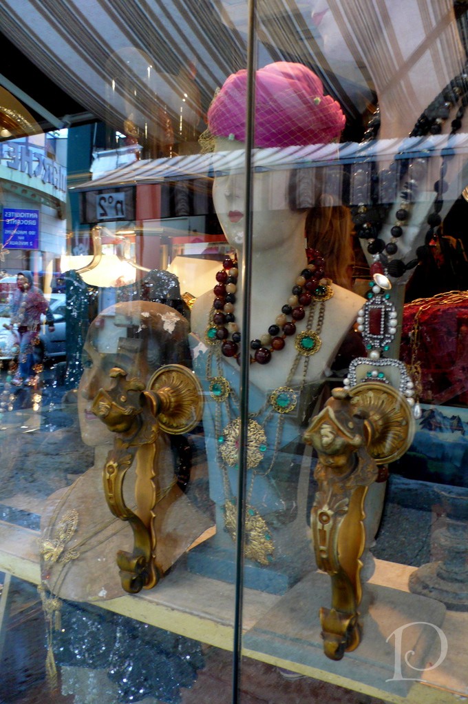
The doors to this vintage Chanel shop were so unusual. Upon closer inspection I could see they were faces of woman, oh how I would love this on my front door! By the way the shop was breathtakingly Chanel: $$$$$
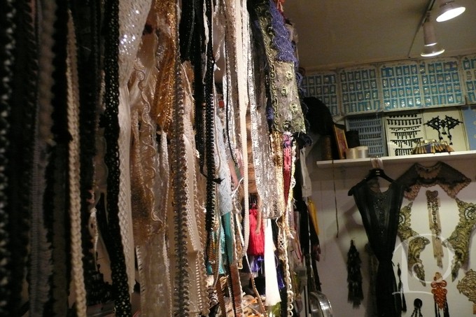
By far my favorite shop was this well kept trim shop that was filled with trims and vintage findings from the proprietors family factory that dated back 200 years! Ahhh which one, or rather, ones to choose?
This exquisite trim was spun silver and simply glowed
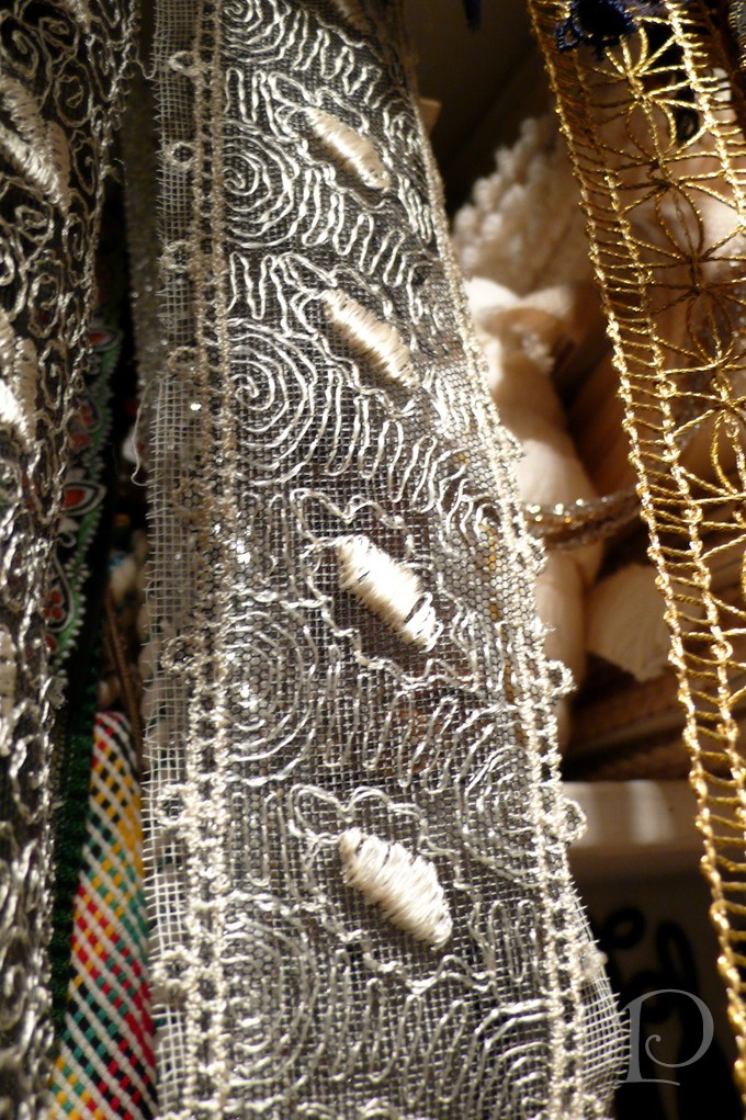
For an 8′ x 6′ space, this stall was a piece of heaven on earth for this designer ~ One last look to tide me over until my next trip.
I hope you’ve enjoyed this glimpse into two of Paris’ famous “fleas”. Whether you’re shopping for brand new treasures or an item with some history this holiday season, I wish you Bonne Chance!
” I love adding antique fabrics, trims or accents to my designs. They bring a history, a patina and a spirit to any room. I often wonder where they lived before I found them.”
Pamela Copeman
xo,
Pamela
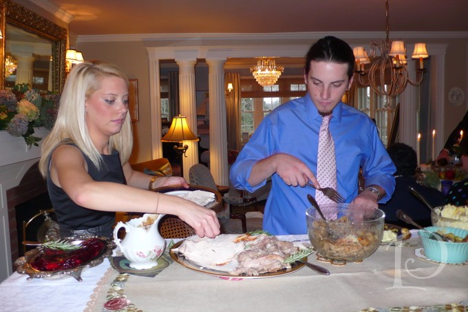
Thanksgiving
Nov 21 2011 · 5 comments · Personal ·0
I had high hopes for this week’s entry~ one of my favorite things to do in anticipation of Thanksgiving is to design the invitation (perhaps a handpainted one), plan the guest list and create a beautiful table scape. Did you notice cooking is not even mentioned? Usually, just before the doorbell announces the beginning of the party I dash around the house and take some photographs for the book I will publish one day (or at the very least to record for my amusement the “Tables I Have Set”).
Along the way I have developed some meaningful traditions I was going to share (that I knew would change the life of all my followers, yes you, Ginny and Tina). After looking at 100’s of photos do you think I could find just the exact pictures that I was looking for? The perfect ones to illustrate what I had in mind? OF COURSE NOT!
So, this year, I will take lots of photographs. I will post the most entertaining ones on my Facebook page so please take a peek next weekend. In the meantime I am going to go straight to the real message of this blog entry.
Thanksgiving is special for so many reasons. It is one of the purest Holidays because we are focused on appreciation for what we have and sharing with others. We count our blessings. When my children were young we had a piece of paper on the refrigerator with the title, We are Thankful for…. and everyone who came into the house jotted down a sentiment. We often had something recorded as serious as my Grampy and Grammy right next to ice cream….
Whether you are seated at an urban Thanksgiving table at the W penthouse in Boston
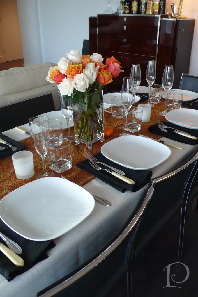
Or a more traditional table by the sea
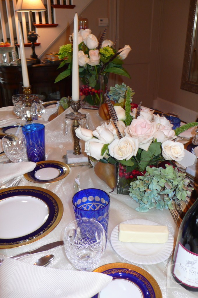
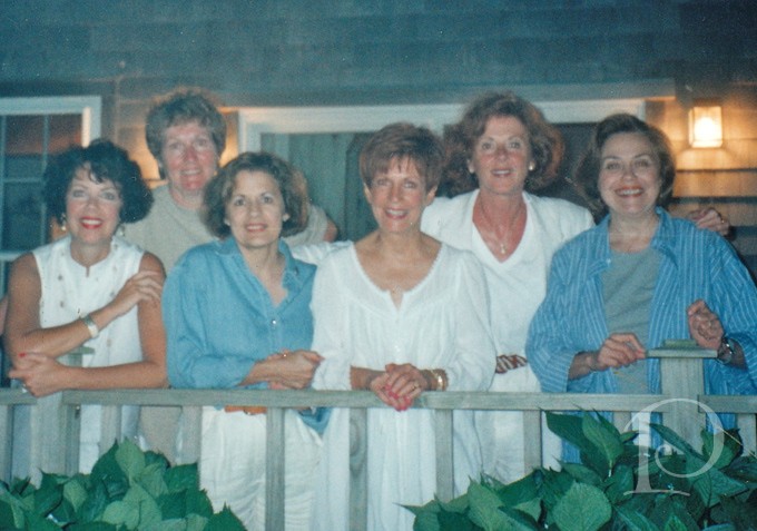
Remember it is who we are surrounded by that truly counts~ Blessed are our family and friends
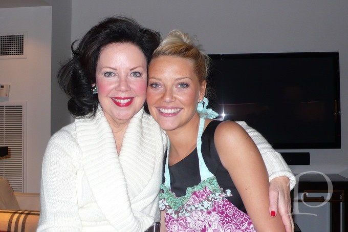
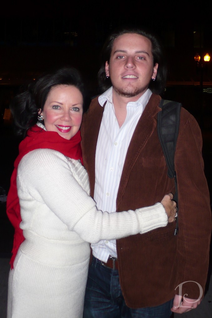
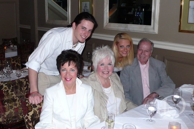
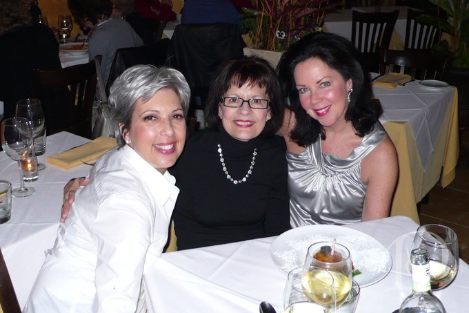
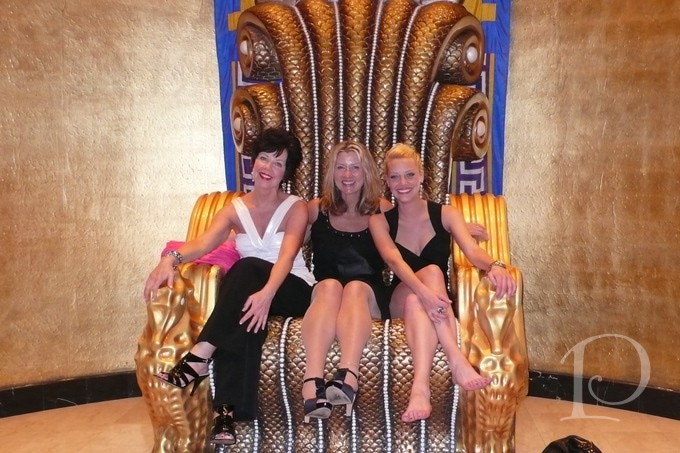
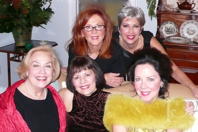
The best friends a girl could ever ask for~
And of course, a beautiful bountiful creative table always adds a posh touch to the Thanksgiving feast!
“As we express gratitude, we must never forget that the highest appreciation is not to utter words, but to live by them.”
~John Fitzgerald Kennedy
Wishing you a Happy Thanksgiving!
xo Pamela