Archive
for March, 2012
Pamela's Posh Picks: Kate Spade Dinnerware
Mar 29 2012 ·0With the Easter holiday and traditional Easter dinner “hopping” closer, I’ve been thinking about beautiful tableware once again. I love to create festive, elegant table settings and this week’s Posh Picks from Kate Spade’s Home Decor line will help you do just that…

Don’t you love this painterly black & white pattern? Placed on a bright linen tablecloth, this china adds a dash of whimsical sophistication to your holiday table:

This simple bow pattern is more traditional. It reminds me of the sweet bows my Emily used to wear in her hair, especially with her Easter dress.

Of course if you’d like a more contemporary look you could pair the Grace Avenue china with this bright yellow accent plate:
Wickford Sea Cliffs Stripe Accent Plate

This yellow pattern just smiles ~ I think this is the perfect plate for a Santa Rosa Salad, full of greenery and orange peppers (my friend Amy’s delicious recipe).
Let’s continue the creativity by using the yellow stripe plate yet again with my next pick…
Larabee Road black accent plate:

Layering different patterns and mixing and matching your plates, glassware and table dressing helps to create interest and drama, setting the “stage” for a lovely gathering.
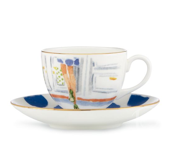
Finally, as the children hop down the bunny trail in search of bounty for their Easter baskets, you can serve dessert and coffee. Presented in these wonderful artisan cups, you can ensure your meal will come to a memorable conclusion.
Illustrated Step Brightly Cup & Saucer Set:
I encourage you to have a colorful and creative time dressing your Easter table this year!
xo,
Pamela
Contact me about Pamela Copeman Design Group services.
To follow me on Pinterest, click here.
To follow Pamela Copeman Design Group on Facebook, click here.
{all images via KateSpade.com }
Posh Palettes Inspiration Board: Spring
Mar 27 2012 ·0“Oh Spring! I want to go out and feel you and get inspiration.”
~Emily Carr
Last week in the Boston area we enjoyed record breaking warmth. Temperatures topped 70 degrees and sunny cerulean blue skies were the norm for 5 days in a row. I felt like I was on vacation! Now the forsythia are blooming next to the daffodils and crocuses, and it is just splendid.
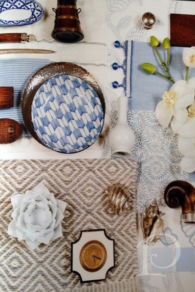
All of this warmth coupled with the afterglow of Alexa Hampton’s lecture and her amazing project boards inspired me to create a vibrant Spring Inspiration Board for some of my personal projects…

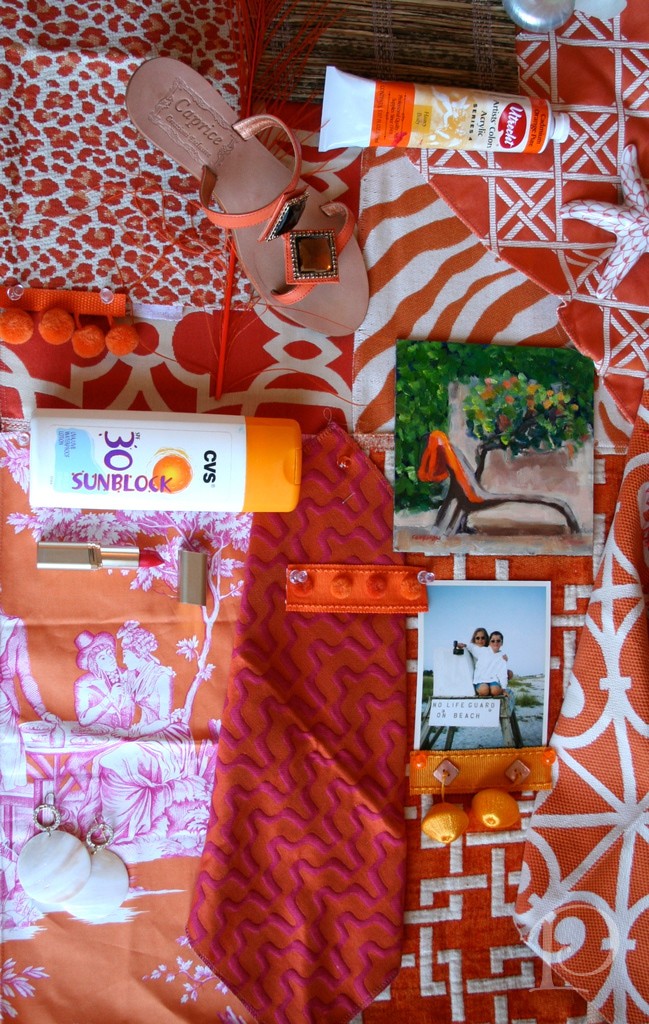
I was inspired by my current favorite color ORANGE~ which as you may recall just so happens to be the Pantone color of the year. Similar to my Presentation Panels for clients, I love to use texture, color, appeal to all of the senses. On this board, the scent of suntan lotion transports me right to the beach, a beach photo recalls memories of younger days, and a bright lipstick brings to mind salty, smudged kisses…

I love woven wood blinds any time of the year but particularly in the Spring and Summertime. Consider installing these versatile window coverings on a porch to shield you just enough from the direct sunshine and then easily roll them up when you want to admire the full view~

Ahhhh, the romance of a toile. Always a classic but so much more cheeky in orange and magenta, don’t you think?

The changing of the seasons invites you to take out all your colorful clothing and accessories. It seems that subliminally I tend to purchase clothes to match my interiors… I wouldn’t want to clash would I??
Just between us, it’s not really subliminal ;-).
The next time you want to approach a design project, why not put together an inspirational board for yourself? It’s so much fun and you just might surprise yourself with some unique textures and color combinations that you adore…
xo,
Pamela
Contact me about Pamela Copeman Design Group services.
To follow me on Pinterest, click here.
To follow Pamela Copeman Design Group on Facebook, click here.

Pamela's Posh Picks: MacKenzie-Childs, Spring 2012
Mar 24 2012 ·0A brand new catalog arrived this week from one of my all-time favorite companies, MacKenzie-Childs. If you’ve been following my blog for a while, you know how much I love anything from MacKenzie-Childs (in fact I wrote about their Flower Market line last Spring). All of their pieces are imbued with a whimsical, colorful, uber-creative spirit that I so adore. Browsing through their latest catalog, I fell in love all over again. Without further ado, I present this week’s Posh Picks from MacKenzie-Childs!

The Merrifield chandelier is adorned with ceramic birds, colored prisms and wands and a crystal bobeche on each arm. So over the top, so amazing, can you stand it?? This chandelier is one of those pieces that the more you look at it, the more you see. So many beautiful layers of craftsmanship! The Merrifield chandelier is definitely “tripping the light fantastic”!

In a product category that lacks imagination, this fireplace screen is a true standout! I love everything about this piece, from the hand painted ceramic pears to the black and white checked feet. So beautiful, so imaginative!


This vibrant rug will add pizazz to whatever space it graces. Whether placed in a pantry, a laundry room or an entry, this rug is sure to make you smile at the sight of it
Flower Market Triple Wall Hook:

I’d never misplace my keys again if I had this charmingly delightful enamel wall hook to hang them on!
Epaulet Accent Table:To me, this Epaulet accent table epitomizes the MacKenzie-Childs style. It is whimsical and beautifully executed. I adore the be-ribboned drawer pull and how the table legs look to be wearing tap shoes ~ such elegant fun! Beauty, function and really, everything you could ever want in a side table, don’t you think?
I hope you’ve enjoyed browsing through this week’s Posh Picks from MacKenzie-Childs. Do take a peek at their website and treat yourself to some beautiful browsing ~ maybe you’ll find something you can’t live without. After all, every home can use at least one MacKenzie-Childs piece!
xo,
Pamela
Contact me about Pamela Copeman Design Group services.
To follow me on Pinterest, click here.
To follow Pamela Copeman Design Group on Facebook, click here.
Alexa Hampton at the Boston Design Center
Mar 19 2012 ·0Alexa Hampton is the President and featured designer of MARK HAMPTON, LLC., the world famous design firm founded by her late father Mark in 1976, and she is FABULOUS!
Last week Ms. Hampton returned to the Boston Design Center to introduce her latest fabric line with Kravet and to give a presentation based on her book, The Language of Interior Design.  I always enjoy the seminars at the BDC; I find them educational, informative, and inspirational and this one certainly did not disappoint. Ms. Hampton is an energetic, articulate and humorous speaker and her talent is just breathtaking. I spent a delightful afternoon at this event, hosted by Bill Elinoff of the Kravet Showroom, enjoying an as-always delicious lunch while Alexa signed books and mingled with the attendees with her signature grace and charm.
Let’s take a look at some of her beautiful designs….
This Manhattan home features a Dining Room space that moves easily into the Living Area ~ the subtle colors work to harmonize the two rooms.

This Dining Room shows Alexa’s versatility; the grasscloth walls and the African textiles and baskets give this room a very global feel~

Master Bedrooms are sanctuaries and Alexa knows this one well because it belongs to her.

What a soothing retreat after a day full of color and raising three children. I particularly love the clean-lined canopy. Alexa explained that the height of the ceiling did not give her and her husband the cocoon feeling she so wanted. She used the canopy to effectively lower the ceiling in the space over the bed and achieved just that. I think it’s a grand idea, don’t you?
This is a sample of one of her amazing inspiration boards~As my loyal readers know, I also love putting my boards together for a project. I find it really helps me refine my vision for a space and showcase textures, colors, and creativity. I love the mix of elements on this inspiration board, so intriguing and tactile!
Alexa Hampton’s new book will be released in June. While the title is still not decided I am already sure it will be on my coffee table just as soon as I can pick it up!
xo,
Pamela
Contact me about Pamela Copeman Design Group services.
To follow me on Pinterest, click here.
To follow Pamela Copeman Design Group on Facebook, click here.
Pamela's Posh Picks: Rolf Benz Studio
Mar 16 2012 ·0One of Europe’s most prestigious brands of contemporary furniture, Rolf Benz, has made its grand arrival at the Boston Design Center! Managed by the outstanding and much loved Gary Riegel, Rolf Benz Studio is the exclusive dealer for Rolf Benz, as well as European brands Draenert and TEAM 7, in the Boston area. I had the great pleasure of visiting this sleek new showroom recently and found my latest Posh Picks.
The furniture from Rolf Benz of Germany is simultaneously modern and timeless and the pieces are stylish~with a secret. It is truly magical, you just have to see the tricks these pieces perform to believe your eyes. What appears to be a sofa can transform effortlessly into a bed or even a recliner (and a sexy looking one at that!). Take a look…
My first Posh Pick is the Rolf Benz 4500:

Rolf Benz 4500
The sensual rounded surfaces give this sofa an unconventional look that invites limitless relaxation, don’t you think?
Next, the Rolf Benz Onda:

Rolf Benz Onda
The Onda is as versatile as it is flowing, with individual, modular pieces that can accommodate any floor plan.
The Rolf Benz Plura:

Rolf Benz Plura
Now this piece is remarkable. Features include a fold out side arm and a swiveling seat along with a backwards and upwards adjustable back. Got that?? You can lounge, sit, recline, or sleep on this beautiful, multi-functional sofa~ now that’s a bargain!
My Posh Pick here is the fab circle carpet:
Paired with another Rolf Benz sectional, it makes a bold and graphic statement.
My final Posh Pick is the Coco chair by Draenert: Don’t you just love the S-line curves of this modern chair? And it’s comfortable too! German engineering succeeds in cars and furniture!
Of course the best way to experience this fabulous furniture is to visit Gary and Holly at Rolf Benz Studio for a demonstration and a walk around this lush new showroom. Contact me, I’d be glad to accompany you!
xo,
Pamela
Contact me about Pamela Copeman Design Group services.
To follow me on Pinterest, click here.
To follow Pamela Copeman Design Group on Facebook, click here.
The Votes Are In…
Mar 12 2012 ·0A while back I shared with you my process for selecting a frame to highlight the star piece of artwork for my foyer, a lively and colorful beach scene by my friend, artist Sandy Welch. With the help of Kate from South Street Gallery, we picked out a beautiful, contemporary frame. The question then became to filet or not to filet? That’s where you my dear readers and friends came in. Your votes and comments encouraged me to go for it and to add the filet to the frame! Without further ado, here is the result:

The champagne finish frame adds polish and the poppy colored filet adds “punch”.

Adding the filet was definitely a risk but I am thrilled I took it! I think it gave this large frame the pizazz it needed to balance the color of the painting and set the tone for my home on the ocean.

You may notice a few other updates to the space.  This newly upholstered french antique chair with the magenta dots against the silvered grey background lends a subtle compliment to the painting and frame.
  Coupled with the freshly dressed table and new lighting, I’m loving this welcoming entrance. Thank for participating in the first Posh Palettes vote ever!
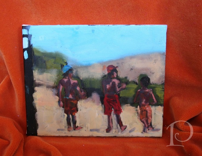
Speaking of painting, this past week I participated in a 2 day painting workshop with Kelley MacDonald at her studio in Warren RI. What a treat. Not only is she one of my favorite artists but she is an intuitive instructor and these 2 days with her were outstanding! During the workshop we practiced several techniques in oil painting.
We worked on value studies (ugh, not my favorite although very necessary).  We had 5, 10 and then 15 minutes to complete our work.
Kelley also had us do timed paintings with other still life subjects.
We had 10 minutes to paint 3 lemon sections– wait, REEEALLY??
And then 5 minute olives…. 
Finally we did a graph painting of 3 forms in 30 minutes.
I was amazed at the paintings I produced and even more amazed at what I learned. Thank you Kelley for an incredible 2 days of inspiration and art!
“Art enables us to find ourselves and lose ourselves at the same time.”
~Thomas Menton
xo,
Pamela
Contact me about Pamela Copeman Design Group services.
To follow me on Pinterest, click here.
To follow Pamela Copeman Design Group on Facebook, click here.
Pamela's Posh Picks: Wall Sconces
Mar 08 2012 ·0For this week’s edition of Posh Picks, I’ve chosen to highlight some of my favorite wall sconces from Currey & Company. I love the versatility of wall sconces and the seemingly endless variety of design choices available. Currey & Company is one of my go-to resources for lighting, always providing top quality and such beautiful designs.
Let’s get to the Posh Picks!
Pembroke ~ One Light Wall Sconce

The Pembroke sconce is smart, contemporary, modern, and sure to work perfectly in a wide range of spaces. This sconce would be marvelous above a nightstand in a bedroom. Then again, it would be equally at home in a foyer–perhaps a pair of Pembrokes above a console table flanking a fabulous piece of artwork!
Goddess ~ Two Light Wall Sconce

As wonderful as this bead-enhanced sconce is on its own, I would love to add lampshades! I could easily see an animal print or tangerine shades on this sconce–just imagine the added pizzazz! I envision the Goddess in a foyer, in a bedroom entry or perhaps most fittingly, in a luxurious bathroom. Placed at eye level on either side of a mirror, what a glam spot for getting ready for the day–or evening!

The bold lines of this sconce coupled with stylish details such as the ball finial and moody black shade make this the perfect sconce for a library or tailored office. As part of an integrated illumination design, the Primo would add style and function to a custom bookcase niche. Another design option would be to hang this sconce on the side of above-desk cabinets, with the electrical housed within the cabinetry. While not suitable for task lighting, this type of sconce placement makes a bold design statement and enlivens an otherwise unused space.
Dorset ~ One Light Wall Sconce

With its tailored, globally-influenced style, this sconce provides soft and chic lighting. A group of Dorset sconces would be perfect for a media room. Arranged in a deliberate, artful grouping, either randomly staggered or installed in a linear pattern, these sconces would add the perfect touch of ambiance, function, and style!
Quantum ~ Two Light Wall Sconce
This playful yet sophisticated sconce would be ideal in a Master Bathroom. Placed on either side of a mirror or flanking a window over a luxurious bathtub, the glass “beads” of the Quantum are reminiscent of delicate soap bubbles. What a wonderful reminder to relax, take a deep breath, and let your cares float away…
Tiny bubbles…Make me happy, Make me feel fine…
~Don Ho
xo,
Pamela
Contact me about Pamela Copeman Design Group services.
To follow me on Pinterest, click here.
To follow Pamela Copeman Design Group on Facebook, click here.
A Golden Transformation
Mar 04 2012 ·0When I was growing up, the story of Cinderella was one of my favorite fairy tales. It never failed to enchant me when the Fairy Godmother appeared and magically transformed Cinderella’s tattered rags into a beautiful ball gown complete with glass slippers. I may not be a Fairy Godmother but I am an interior designer and I love transforming pale and boring spaces into jazzy, eye-catching jewels!
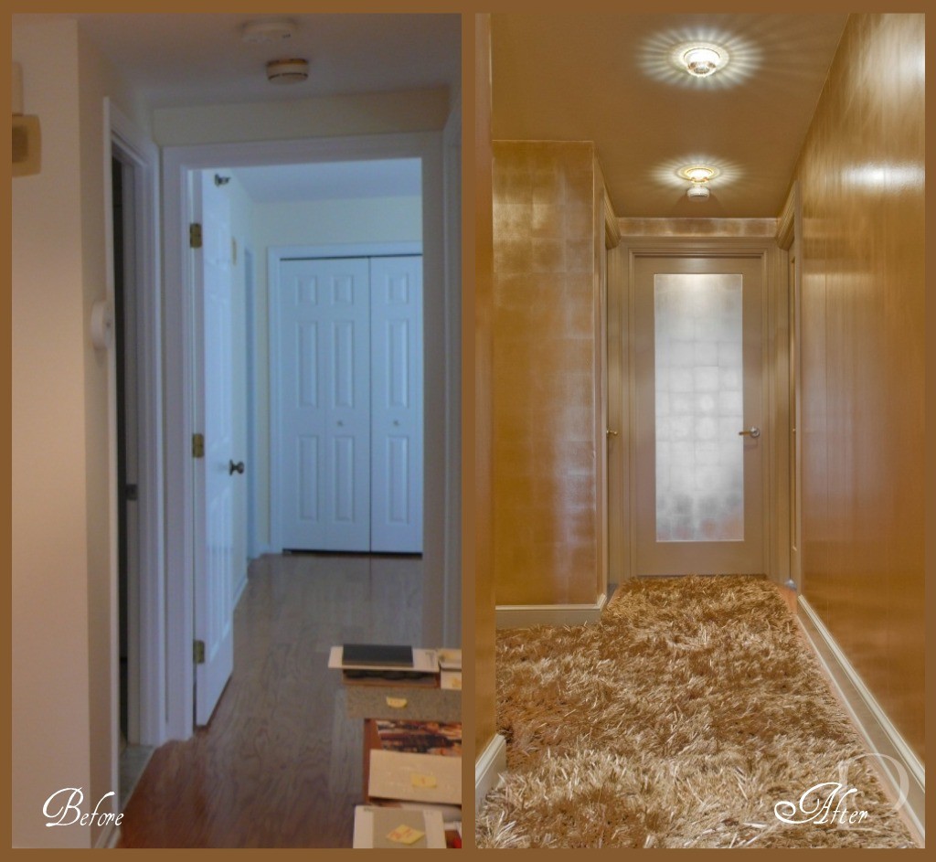
Today I want to share with you one of my more dramatic transformations. The project was a condo on Tremont Street in Boston and the space was a petite Foyer and Entrance Hall.
This before photo shows the Hallway that leads to the Master Bedroom. The space is boring, vanilla and dare I say, plain Jane.

Foyer ~ before
This is the interior shot of the Front Door. So boring, simply no personality at all.

Doorway ~ before
I was determined, along with my client, to banish the boring and have her guests wowed as soon as they walked in the front door. Yes, this space was definitely in need of a touch of interior design “magic”. So I conjured up a dash of sparkle, a dose of glam, a whole lot of gold and… TA-DA:

Can you believe this is the same space?? From the incredible Swarovski crystal inserts on the recessed lights (from Chimera) to the stunning metallic wall covering (Maya Romanoff, purchased at Donghia) right down to the amazing custom gold silken carpet (from Colony Rug) there’s no shortage of wow factor! I love how we carried the gold color palette through the entire Foyer using a variety of finishes. Instead of making visitors want to turn around and leave, now this beguiling space makes a statement that says: Do come in and prepare to be amazed!
Here is the ‘after’ view of the hallway leading to the Master Bedroom. What a metamorphosis! Of course all good interior designers have a fabulous team that helps them make the magic happen. Contractor John Horgan and Associates did a masterful job with the wallcovering and painting. The carpentry renovations (including sleek new doors) were done by the award winning S+H Construction. Randy Gross of Eric Levin Photography was a superstar during this shoot. He kept his good humor and smile despite the 90 degree heat, working with me to get “the” perfect shot.

I can’t resist showing you one more look at the Golden transformation~
I love this project and I hope you do too. What a wonderful reminder that even a small space can have a big personality so…think BIG!
“Live life big”
~Connie Hilner
xo,
Pamela
Contact me about Pamela Copeman Design Group services, including magical transformations!
To follow me on Pinterest, click here.
To follow Pamela Copeman Design Group on Facebook, click here.